Born Nashville, Tennessee, 1983. He attended Western Kentucky University’s Bachelor in Fine Arts program for Graphic Design 2003-07, and Vermont College of Fine Arts Masters of Fine Art for Graphic Design 2015-17. His work has been showcased in publications such as Graphic Magazine (Korea) 2021, Visual Strategies for the Apocalypse (Wordshape) 2019, GD USA 2017, Monthly Design Magazine (Korea) 2015, and UC.Quarterly 2014.Q2 and 2013.Q4, Print Regional Annual 2011.
His work has been exhibited around the world including The Packing Plant in Nashville, Tennessee 2018, Jeju Yeon Gallery in Jeju-do, Korea 2016, Miami University in Oxford, Ohio 2012, Art Academy of Cincinnati in Cincinnati, Ohio 2011.
He is currently acting as the director & co-founder of Funeral in Brooklyn, New York, educator at Parsons New School of Design, curator at Us by Us, and typographer at Bad Type Club.
Outside work, he writes and is compiling three (in-progress) books.
From Nashville, TN - Currently in Brooklyn, NY
Trashdragon - Unwavering Kindness and Everlasting Love
2022
P
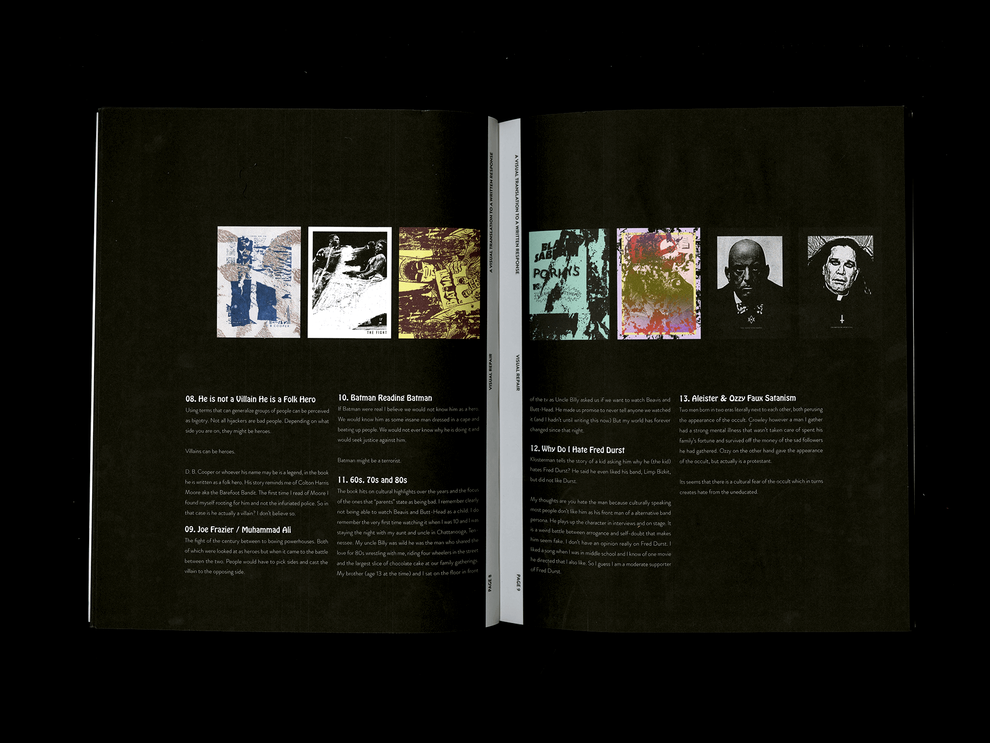
Funeral
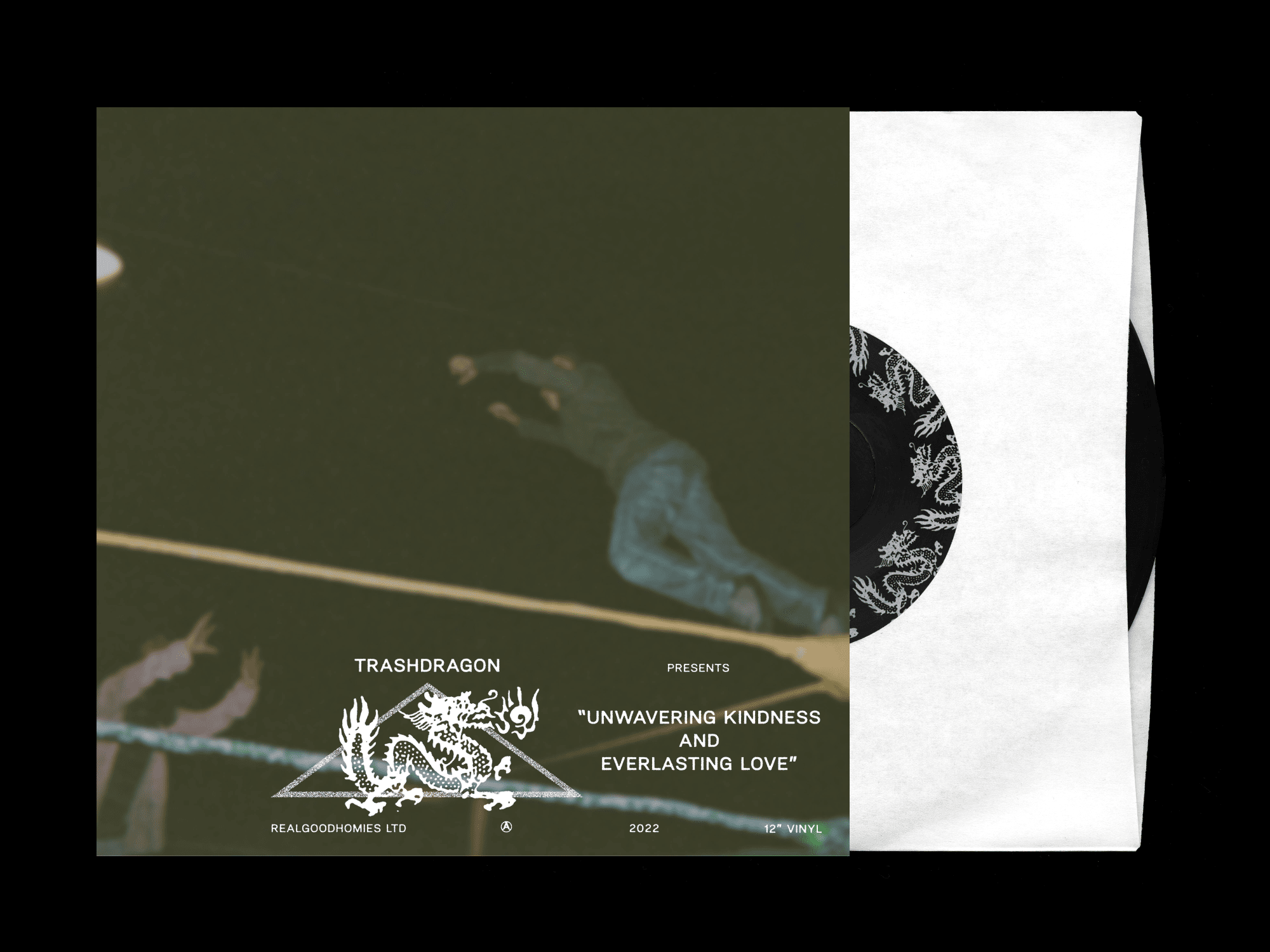
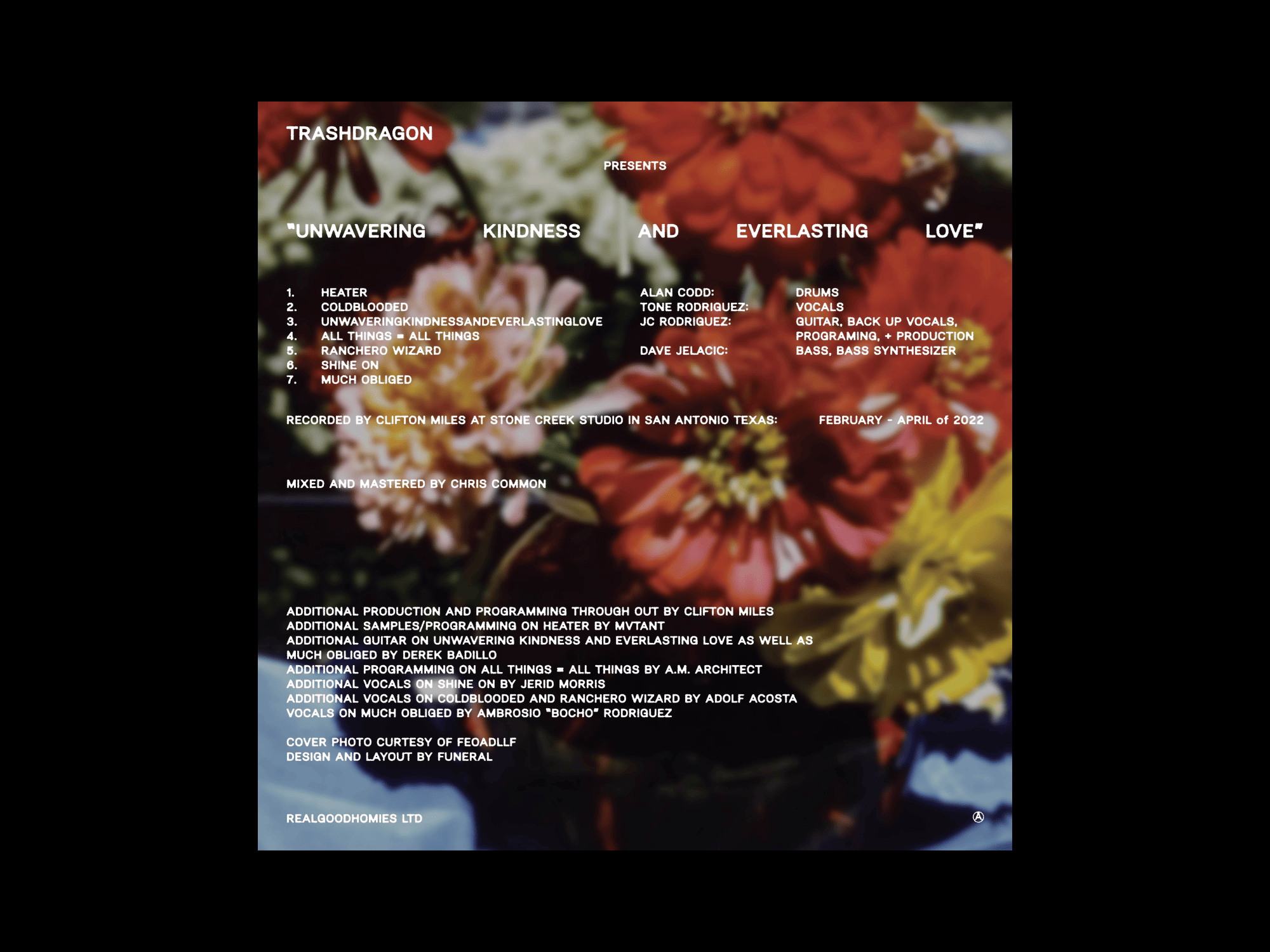


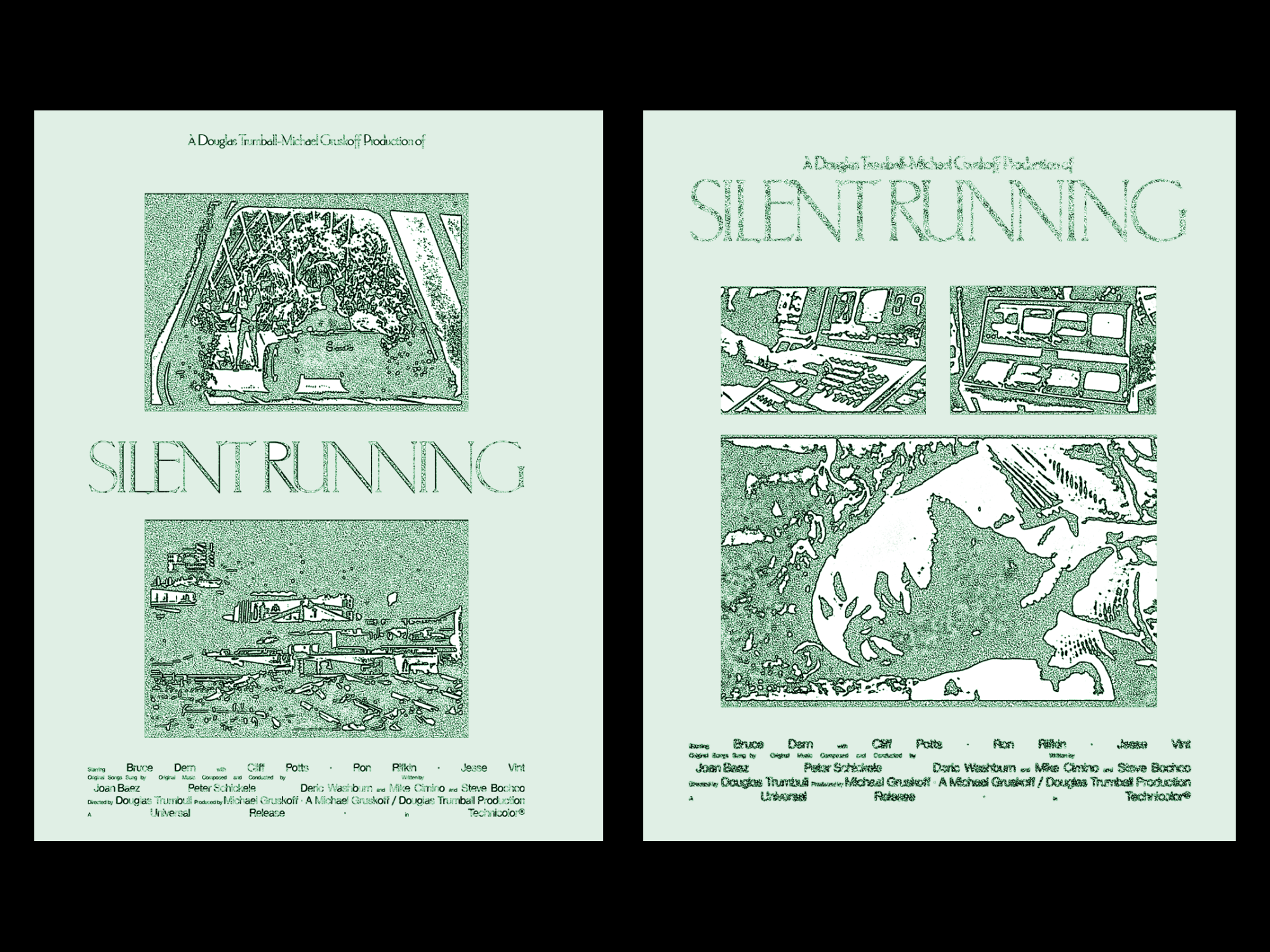
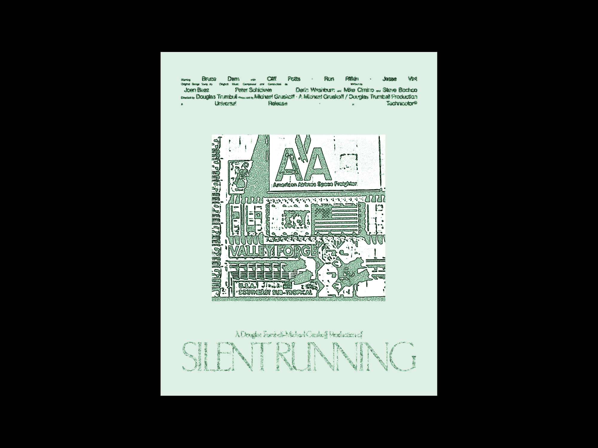
"Unwavering Kindness and Everlasting Love" is an exceptional release by San Antonio's post-punk noise band, Trashdragon. The unique blend of post-punk and noise rock is on full display throughout the album, with each track featuring intricate guitar riffs and thunderous drum beats.
While talking with the band, I discovered that they had a collection of photographs taken by Feoadlf. Once I stumbled upon these dreamy, nostalgic images used for the cover, I needed to pair them with a graphic element from the past. The dragon illustration was borrowed from a late 60's take-out menu for a Chinese restaurant in Australia. The Back photograph was taken of a potted flower in Brooklyn. Organizing lengthy content into a grid layout allows owners to navigate the content easily.
While talking with the band, I discovered that they had a collection of photographs taken by Feoadlf. Once I stumbled upon these dreamy, nostalgic images used for the cover, I needed to pair them with a graphic element from the past. The dragon illustration was borrowed from a late 60's take-out menu for a Chinese restaurant in Australia. The Back photograph was taken of a potted flower in Brooklyn. Organizing lengthy content into a grid layout allows owners to navigate the content easily.
Collaboration with
Kevin Green
Max Smouha
Kevin Green
Max Smouha
This website is specifically designed to showcase a Shopify plugin that offers a valuable feature for online store owners. With this plugin, you can notify your customers when products are restocked, providing them with a seamless shopping experience and helping you to increase sales.
The plugin is a great solution for those who want to keep their customers informed when their favorite products are back in stock. This is especially important for products that are in high demand and sell out quickly. By using this plugin, you can avoid the frustration that customers feel when they are unable to purchase a product they want.
The website highlights the key features of the plugin and how it works. It provides detailed information on how to integrate the plugin with your Shopify store, as well as how to customize the notifications to match your brand. In addition, the website includes customer testimonials and case studies, demonstrating the benefits of the plugin and how it has helped other online store owners to increase their sales and customer satisfaction.
Overall, this website is a valuable resource for online store owners who want to provide their customers with a seamless shopping experience and increase their sales. With this plugin, you can keep your customers informed and engaged, ensuring that they keep coming back to your store.
Hunger Mtn
2022
I W
Funeral
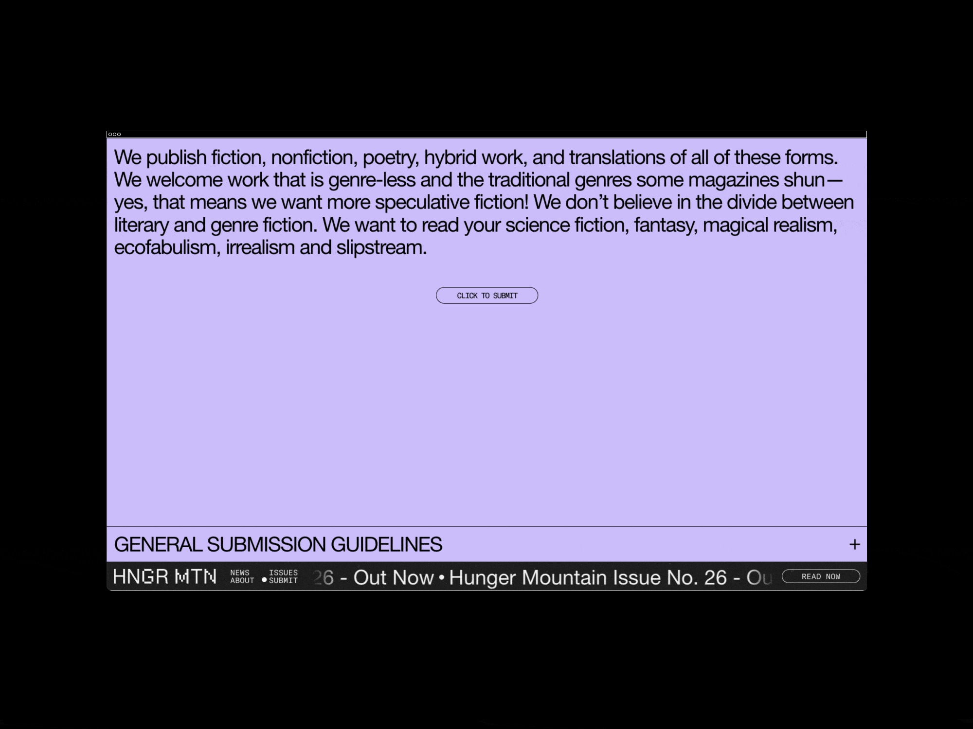
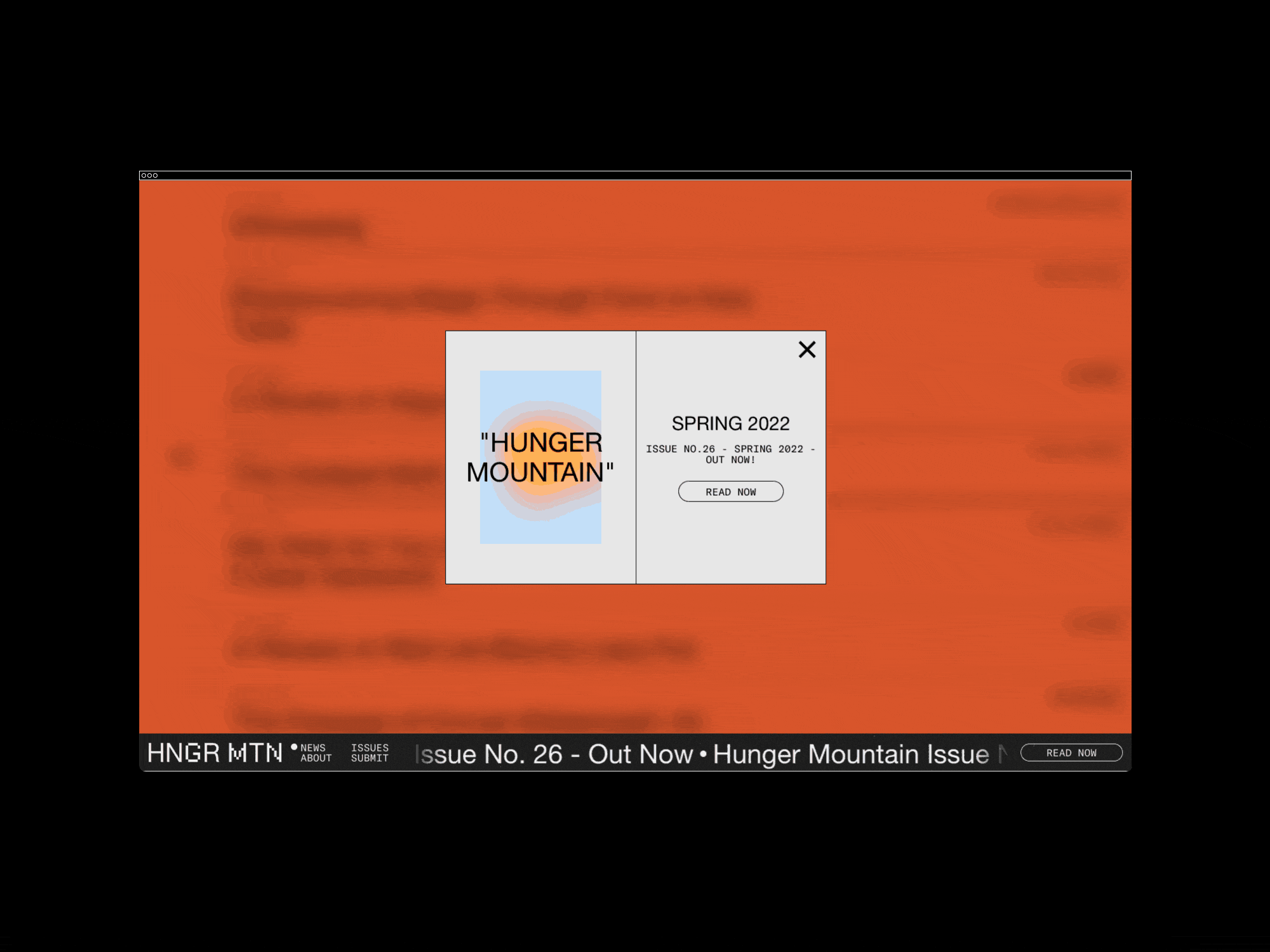
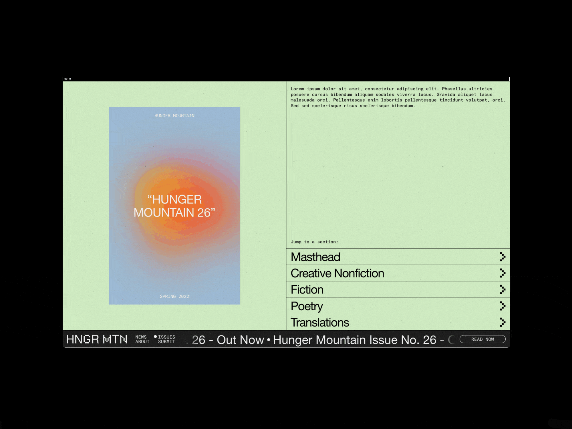
Hunger Mountain, a literary journal, was founded in 2002 by faculty and students in the Writing Program at Vermont College of Fine Arts. The journal aimed to showcase the best of contemporary fiction, poetry, creative nonfiction, visual art, young adult, and children's writing. Since then, it has been a platform for emerging and established writers and artists to share their work with readers.
Recently, we were tasked with rebranding and building a new website for Hunger Mountain. Our goal was to help the publication transition smoothly from print to the digital world. We had to carefully consider the design, layout, and functionality of the website to ensure that it would be visually appealing and easy to navigate for readers. Additionally, we collaborated with the editors to create new content such as author interviews, writing prompts, and book reviews to engage the audience and keep them coming back for more. With our efforts, we hope to expand the reach of Hunger Mountain and help it continue to be a vital part of the literary community for years to come.
Recently, we were tasked with rebranding and building a new website for Hunger Mountain. Our goal was to help the publication transition smoothly from print to the digital world. We had to carefully consider the design, layout, and functionality of the website to ensure that it would be visually appealing and easy to navigate for readers. Additionally, we collaborated with the editors to create new content such as author interviews, writing prompts, and book reviews to engage the audience and keep them coming back for more. With our efforts, we hope to expand the reach of Hunger Mountain and help it continue to be a vital part of the literary community for years to come.
Collectoor
2022
I W
Funeral
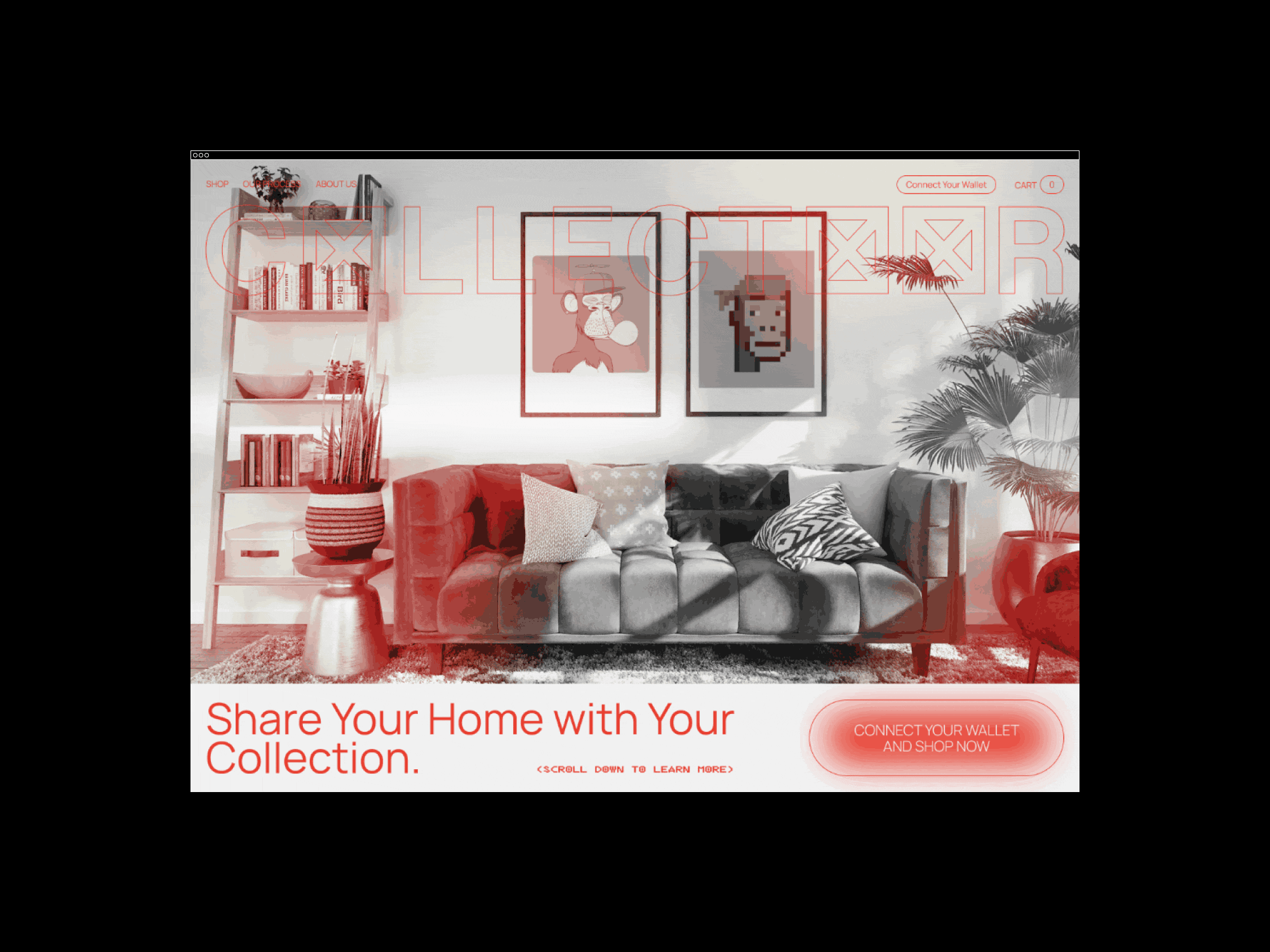


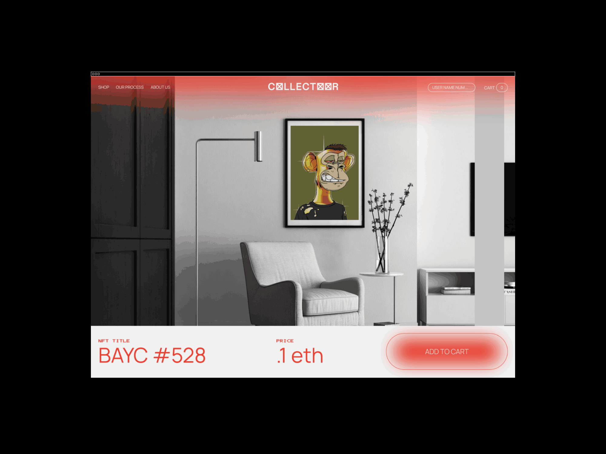

Collectoor is a premium service that takes your NFT collection and creates high-end giclee prints on archival card stock. These prints are then framed with minimal real wood frames and UV-blocking glass and come ready to hang right out of the box.
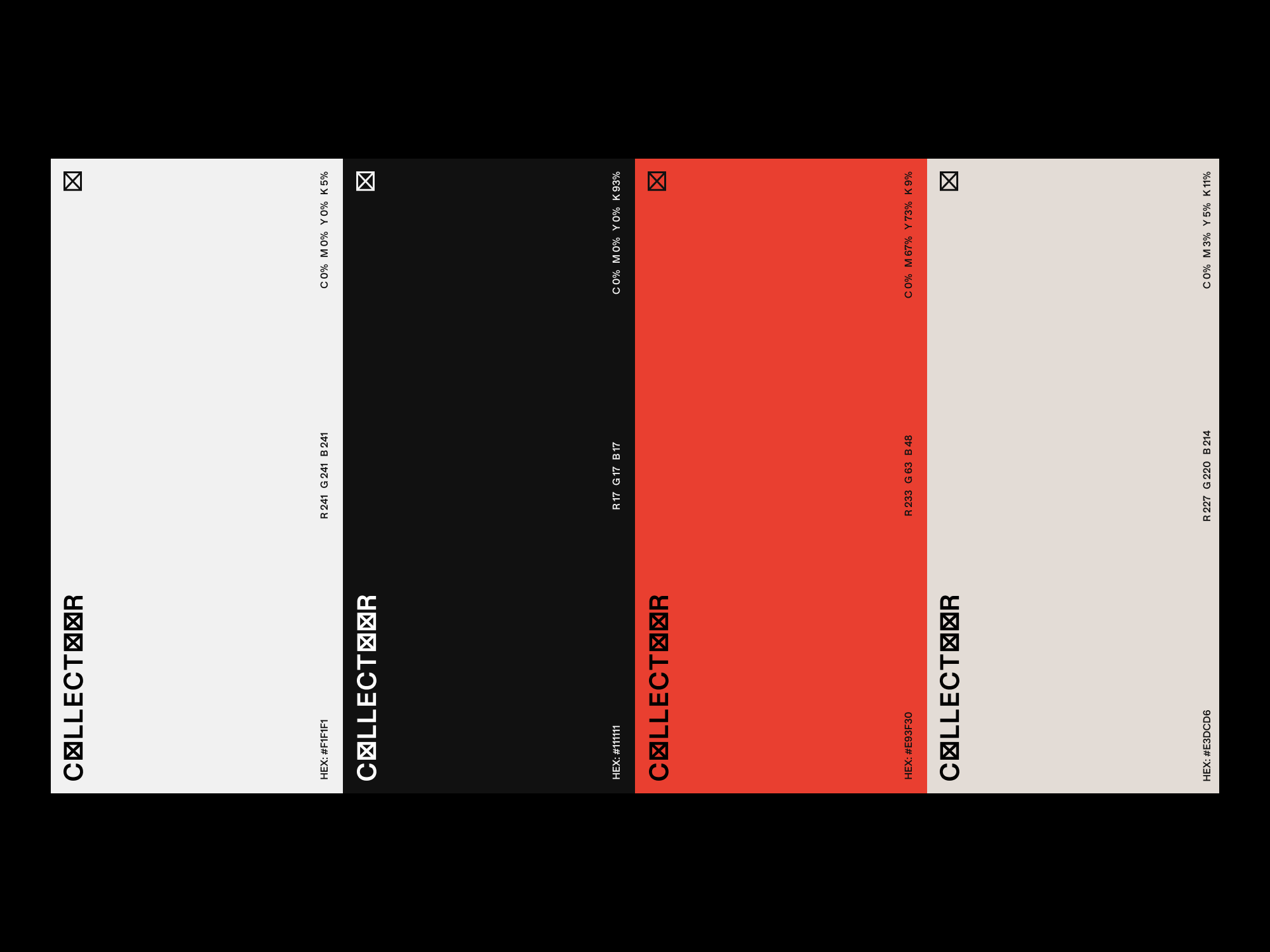
My role as a designer also involved creating a visual identity for Collectoor that would resonate with the target (crypto) audience. After conducting extensive market research and analyzing the competition, I developed a brand identity that was both unique for the market and visually appealing to grow with. This included creating a logo, selecting a color palette, and choosing typography that would convey the sophistication and elegance of the Collectoor brand.
Furthermore, I worked closely with the team at Collectoor to ensure that the website was user-friendly and easy to navigate. This involved creating wireframes and prototypes to test the user experience, and iterating on the design until it met the needs of both the client and the end user. It was important to strike a balance between showcasing the beauty and quality of the prints, while also providing a seamless online shopping experience.
Shannon Vaughn
2022
W
Funeral
Photography
Cece Davis
Cece Davis
After successfully completing work on the Pursoma website, our team was approached to create a small marketing site for the founder and owner, Shannon Vaughn. The objective of this new site was to highlight her accomplishments, showcase her press write-ups, and promote her speaking engagements. Our team designed a simple yet elegant grid layout to accommodate multiple page types, including a page for her bio, a page for her press mentions, and a page for her upcoming speaking engagements. We worked closely with Shannon to create a user-friendly interface that would allow visitors to easily navigate through the site, view her press write-ups, and register for her speaking engagements. Additionally, we added various interactive features to make the site more engaging and memorable, such as a photo gallery and a blog section. In the end, the site proved to be a great success, attracting more visitors to Shannon's site, and increasing her speaking engagements.
Pursoma
2021
W
Funeral


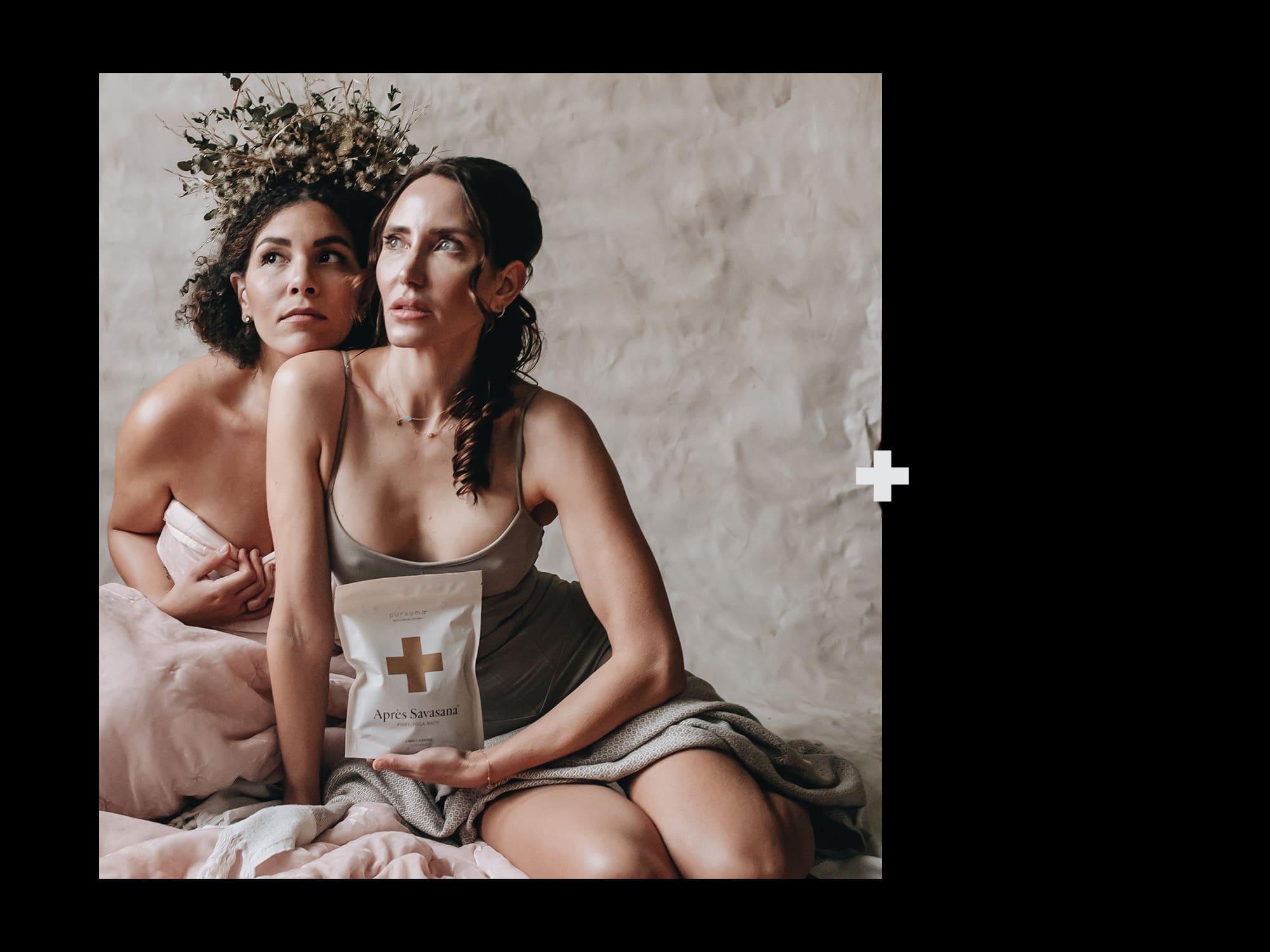


Pursoma is a brand that focuses on self-wellness, aiming to help people achieve better physical and mental health. To do this, they use only all-natural and sustainably sourced ingredients to create their highly effective self-care products. Funeral, a renowned design firm, was tasked with optimizing and expanding Pursoma's visual identity, and developing a high-functioning e-commerce site. The project was designed to reflect the brand's educational aspect, while also ensuring that repeat customers could quickly and easily find their orders.
To accomplish these goals, Funeral worked with Pursoma to develop a comprehensive strategy that involved not only the design of the website but also the development of content that would educate and inform visitors about the benefits of Pursoma's products. This content was carefully crafted to be engaging and informative, while also highlighting the unique features of each product.
In addition to the website, Funeral also developed a range of marketing materials to help promote Pursoma's brand and products. These included social media campaigns, email newsletters, and print advertisements. By leveraging these channels, Funeral was able to help Pursoma reach a wider audience and build a loyal customer base.
Overall, Funeral's work with Pursoma was a great success, helping the brand to establish a strong visual identity and build a reputation for high-quality, all-natural self-care products. With their new e-commerce site and marketing materials in place, Pursoma is well-positioned to continue growing and expanding its reach in the self-wellness market.
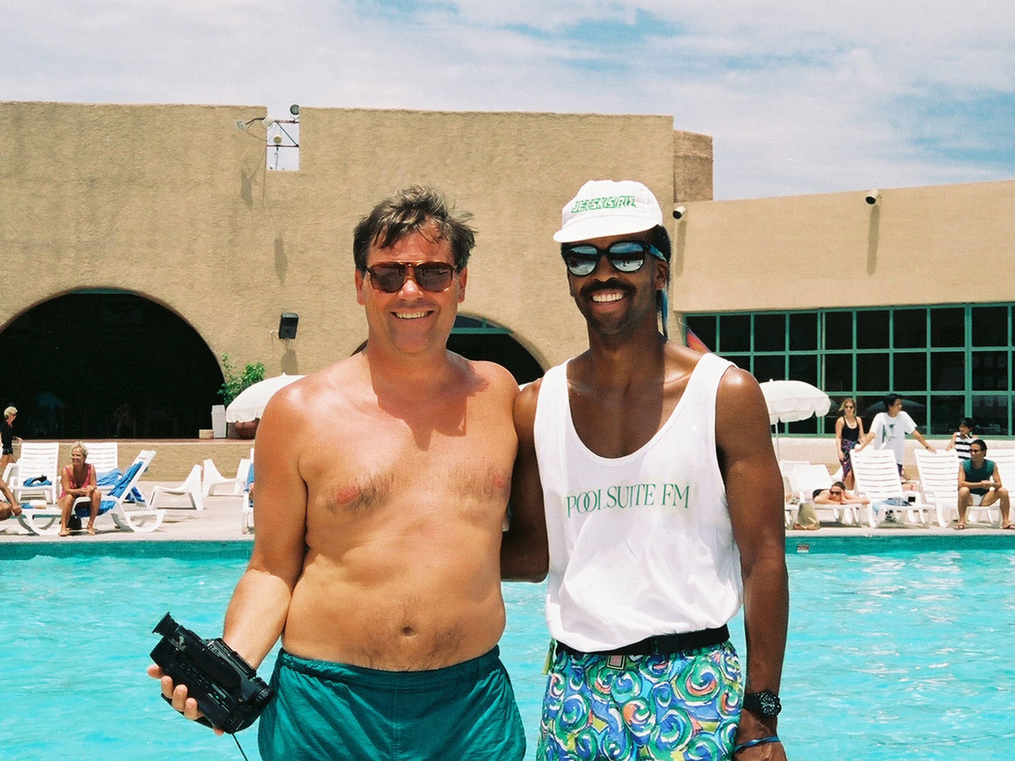


Poolsuite FM has recently launched their new product, Vacation, which aims to bring back the fun in using sunscreen. Vacation claims to be the "world's best-smelling sunscreen" due to its unique blend of coconut, shea butter, and jasmine. But it's not just any ordinary blend - it also includes playful notes of pool toys and swimsuit Lycra, which gives a fresh and exciting take on the classic "sunscreen smell".
To help with their pre-launch and teaser interim site, Jetskis was approached by Poolsuite FM. The goal was to capture the essence of an 80s beach resort trifold brochure. The result was an exciting and engaging website that gave potential customers a glimpse of what Vacation is all about.
After the successful launch of the teaser site, Jetskis took on the challenge of fully conceptualizing and building out a unique e-commerce experience for Poolsuite FM. With a focus on user experience, the new e-commerce site was designed to be easy to navigate and visually appealing. Customers can easily browse through the different products and make a purchase with just a few clicks.
In summary, Poolsuite FM's Vacation is not just any ordinary sunscreen - it's a fun and exciting product that brings back the joy of using sunscreen. With the help of Jetskis, Poolsuite FM was able to successfully launch its product and create a unique e-commerce experience for its customers.
Posters, flyers, and Miscellaneous
2021
P
Self Initiated


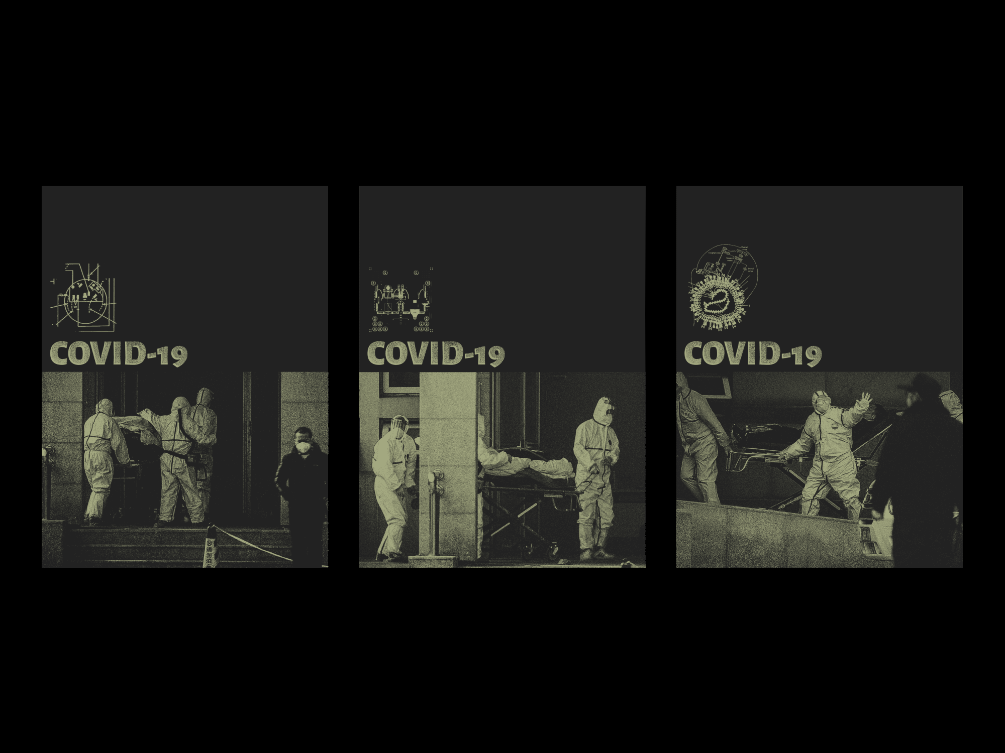
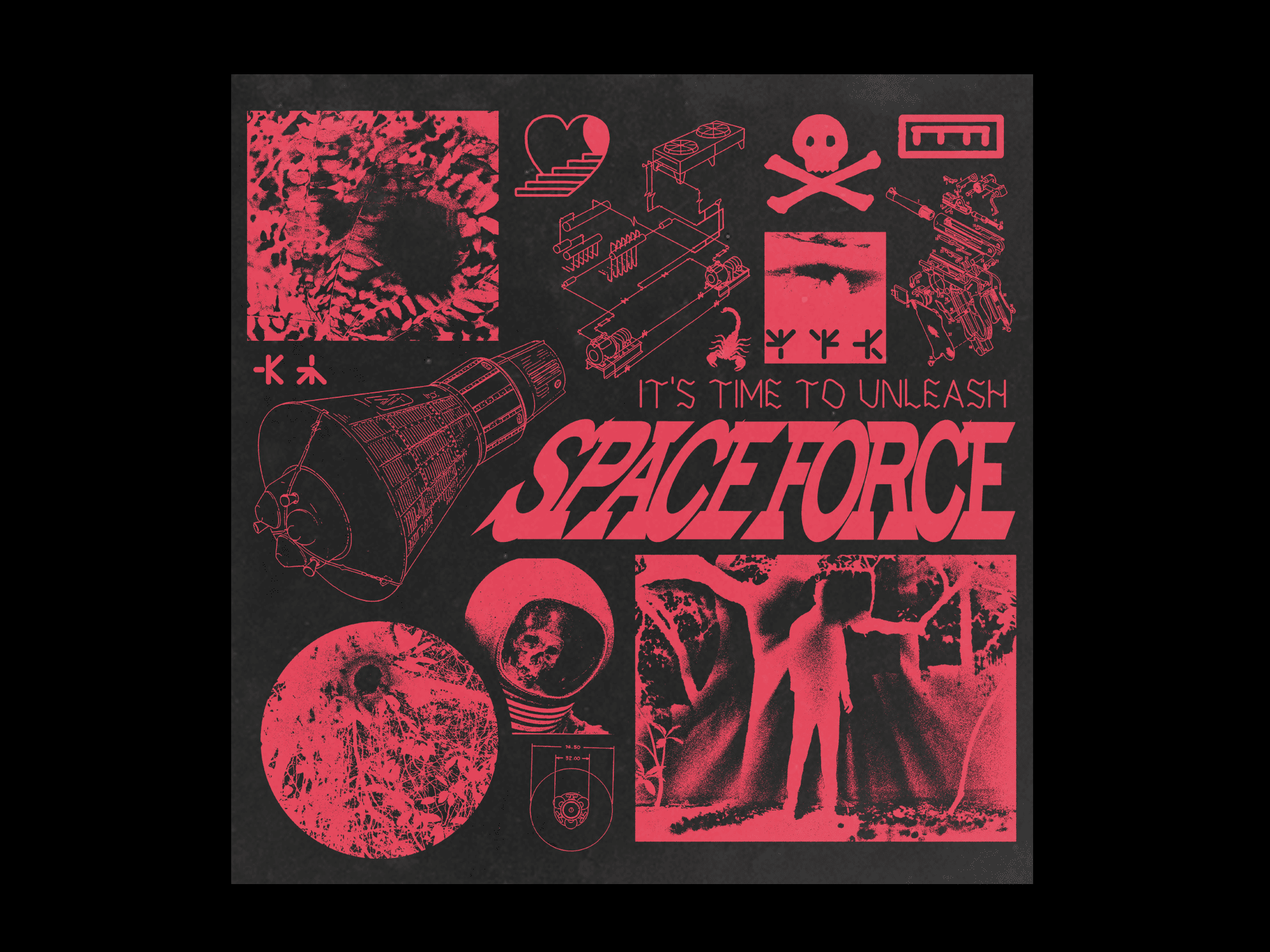
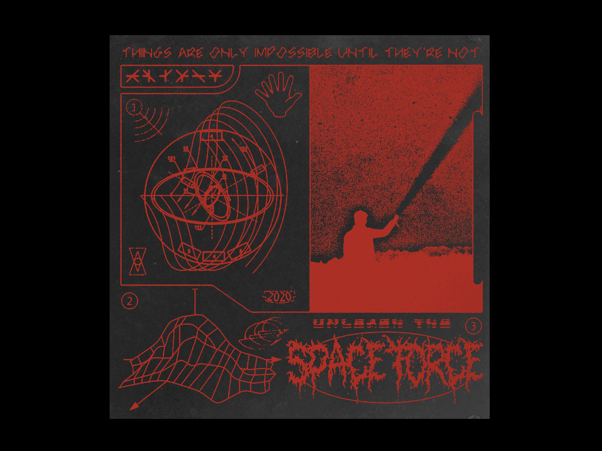
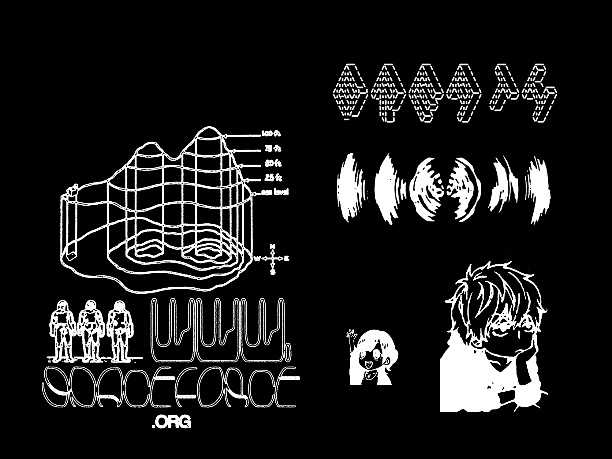
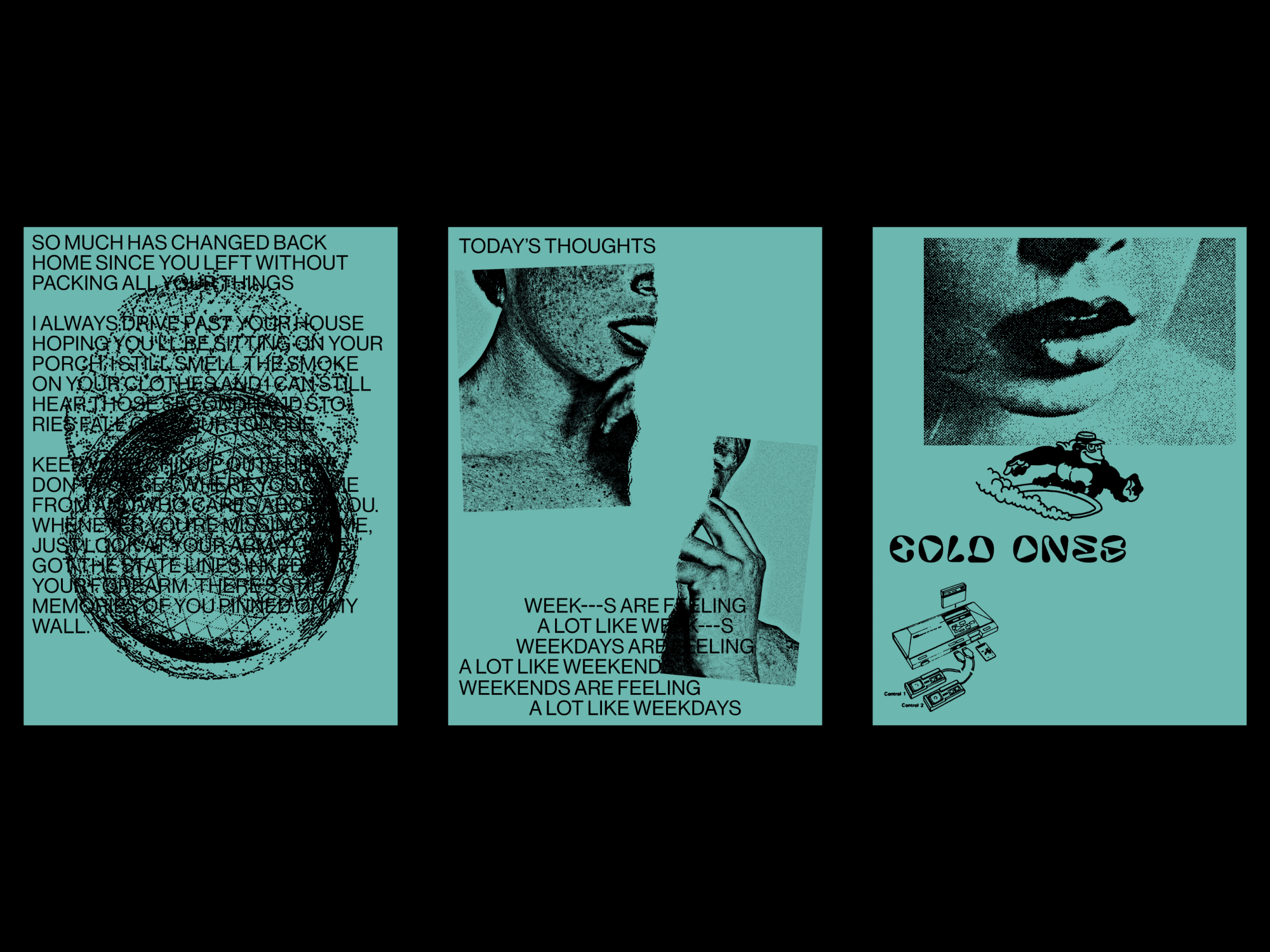
As designers, we're all constantly trying to improve our craft. We often spend hours scouring the web for useful tips and tricks to enhance our design skills. However, while it is important to seek inspiration and learn from others, it is equally important to set aside time for experimentation and creative exploration. By dedicating more time to the process of creating and designing, we can develop our own unique style and perspective, and push the boundaries of what is possible in our field. Additionally, this process can lead to unexpected breakthroughs and discoveries, as well as a deeper understanding of our own strengths and weaknesses as designers. So instead of solely relying on external sources for inspiration, let's make a conscious effort to prioritize the act of creating and designing ourselves.
Here is a collection of warm-up and warm-down exercises that have been created over the years to be used at the start or end of the day.
Here is a collection of warm-up and warm-down exercises that have been created over the years to be used at the start or end of the day.


Development:
Kevin Green
Kevin Green
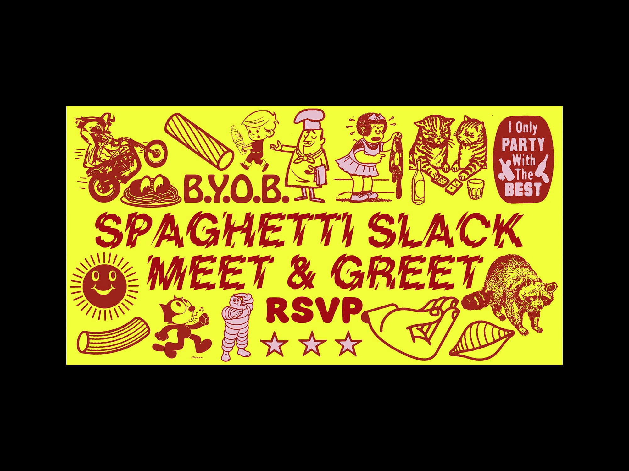
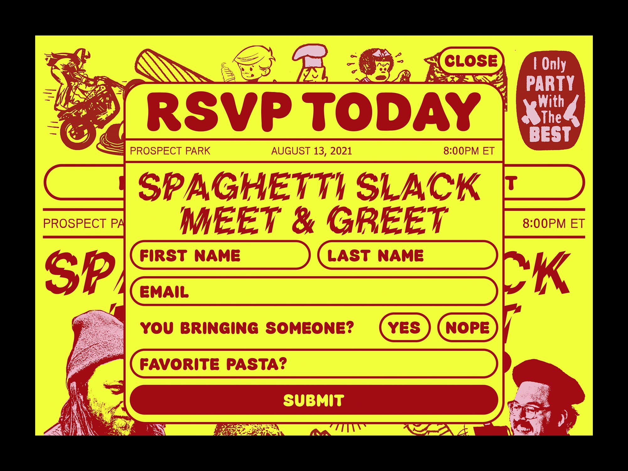
My friend, Kevin Green, and I decided to organize an outdoor meet-up event for our Slack group of over 500 members. We named it the world's first-ever mega-digi-in-real-life-spaghetti meet-up. I created the visual concept for the event, and Kevin developed a mini-site for RSVPs and a single purchasable item.
We faced challenges in sourcing shirts due to the Covid-related cotton shortage. To overcome this, I designed the product description page to describe colors abstractly instead of showing actual visuals. This allowed us to source shirts from various brands and select the final fabric color based on what was in stock.
We faced challenges in sourcing shirts due to the Covid-related cotton shortage. To overcome this, I designed the product description page to describe colors abstractly instead of showing actual visuals. This allowed us to source shirts from various brands and select the final fabric color based on what was in stock.


Collaborators:
Chad Miller, Kayla Donlin
Chad Miller, Kayla Donlin
Development:
Marcd
Project Management:
Aretha Choi
Interior Design:
Pete Trentacoste
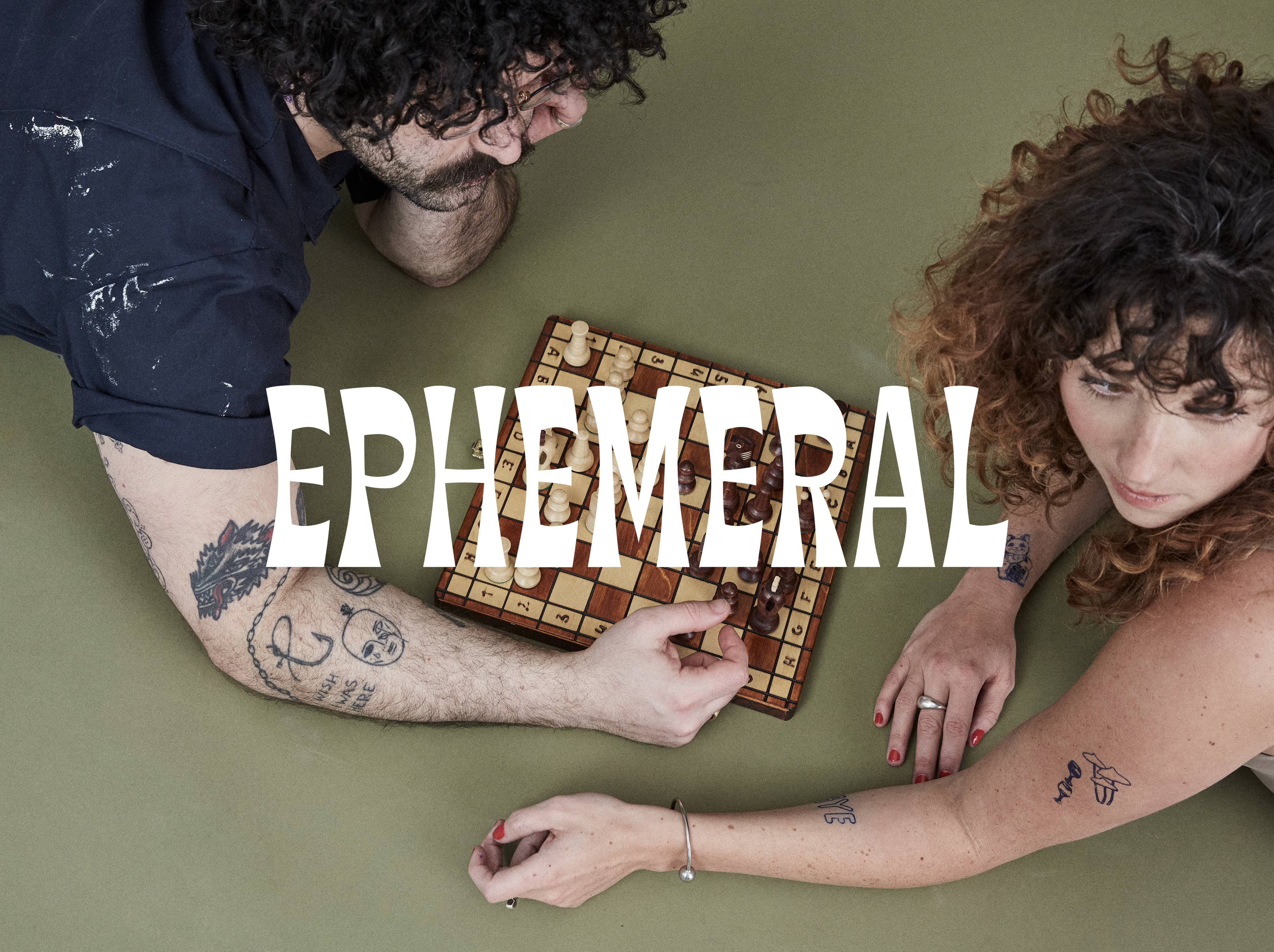
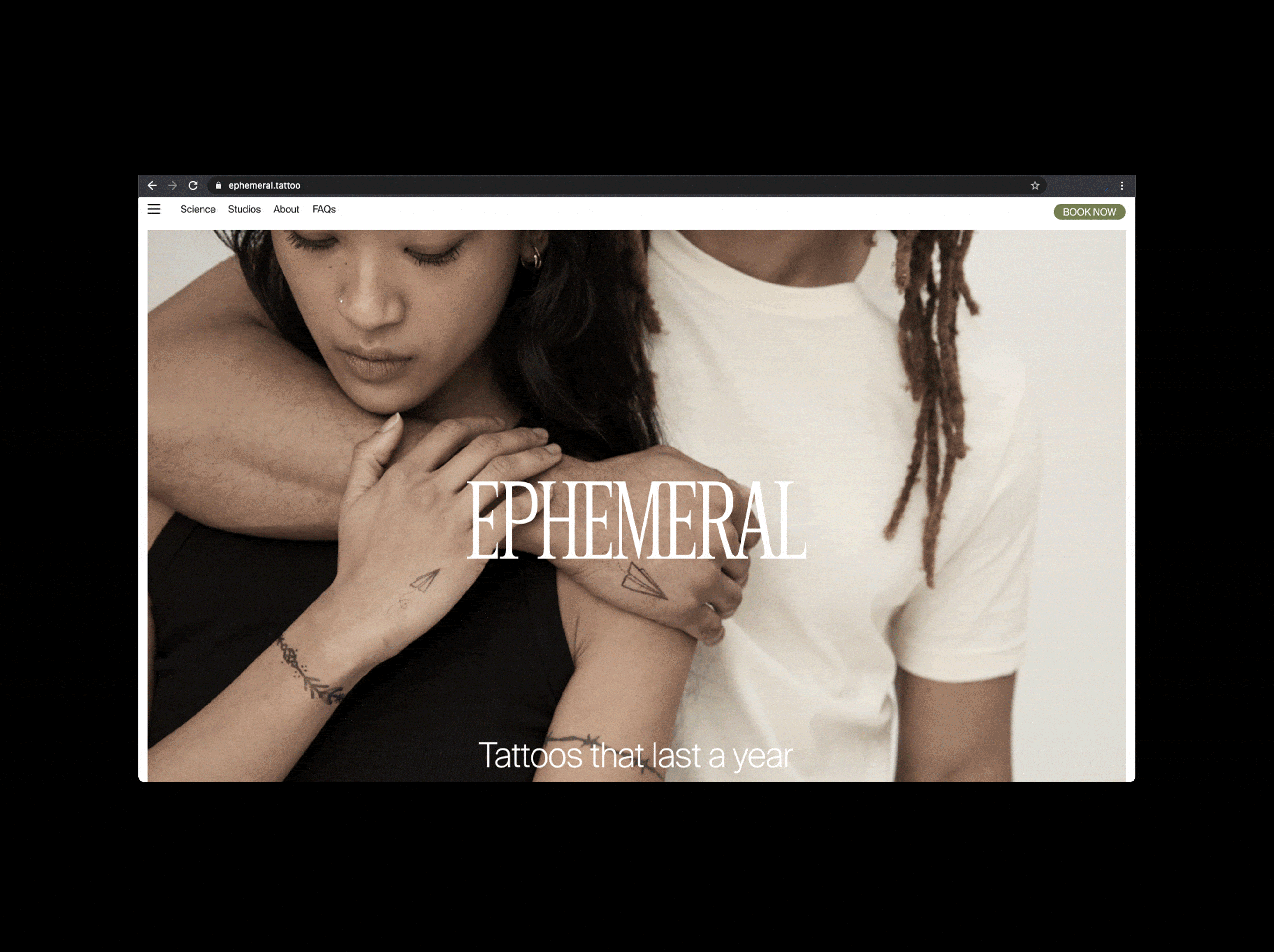
Ephemeral is a one-of-a-kind tattoo parlor that offers tattoos that are designed to fade over time. The ink used in the tattoos has been in development for the past six years, and the first location has finally opened in Williamsburg, Brooklyn. The company collaborated with Funeral team to create the visual identity of the brand. In order to achieve Ephemeral's goal of being "something between a traditional tattoo shop (eclectic and heritage) and a high-end salon structure (without being inaccessible), with a range of playful (hinting at the nature of the product) to clinical (capturing trust in the technology)," the logo was actually designed with four interchangeable logos. This allows for flexibility and a wide range of possibilities for the brand's future development.
Funeral was brought in to help build the brand voice and visual identity. In order to emphasize the idea of tattoos changing over time, we created four different wordmarks that can be added to in the future. We also chose soft color palettes that would bring a sense of comfort to the brand's users. By working with Funeral, Ephemeral has been able to create a unique and cohesive brand identity that truly captures the essence of its mission and goals.
Funeral was brought in to help build the brand voice and visual identity. In order to emphasize the idea of tattoos changing over time, we created four different wordmarks that can be added to in the future. We also chose soft color palettes that would bring a sense of comfort to the brand's users. By working with Funeral, Ephemeral has been able to create a unique and cohesive brand identity that truly captures the essence of its mission and goals.
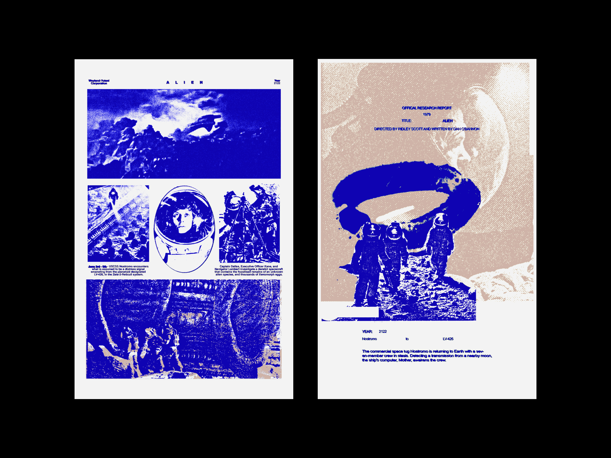
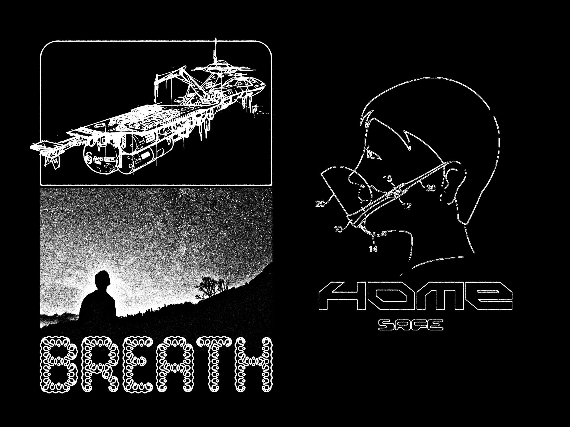
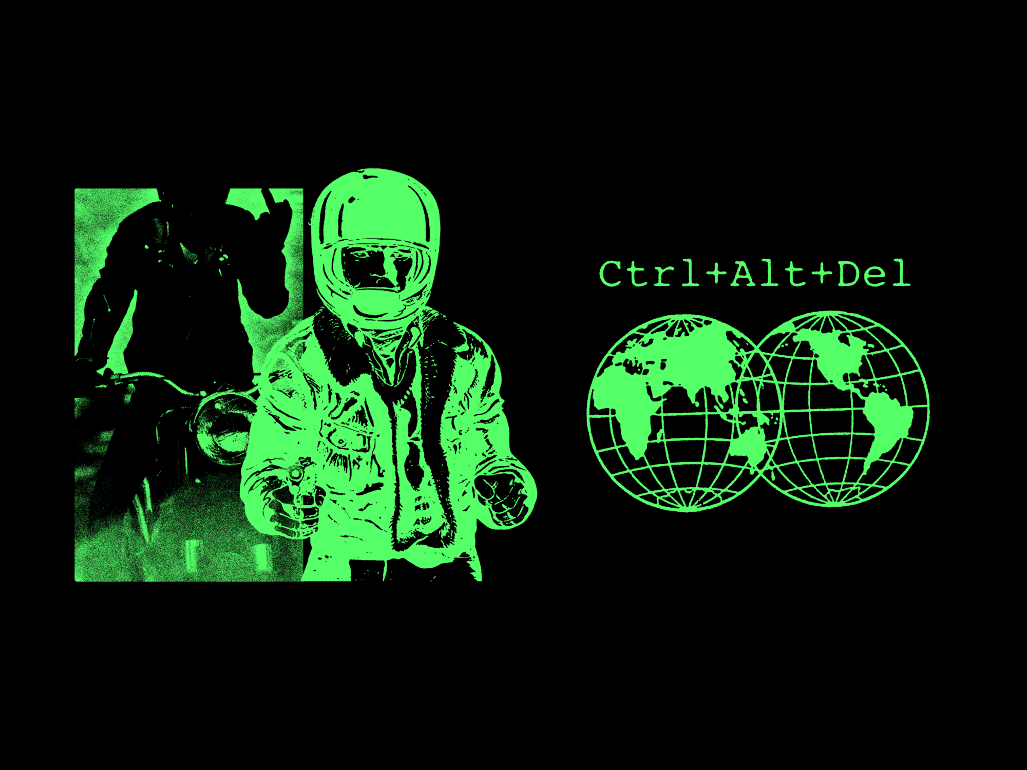
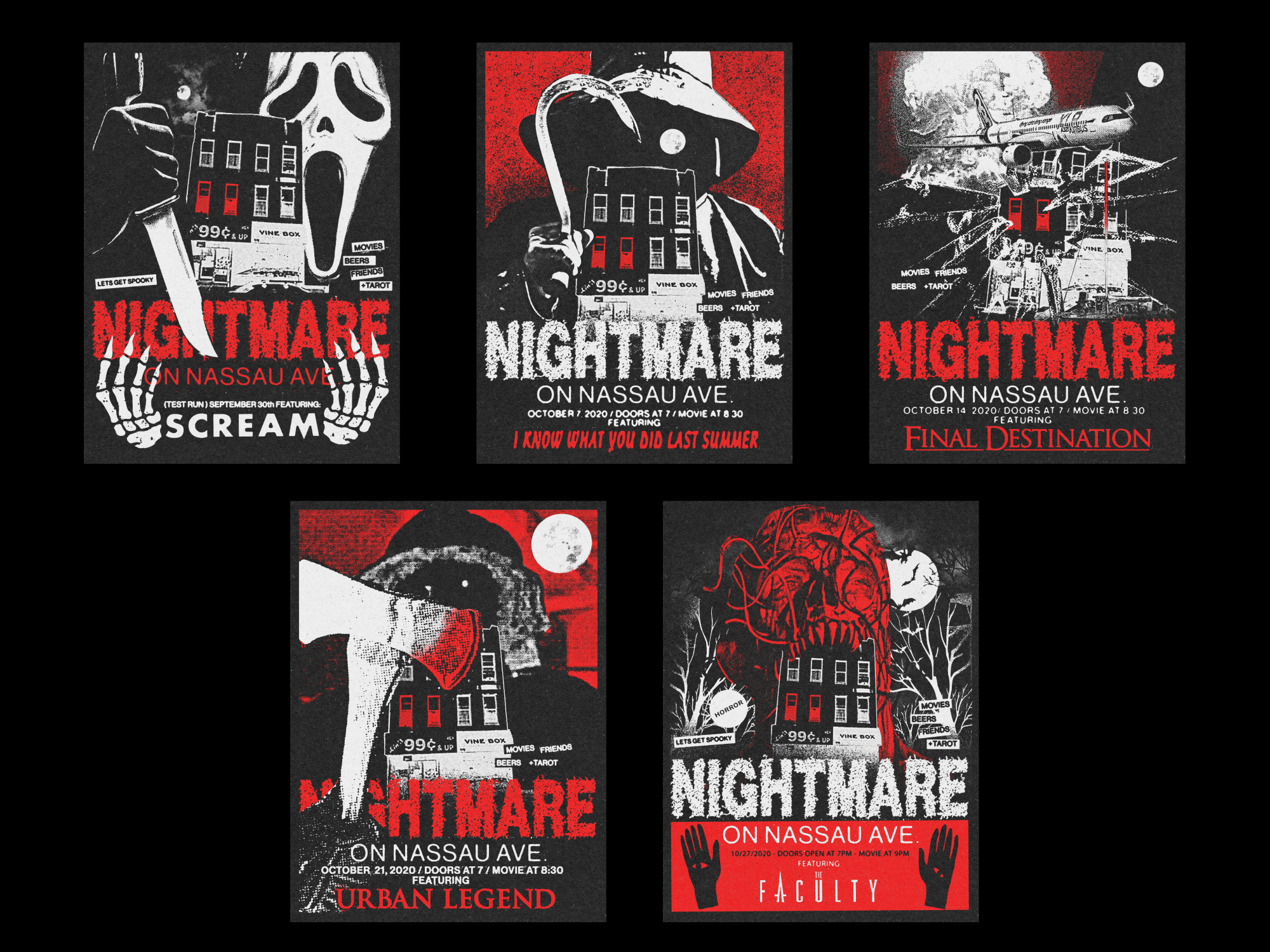
My Chemical Romance
2020
P
Commission
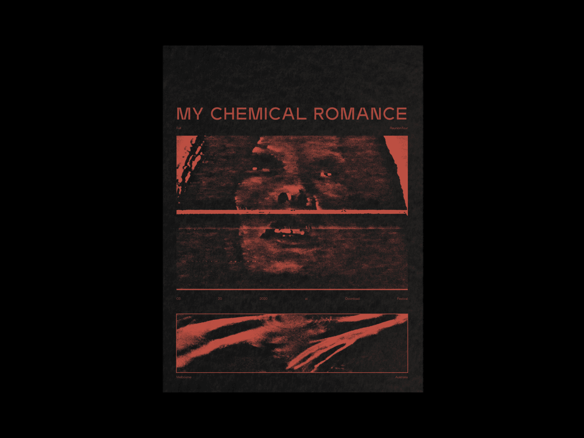
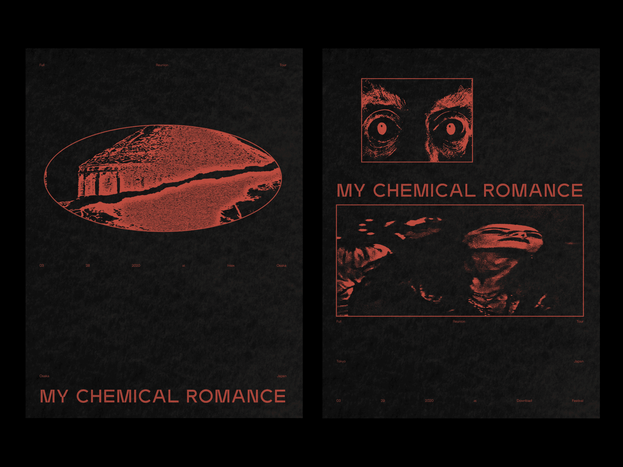
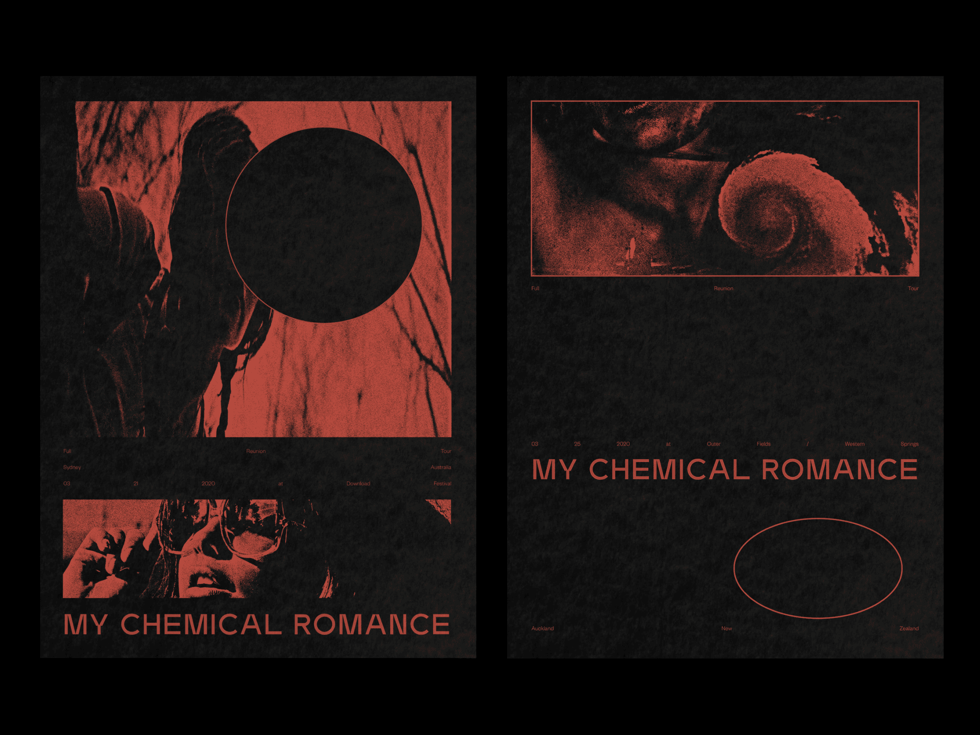
I was recently approached to help with the promotion of My Chemical Romance's upcoming reunion mini-tour. Specifically, I was asked to design a series of promotional posters for a few of the tour dates. To create a visually stunning and eye-catching design, I decided to use imagery of liminal spaces and static-filled glimpses of figures, which I then arranged together using a shared grid.
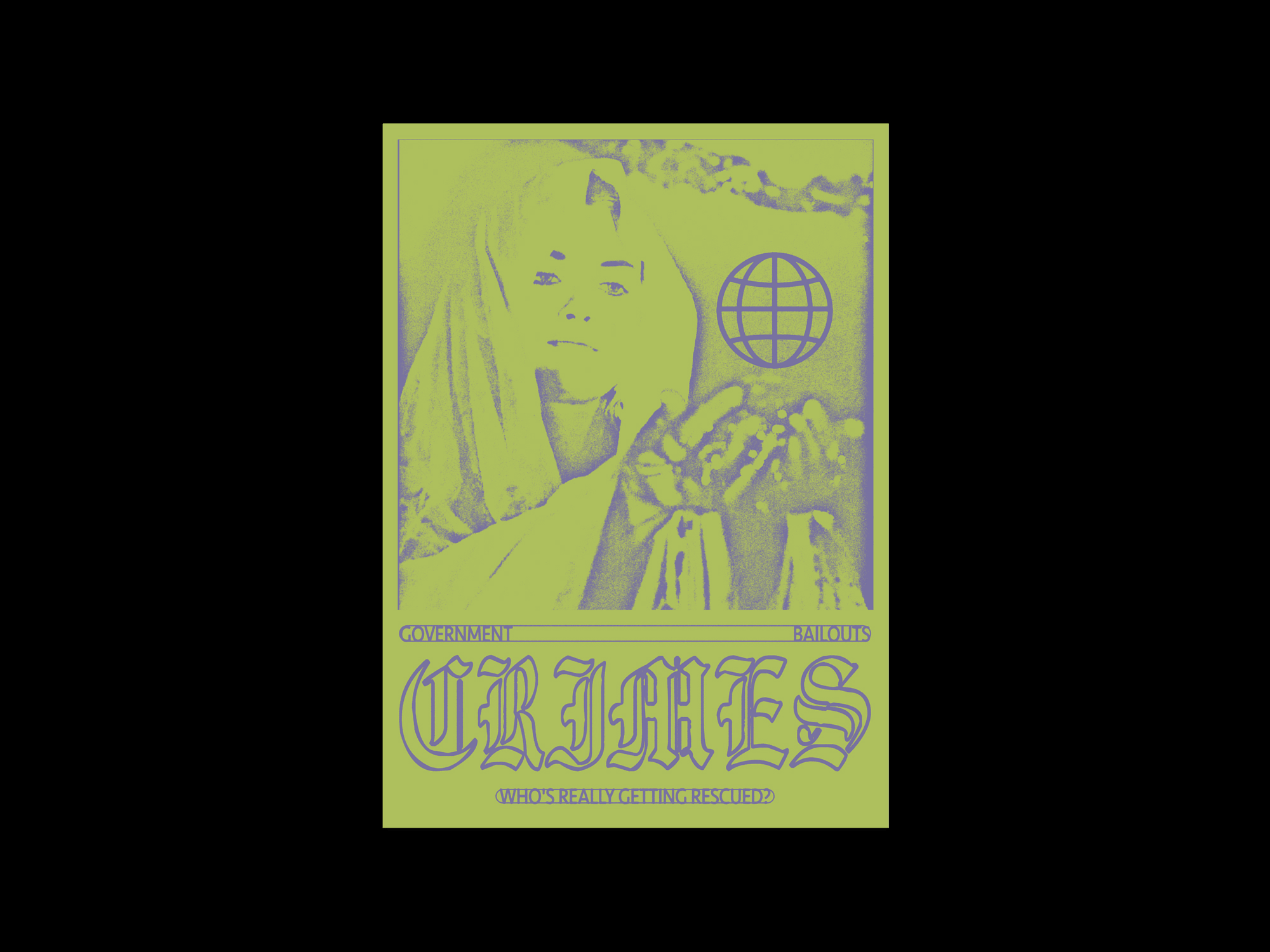
The idea behind using liminal spaces and static-filled glimpses of figures was to create a sense of mystery and intrigue that would draw potential concert-goers in. Liminal spaces, such as hallways and stairwells, are often associated with a sense of uncertainty and transition, which I thought was fitting given the anticipation and excitement surrounding My Chemical Romance's reunion tour. By juxtaposing these liminal spaces with static-filled glimpses of figures, I aimed to create a sense of movement and energy within the design.
To further enhance the visual impact of the posters, I chose to arrange the imagery using a shared grid. This allowed me to create a cohesive and visually balanced design that would be both aesthetically pleasing and easy to read.


2019
ILYSM
B P W
Funeral

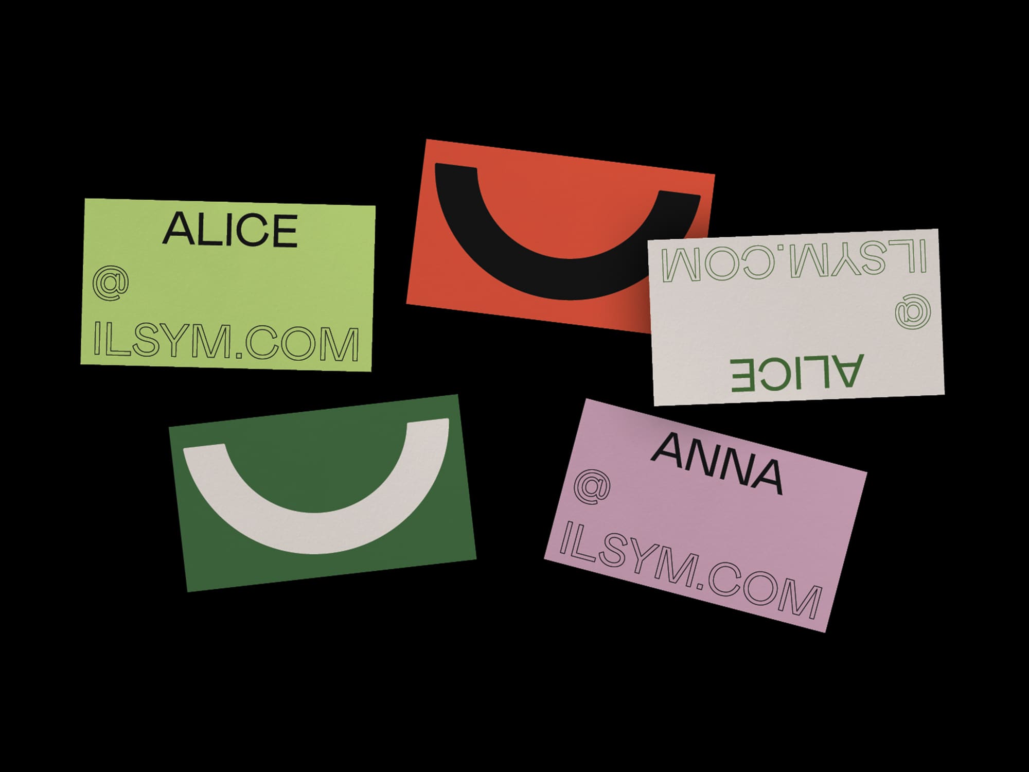


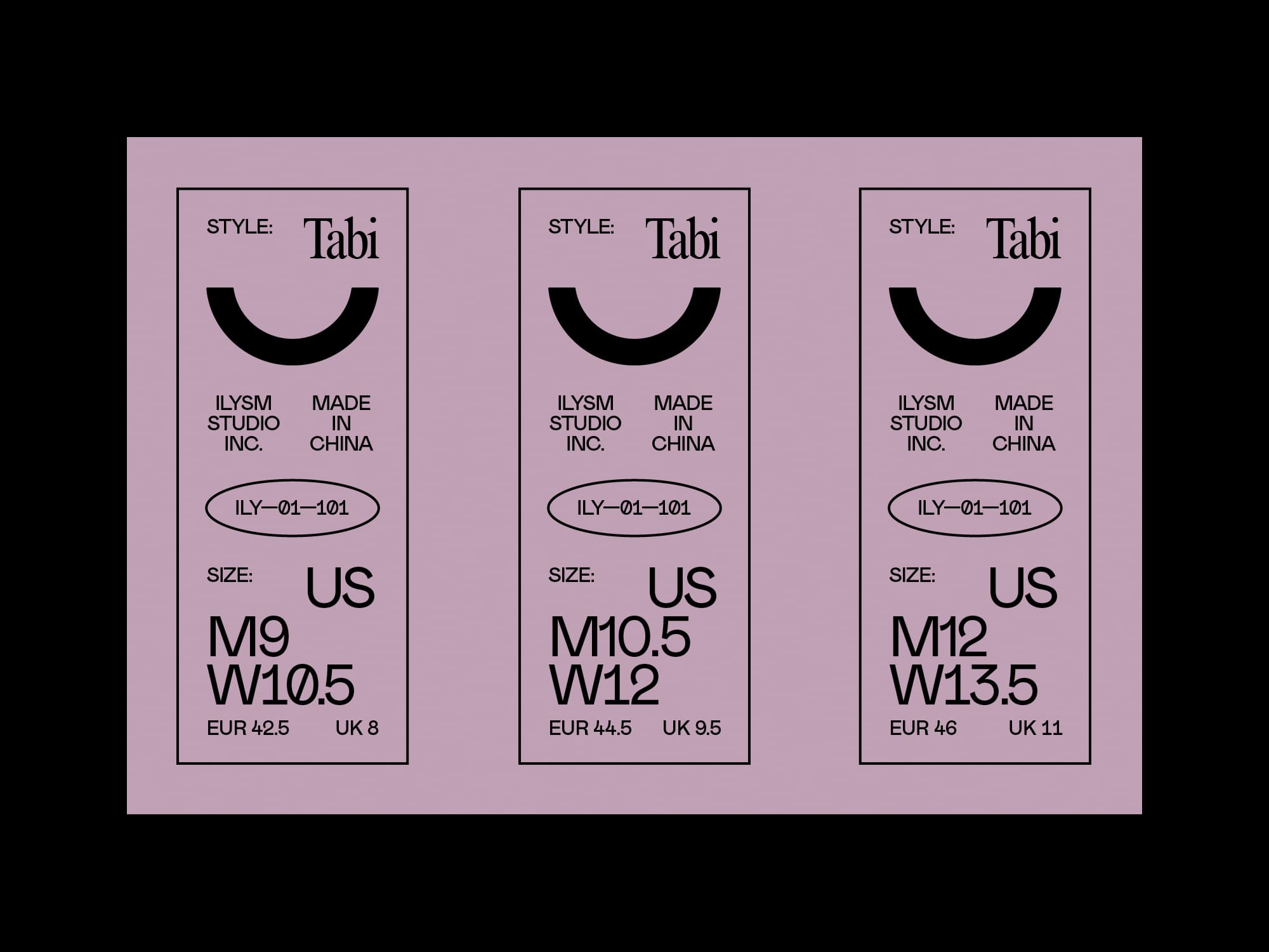
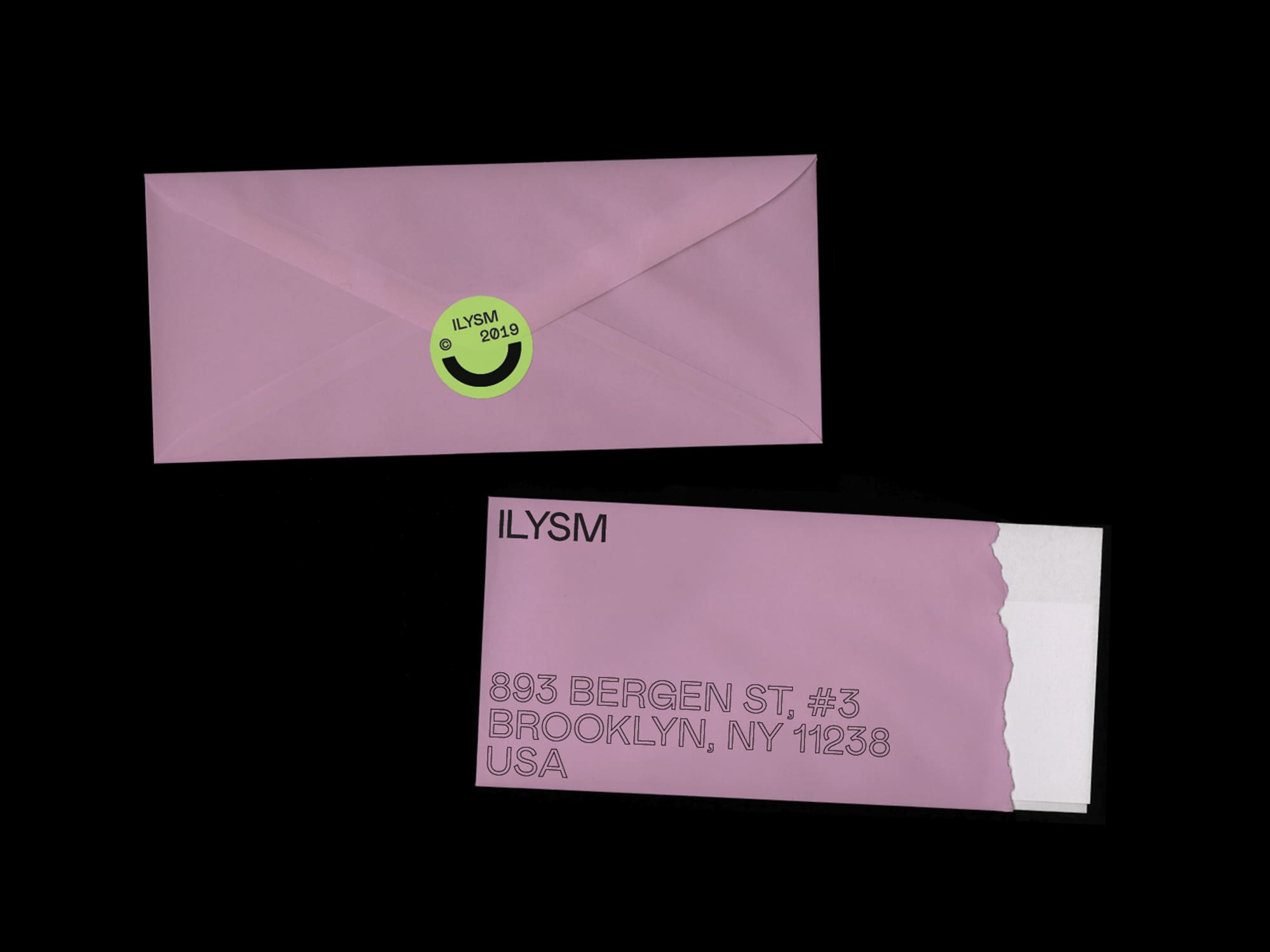


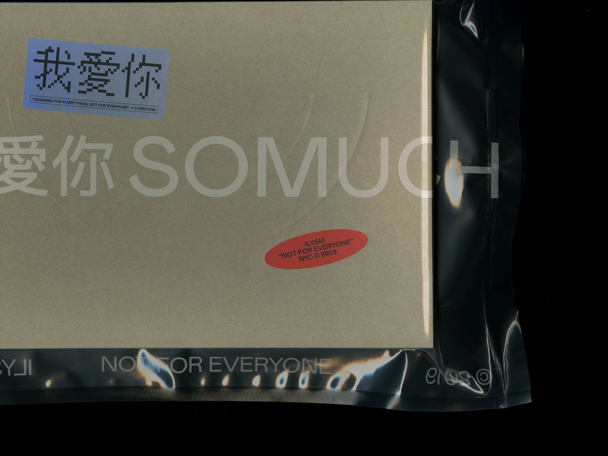
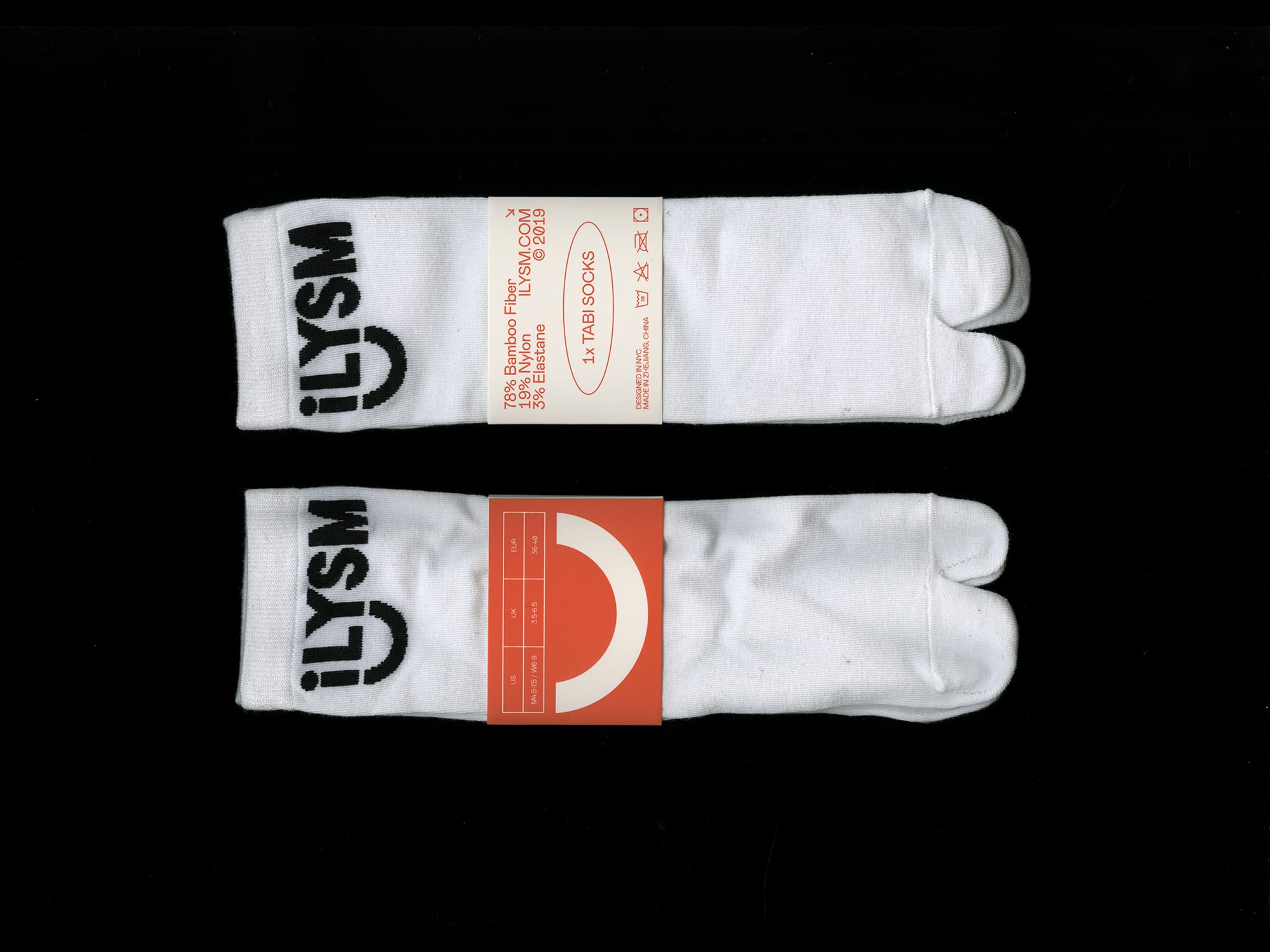
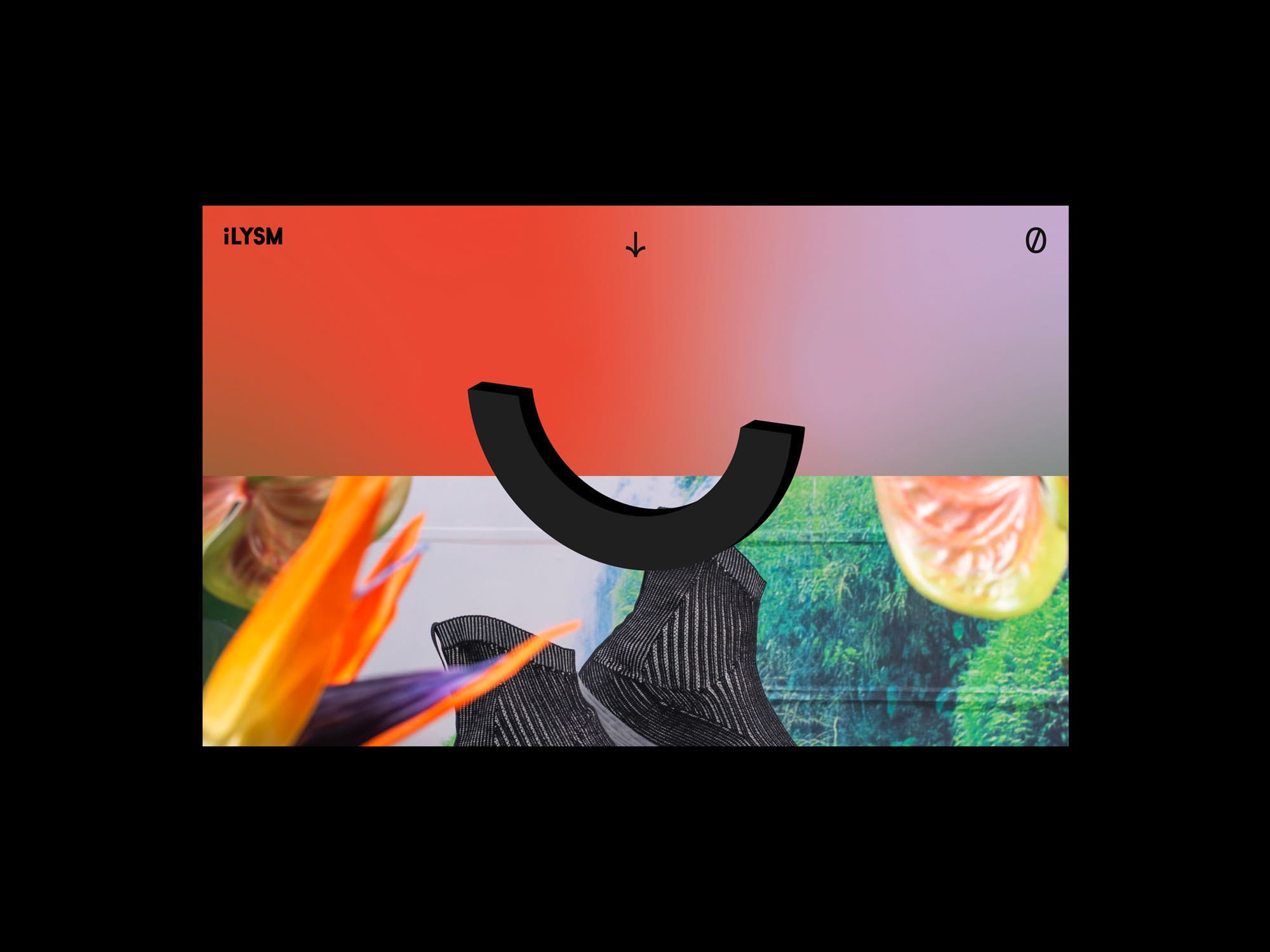
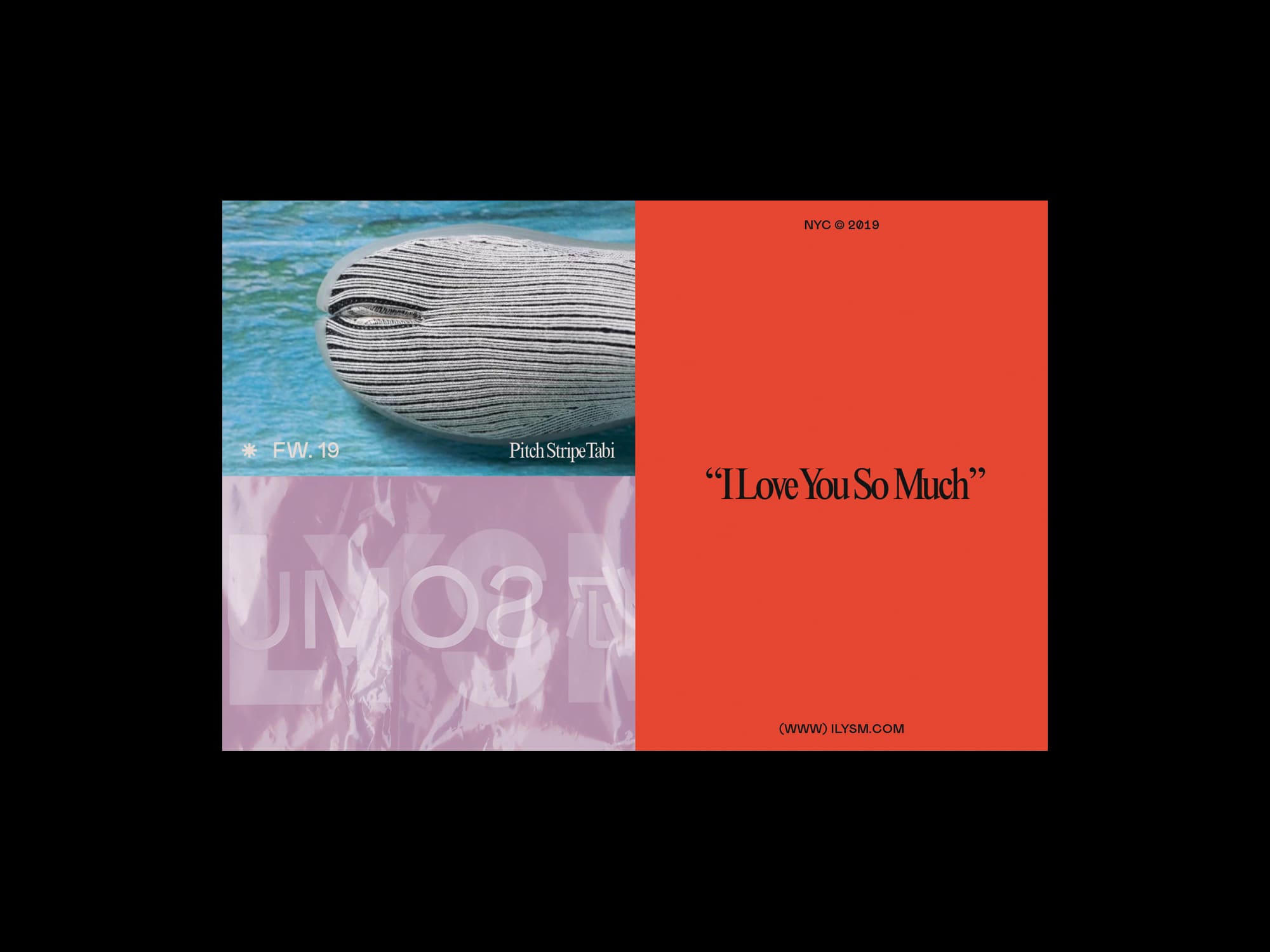


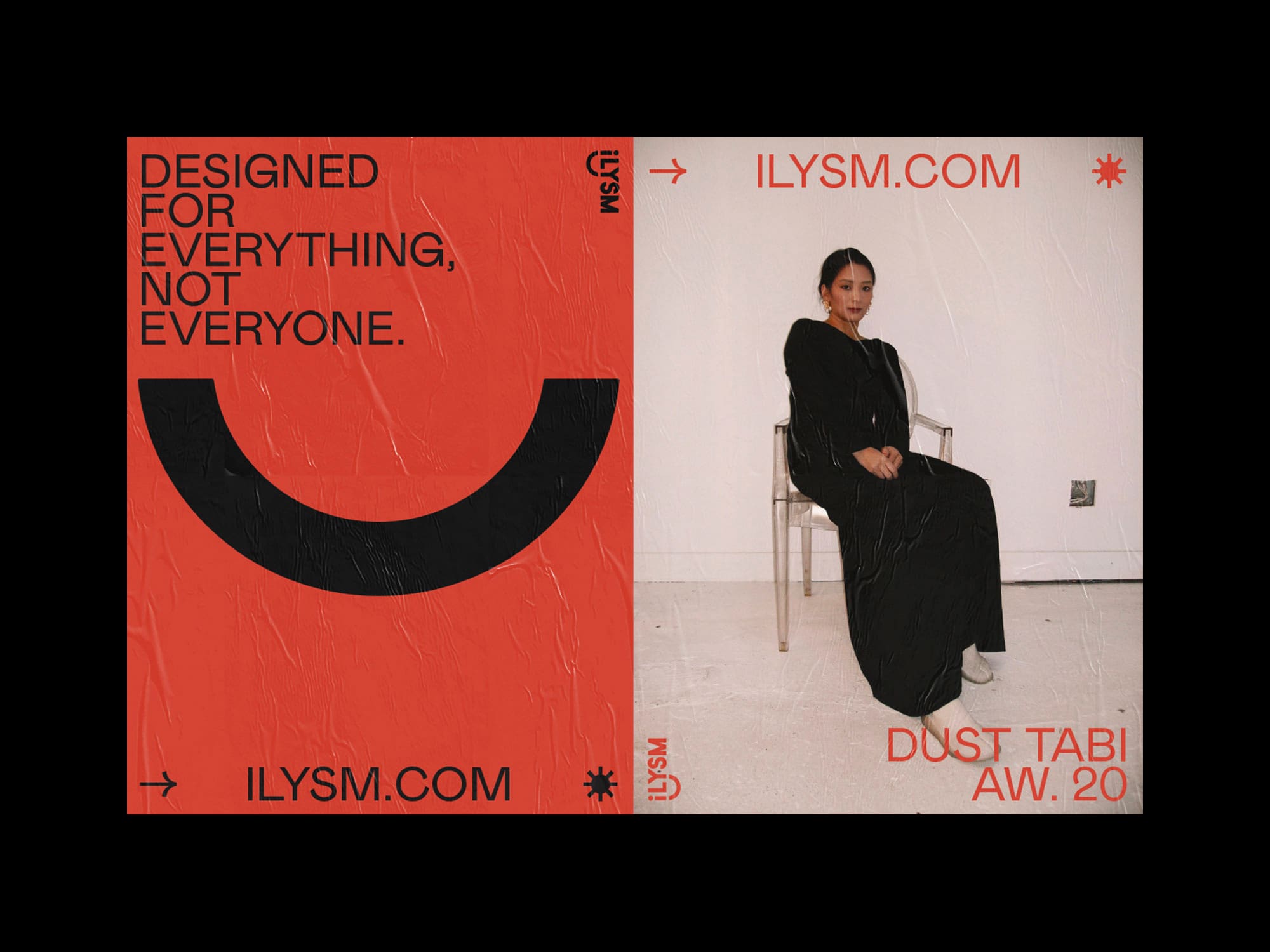

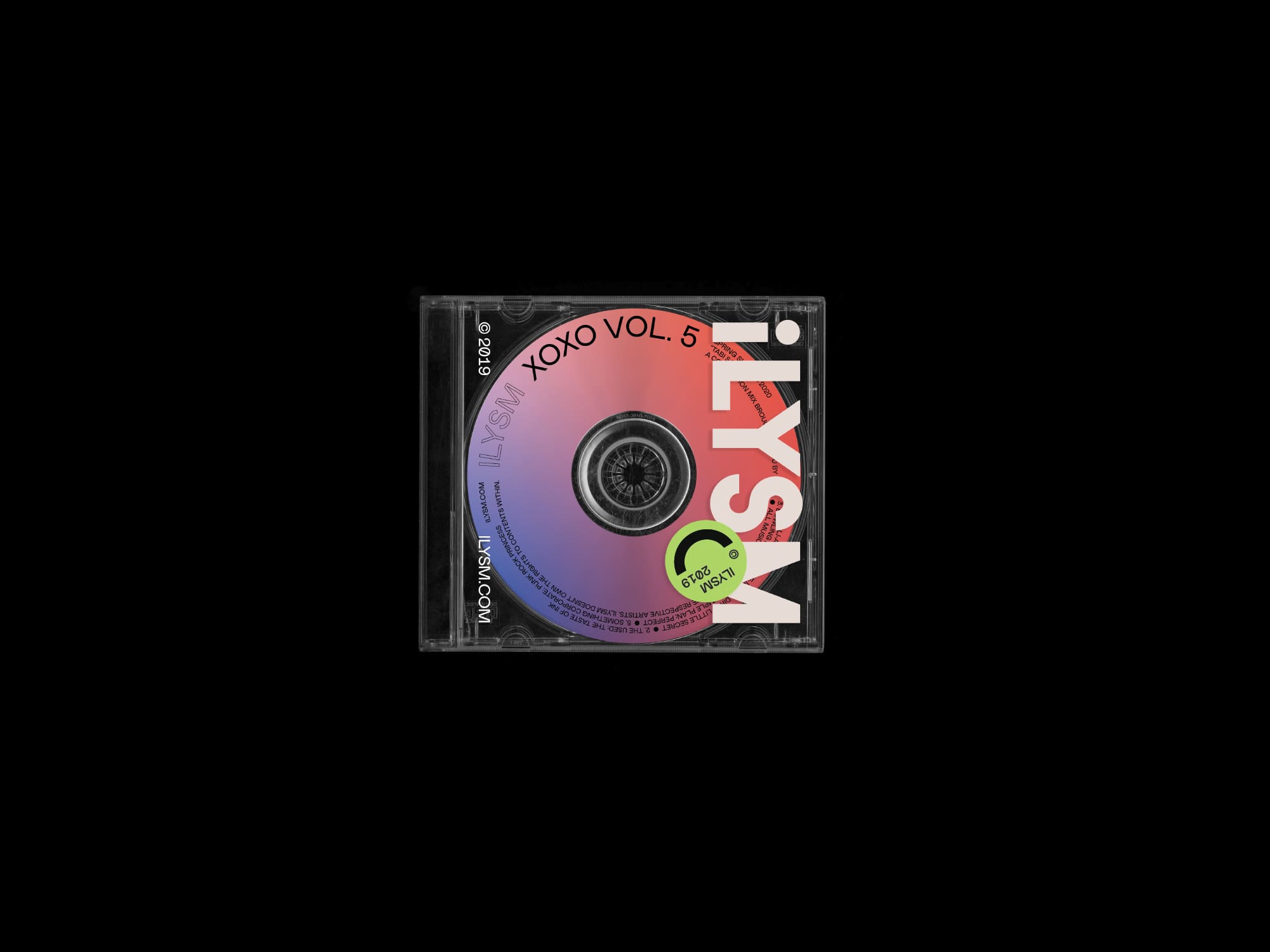
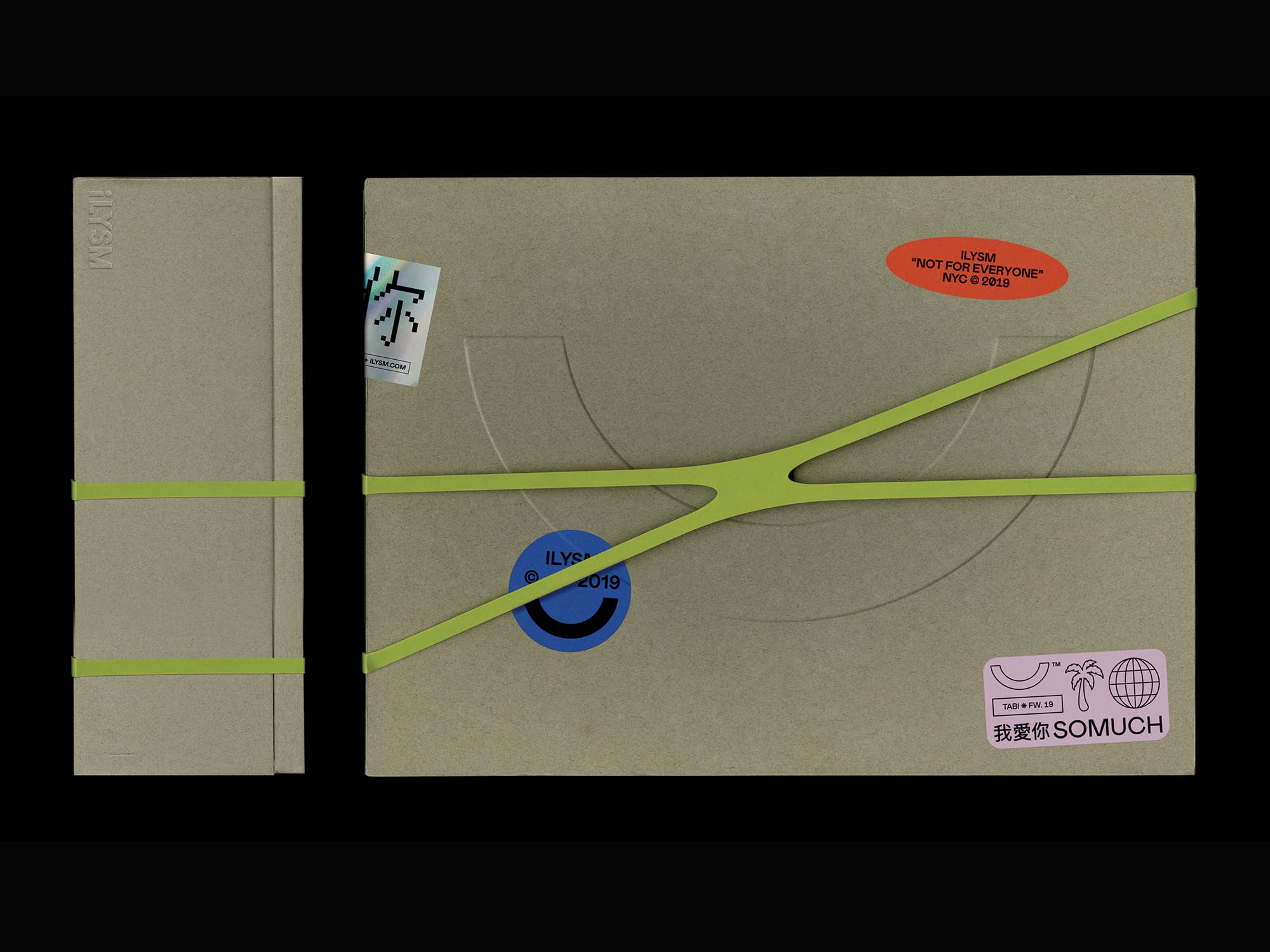

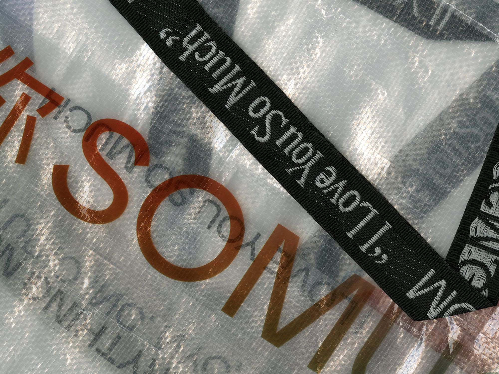

We were brought in by ILYSM (I Love You So Much), a lifestyle brand based in New York City, to develop and evolve its visual identity. The brand is focused on all things ugly, comfy, and cool. Our collaboration with ILYSM involved refining their logo system and creating a distinctive visual language that spans all aspects of the brand, both physical and digital.
We worked closely with the owner, Alice Wang to understand their values and messaging, incorporating these ideas into the visual identity to create a cohesive and engaging brand experience. In addition to the logo system, we also developed a comprehensive set of brand guidelines to ensure consistency across all of the marketing materials. These guidelines covered everything from color palettes to typography, ensuring that every element of the brand's visual language was perfectly aligned with its values and messaging.
We worked closely with the owner, Alice Wang to understand their values and messaging, incorporating these ideas into the visual identity to create a cohesive and engaging brand experience. In addition to the logo system, we also developed a comprehensive set of brand guidelines to ensure consistency across all of the marketing materials. These guidelines covered everything from color palettes to typography, ensuring that every element of the brand's visual language was perfectly aligned with its values and messaging.


Collaborators:
Chad Miller
Music:
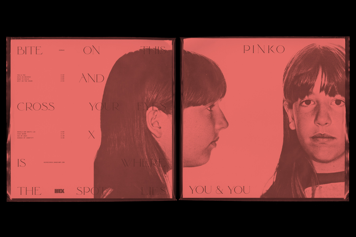
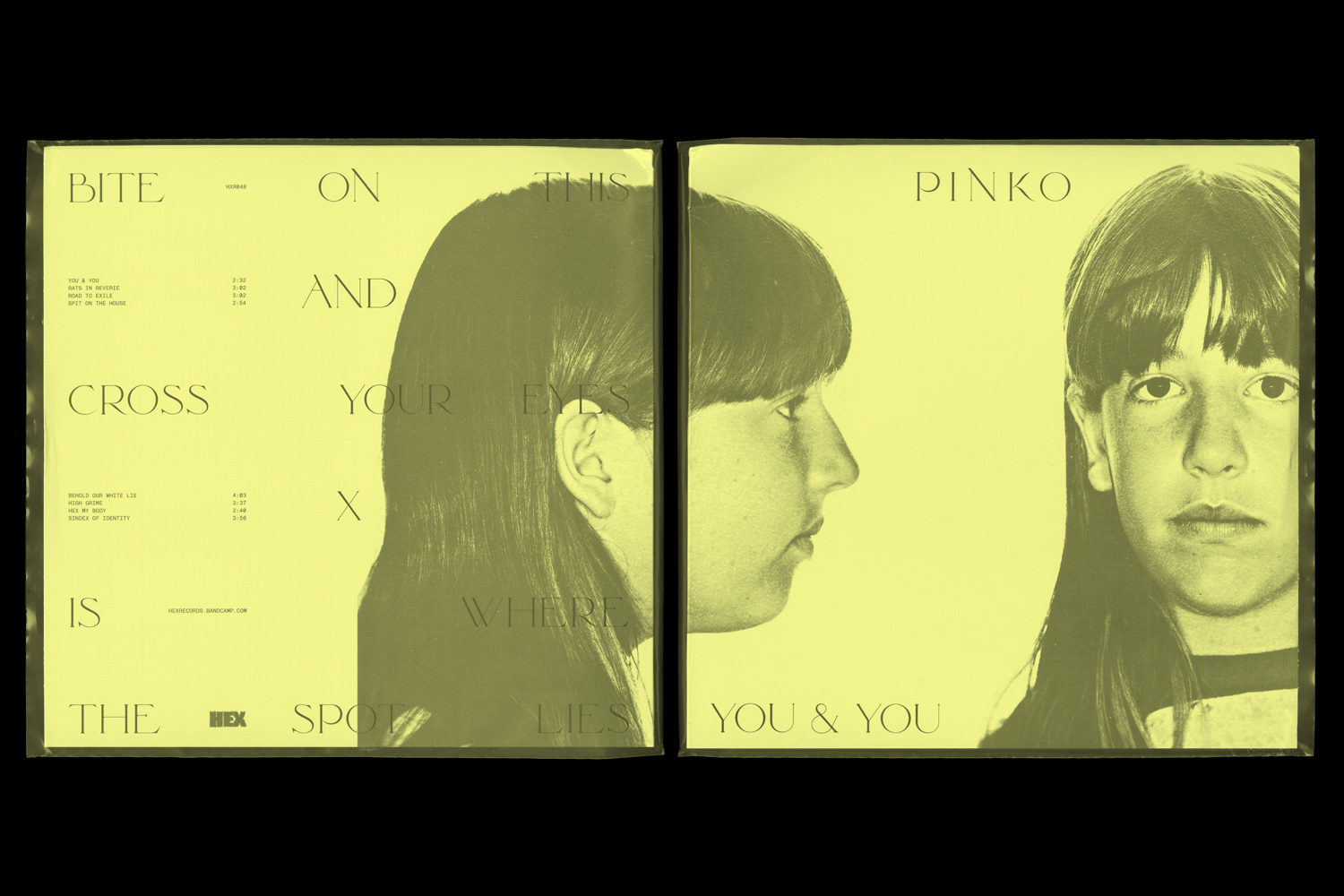
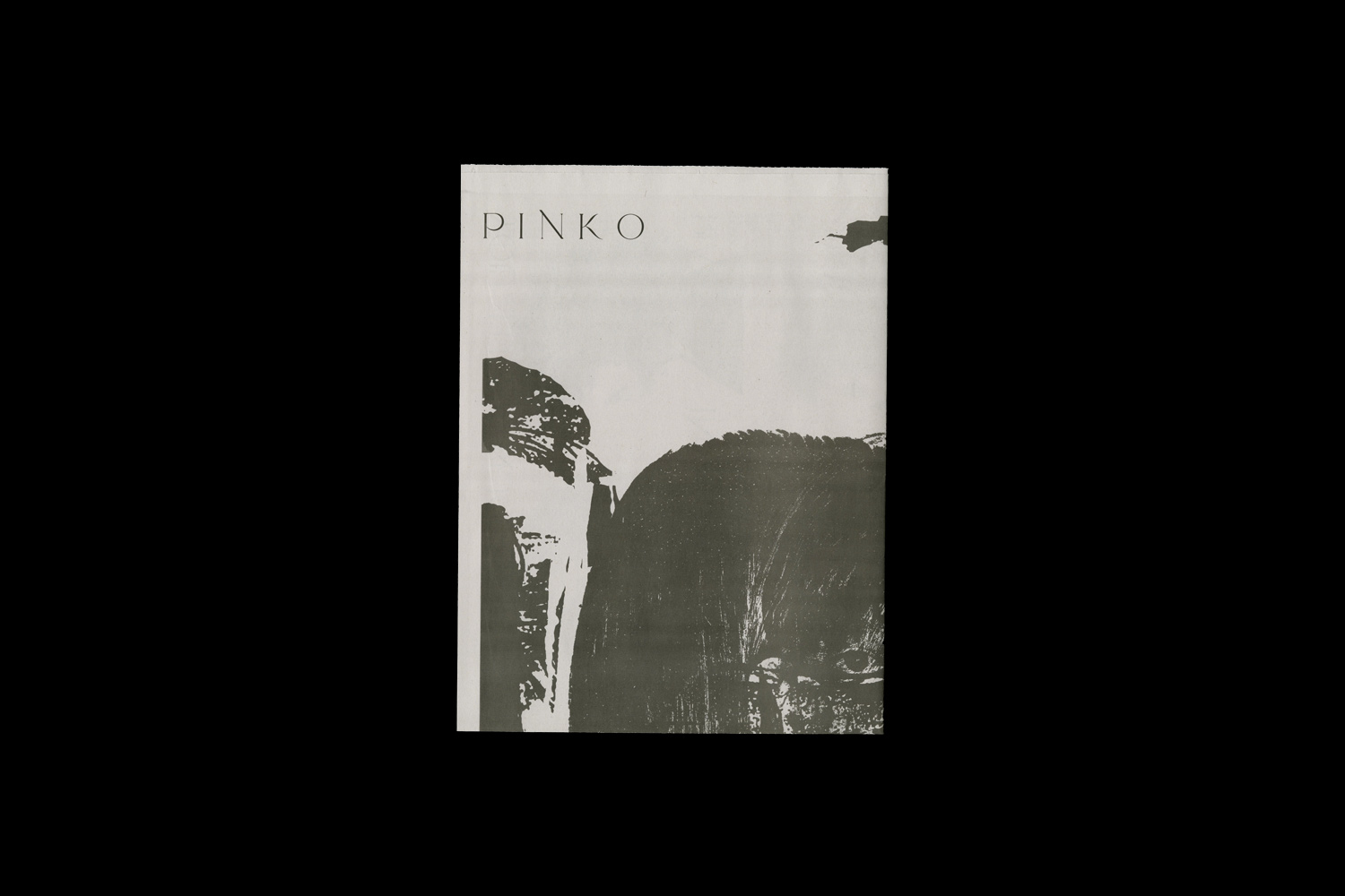
Pinko
Released:
Hex Record on December 13, 2019
Typography:
Traviata
Monument Grotesk
Chad Miller
Music:
Pinko
Released:
Hex Record on December 13, 2019
Typography:
Traviata
Monument Grotesk
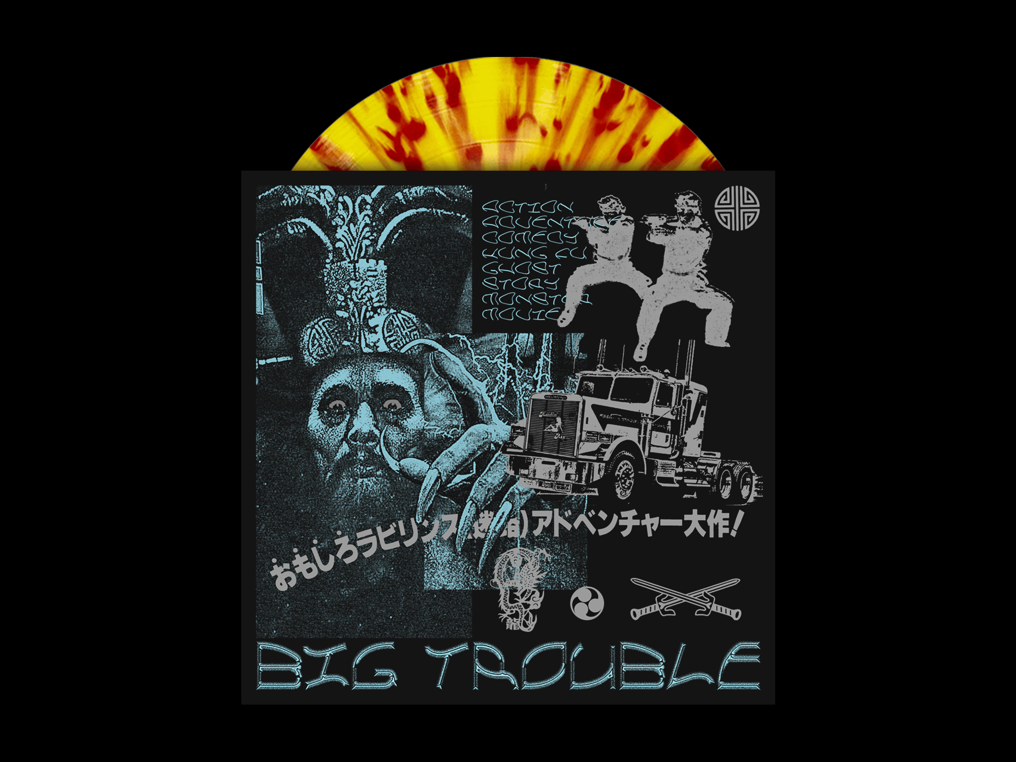
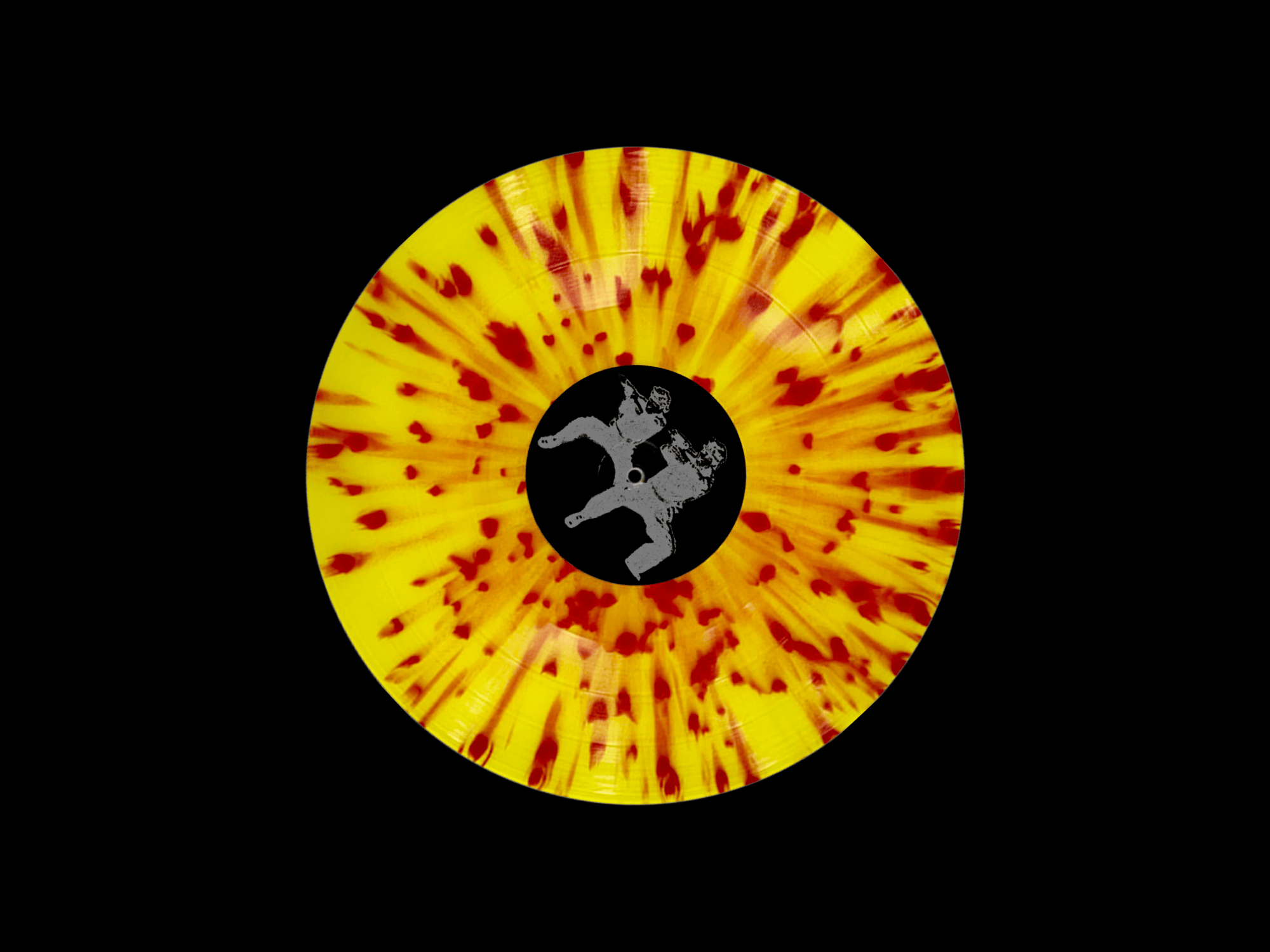
Record package design for Pinko's "You & You" limited vinyl release. PINKO is a chaotic, noisy three-piece band from San Antonio, TX. You & You is their first full-length album.


Image Design Works, a creative production studio based in Oakland, California, approached us, seeking our assistance in reimagining their brand identity. They were looking to revitalize their image and create a more modern look and feel that would better reflect their dynamic team and the top-quality services they offer.
To begin the project, we conducted an in-person workshop with each partner and employee, delving deep into their unique perspectives and ideas. Through our discussions, we identified key elements of their brand that we could build upon, while also identifying areas where we could innovate and expand their offerings.
After careful consideration and analysis, we decided to shorten the wordmark to I.D/W. This new identity was inspired by the team's collaborative approach to design and the innovative solutions they bring to each project. Our team worked tirelessly to ensure that every aspect of the new brand accurately reflected the company's values and goals.
To ensure that the rebranding was a complete success, we also created new collateral and a complete website. The new website now showcases the studio's impressive portfolio, and the updated collateral materials are designed to engage potential clients and partners in a more compelling way. The result is a fresh, modern, and dynamic brand that truly captures the essence of I/D.W and its talented team.


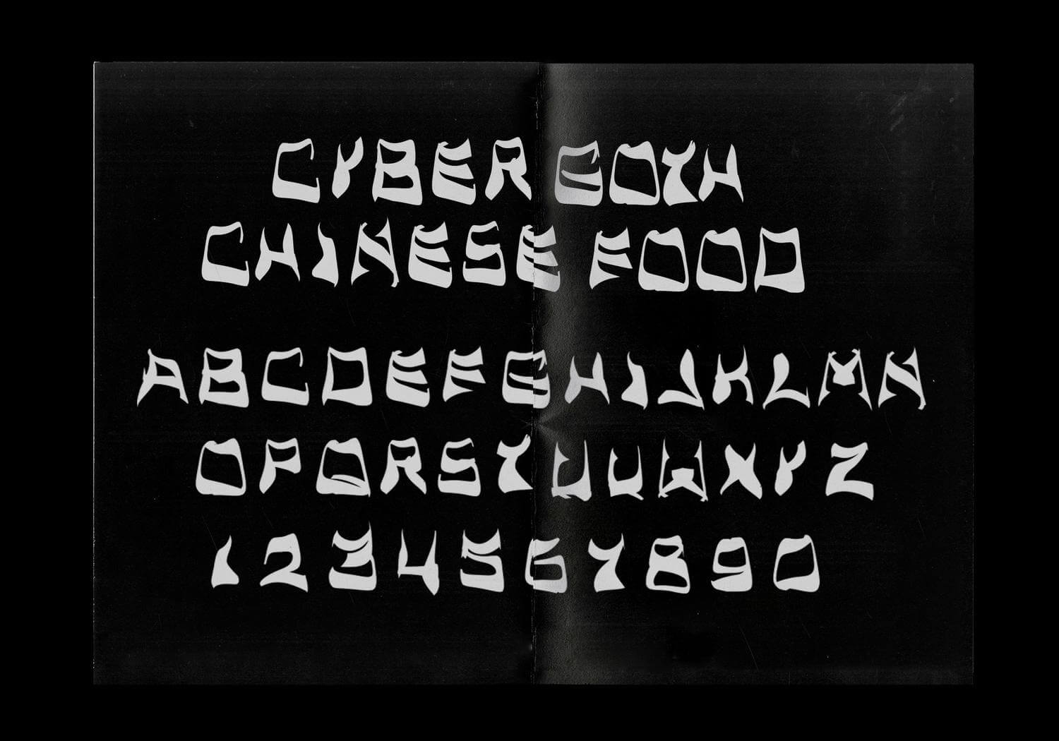
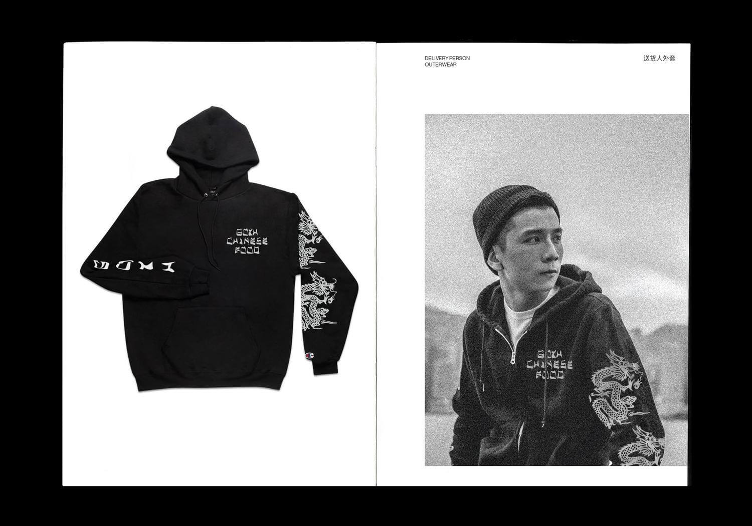

Cyber Goth Chinese Food is a unique display typeface that merges the northeastern graffiti hand styles and the "cut-onions" style typography commonly used for Chinese takeout. The result is a bold and eye-catching typeface that blends two seemingly contrasting subcultures to create a distinctive and memorable design.
This typeface was inspired by the hand styles featured across New York City, which often represent ownership and individuality. By fusing this with the misrepresented and often offensive ethnic typefaces intended to express an Asian or Chinese aesthetic, Cyber Goth Chinese Food produces a unique juxtaposition.
The result is a typeface that is both Intense and romantic, combining elements of street art with a touch of low-brow elegance. The unique blend of northeastern graffiti hand styles and the "cut-onions" style typography is what sets Cyber Goth Chinese Food apart from other Orientalism-based typefaces. This distinct combination creates a completely new aesthetic that is both visually striking and neo-culturally relevant.
Rightfully Hers: American Women and the Vote
2019
B E
Second Story

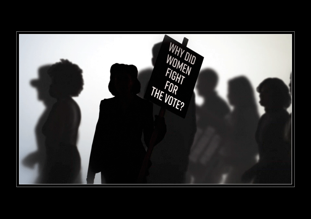
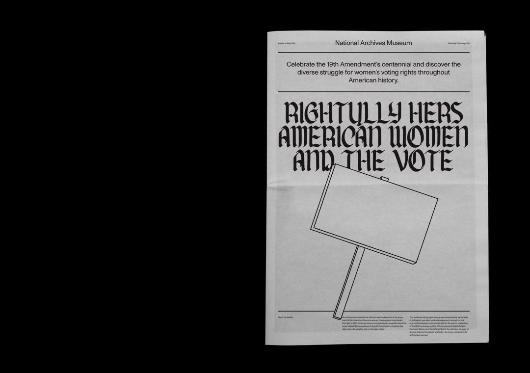
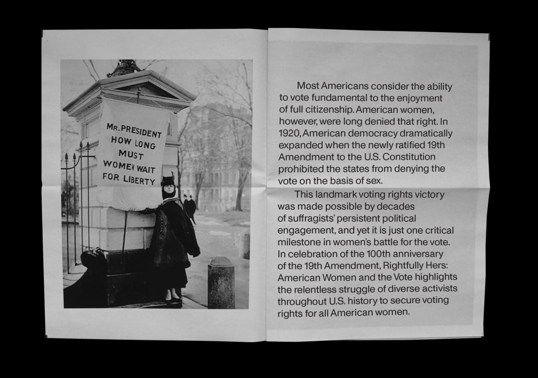
To commemorate the 100th anniversary of the 19th Amendment, Rightfully Hers: American Women and the Vote brings to light the persistent and arduous efforts of a broad array of activists throughout the course of American history who fought to ensure that voting rights were extended to all women in the United States.
The exhibit spans across an expansive area of 3,000 square feet, and boasts over 90 items that are on display, including an array of records, artifacts, and photographs that capture the essence of the journey that women went through to obtain voting rights. I was fortunate enough to work alongside Second Story, and contributed to the planning and implementation of the exhibit's art direction, which included projected videos, the exhibit catalog, and the development of an effective wayfinding system that would guide visitors through the space with ease.
The exhibit spans across an expansive area of 3,000 square feet, and boasts over 90 items that are on display, including an array of records, artifacts, and photographs that capture the essence of the journey that women went through to obtain voting rights. I was fortunate enough to work alongside Second Story, and contributed to the planning and implementation of the exhibit's art direction, which included projected videos, the exhibit catalog, and the development of an effective wayfinding system that would guide visitors through the space with ease.
Pinko / Exhalants Split
2018
P
Commission
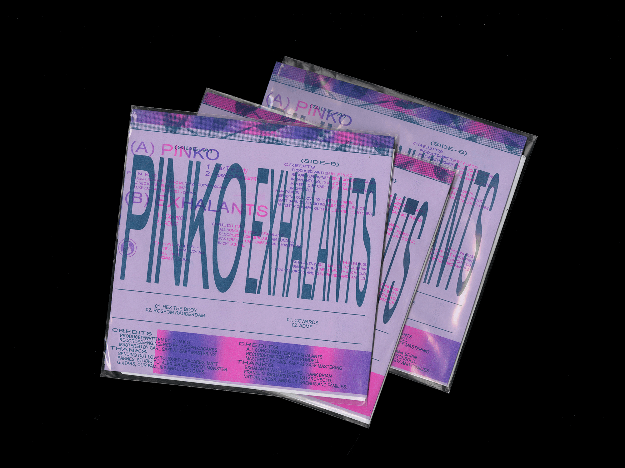


Collaborators:
Chad Miller
Andrew Brumagen
Edition:
500
Music:
Pinko
Exhalants
Label:
Self Sabotage Records
Release Date:
November 19, 2018
Chad Miller
Andrew Brumagen
Edition:
500
Music:
Pinko
Exhalants
Label:
Self Sabotage Records
Release Date:
November 19, 2018
This collaborative release from Pinko and Exhalants features two loud, fast, and noisy tracks on each side, resulting in a total of four songs for the split seven inch vinyl. We approached the design process in a similar manner to their music-making: each wrote and recorded their own tracks separately before coming together to deliver the final product. To bring this project to life, Chad Miller, Andrew Brumagen, and Iworked independently, focusing on different aspects of the design before bringing everything together for the final product. We used a studio Risograph to produce the final artwork in order to achieve a cohesive and unified look.
Listen To Here
Listen To Here
Snake Oil Supplements
2018
B P
Studio Post Office
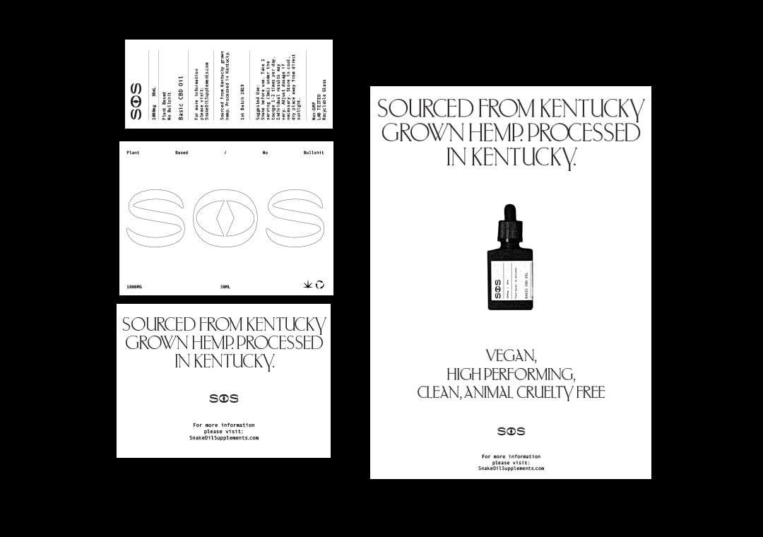
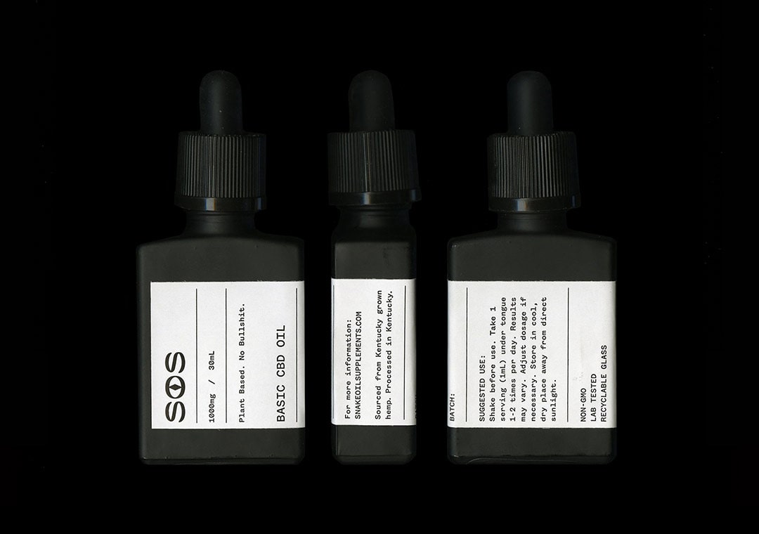

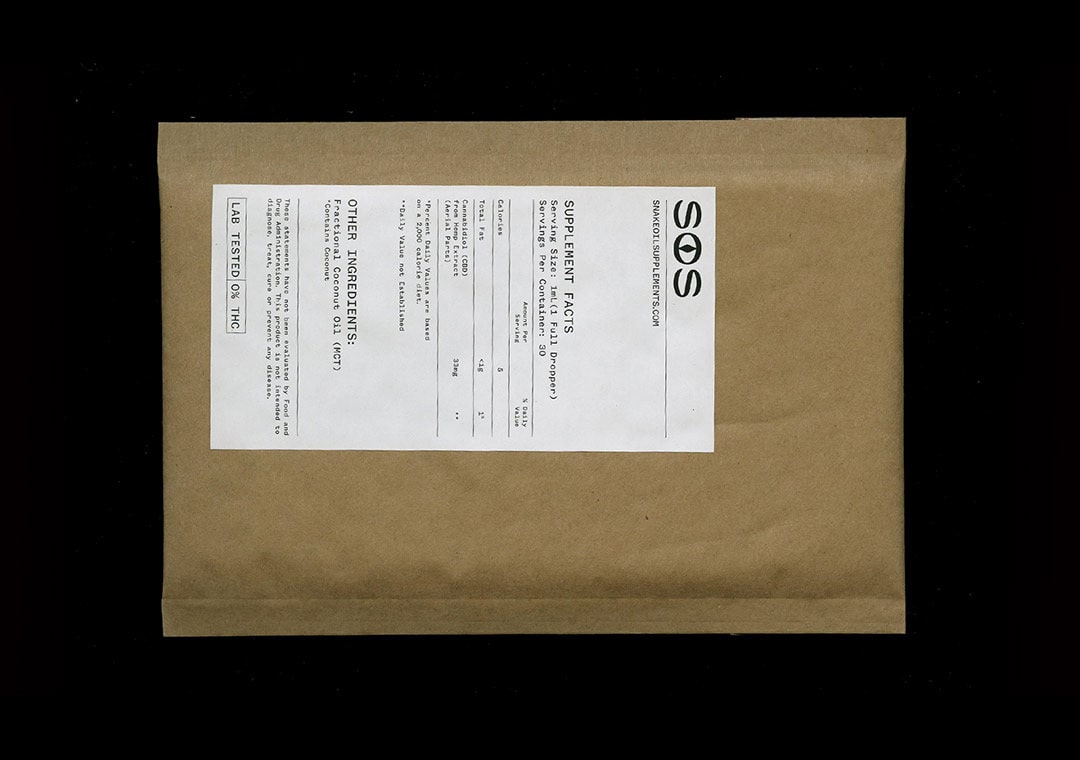
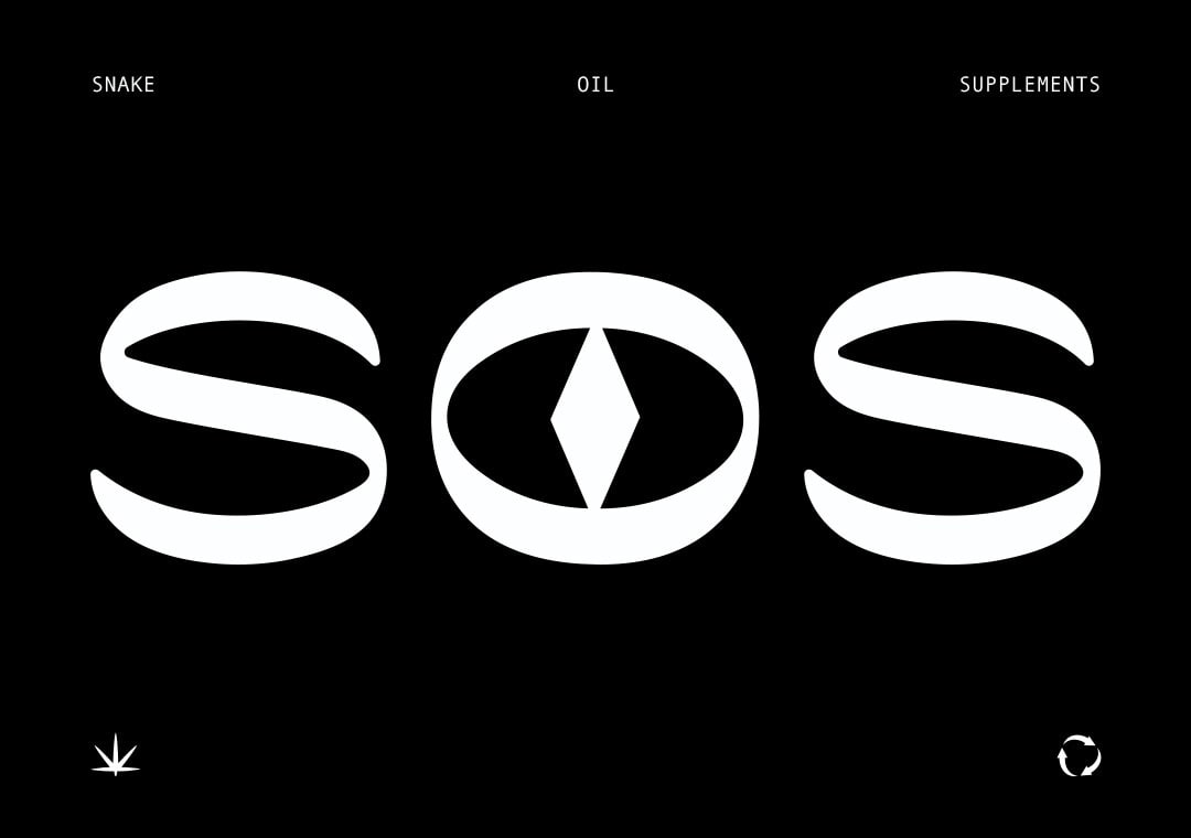
As the demand for CBD products continues to grow, consumers are becoming more interested in learning about the differences between various products. Snake Oil Supplements (S.O.S.) has entered the market with a unique approach to educating consumers about CBD products, all at an affordable price.
Our team was given the task of creating a brand name, developing a strategy, and crafting a visual identity that would effectively communicate the simplicity and ease of using CBD products. Through thorough research, we discovered that many of our competitors were using misleading messaging and selling products that were not effective, leaving consumers feeling disappointed and frustrated.
To combat this, we developed a simple identity system that allows consumers to easily navigate products that meet their specific needs. With our approach, consumers can feel confident in their purchase and trust that they are getting a high-quality product that is worth their investment. Additionally, we created a variety of educational materials to help consumers learn more about CBD and its many benefits.
Naptown Collective: S.T.O.N.E.
2018
B
Naptown Collective

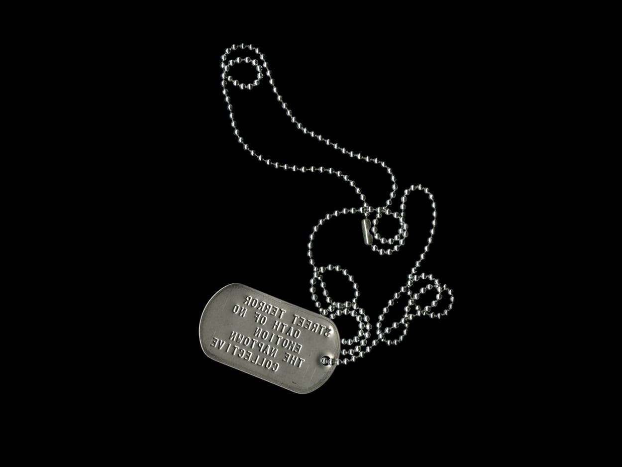

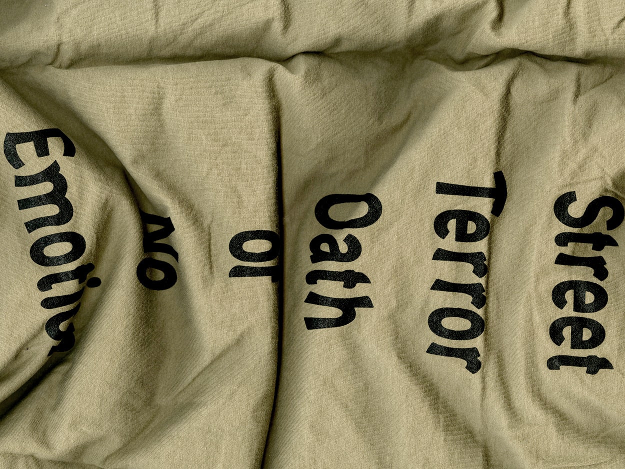


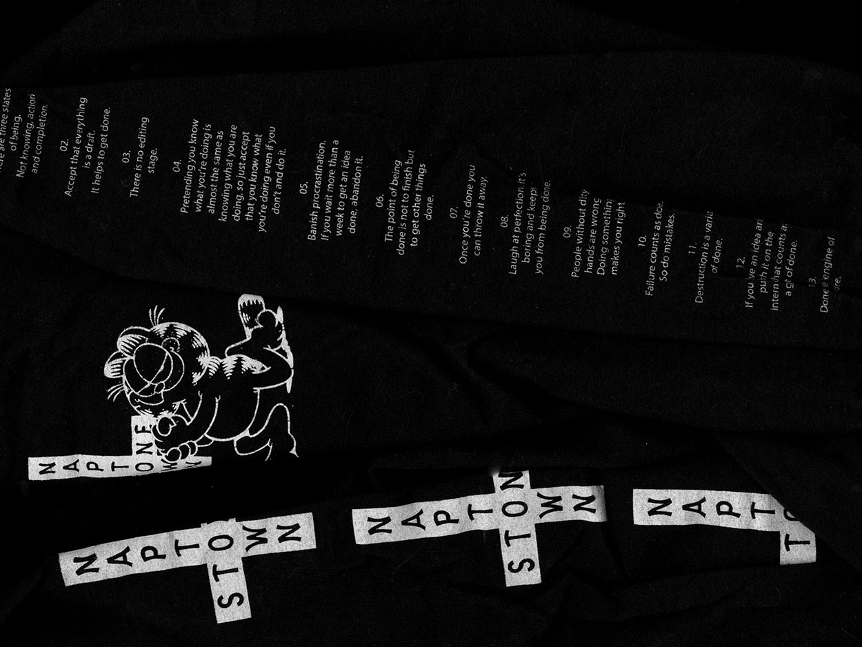

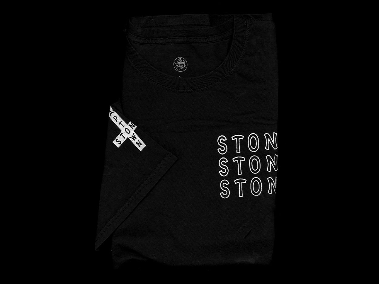

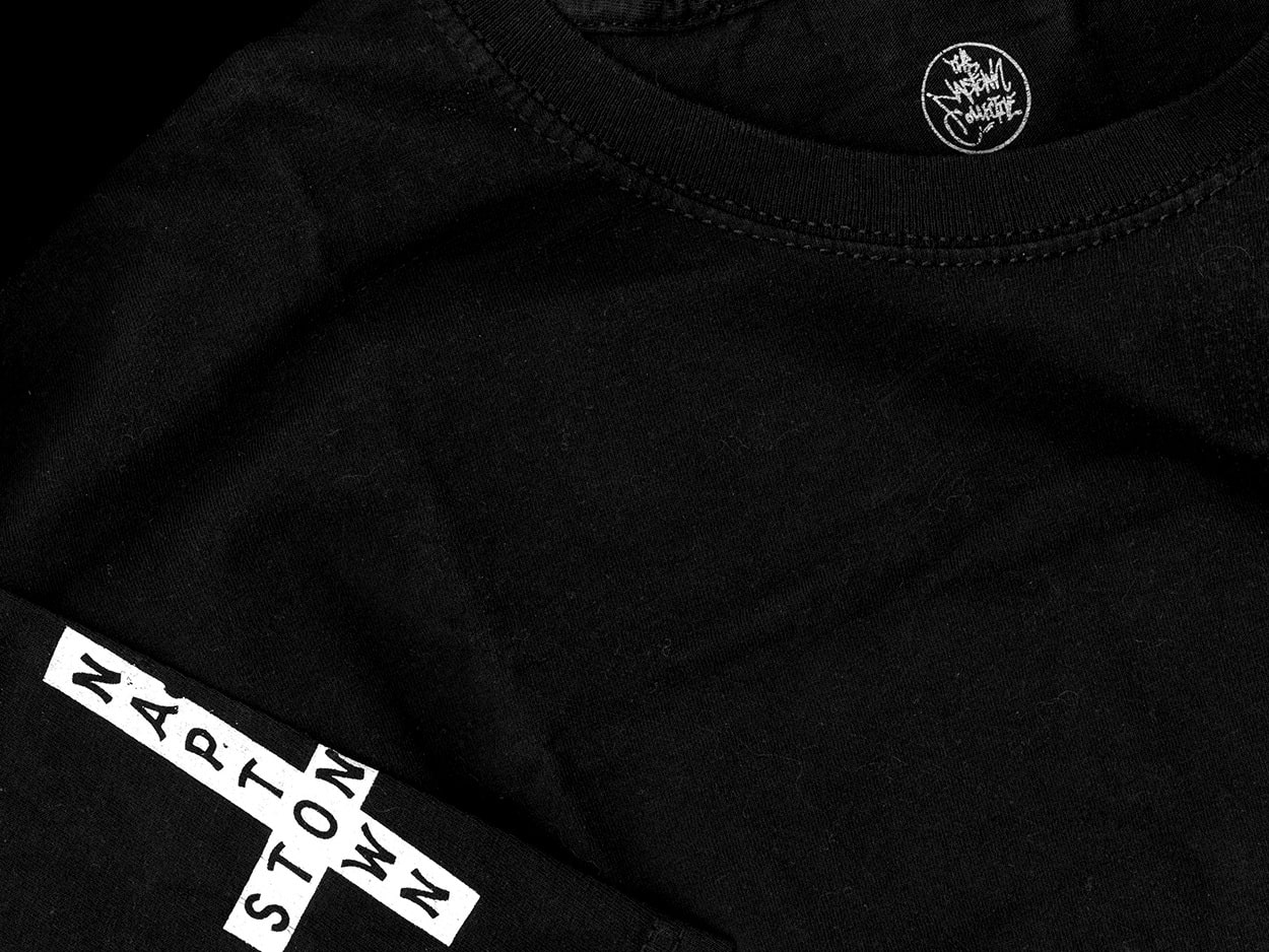

In mid-2018, S.T.O.N.E. (Street Terror Oath of No Emotion), a clothing brand, was created through a friendly collaboration with The Naptown Collective. The brand was born out of a desire to create something unique and innovative that would be a reflection of the collective's ethos. The brand's vision is to provide a platform for individuals to express themselves through fashion, and to challenge traditional norms and boundaries. S.T.O.N.E. represents a new way of thinking about fashion and textiles, and it is through the collaboration with Elliot from The Naptown Collective that this vision has been made a reality.
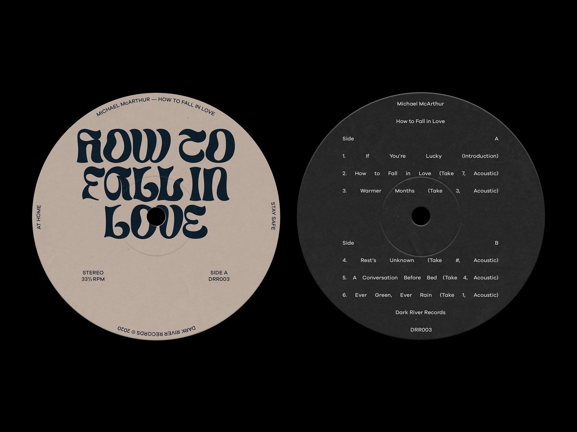
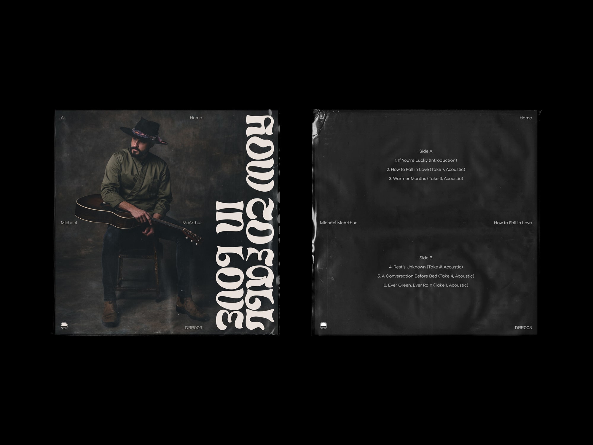
Michael McArthur Ever Green, Ever Rain
2018
P
Studio Post Office
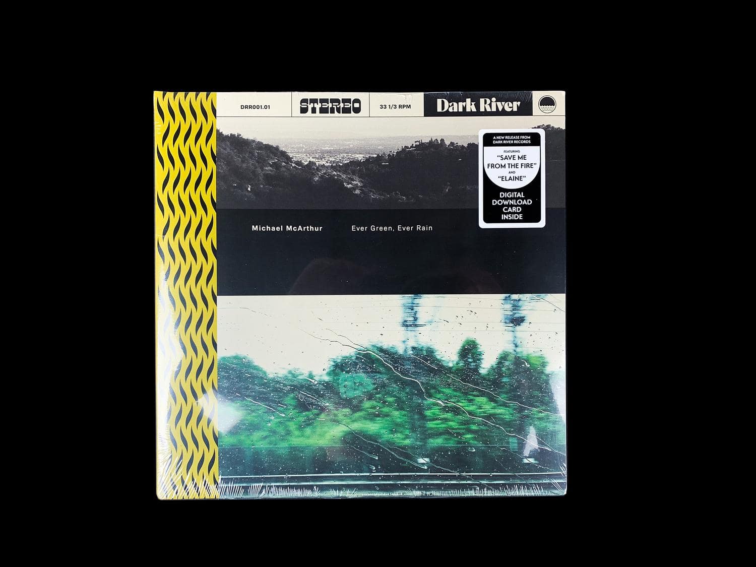
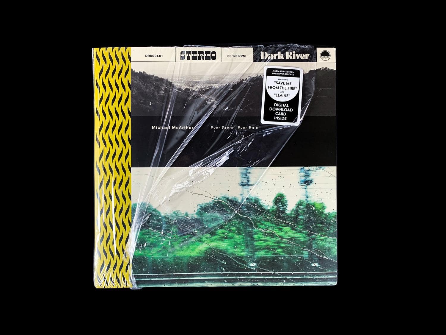

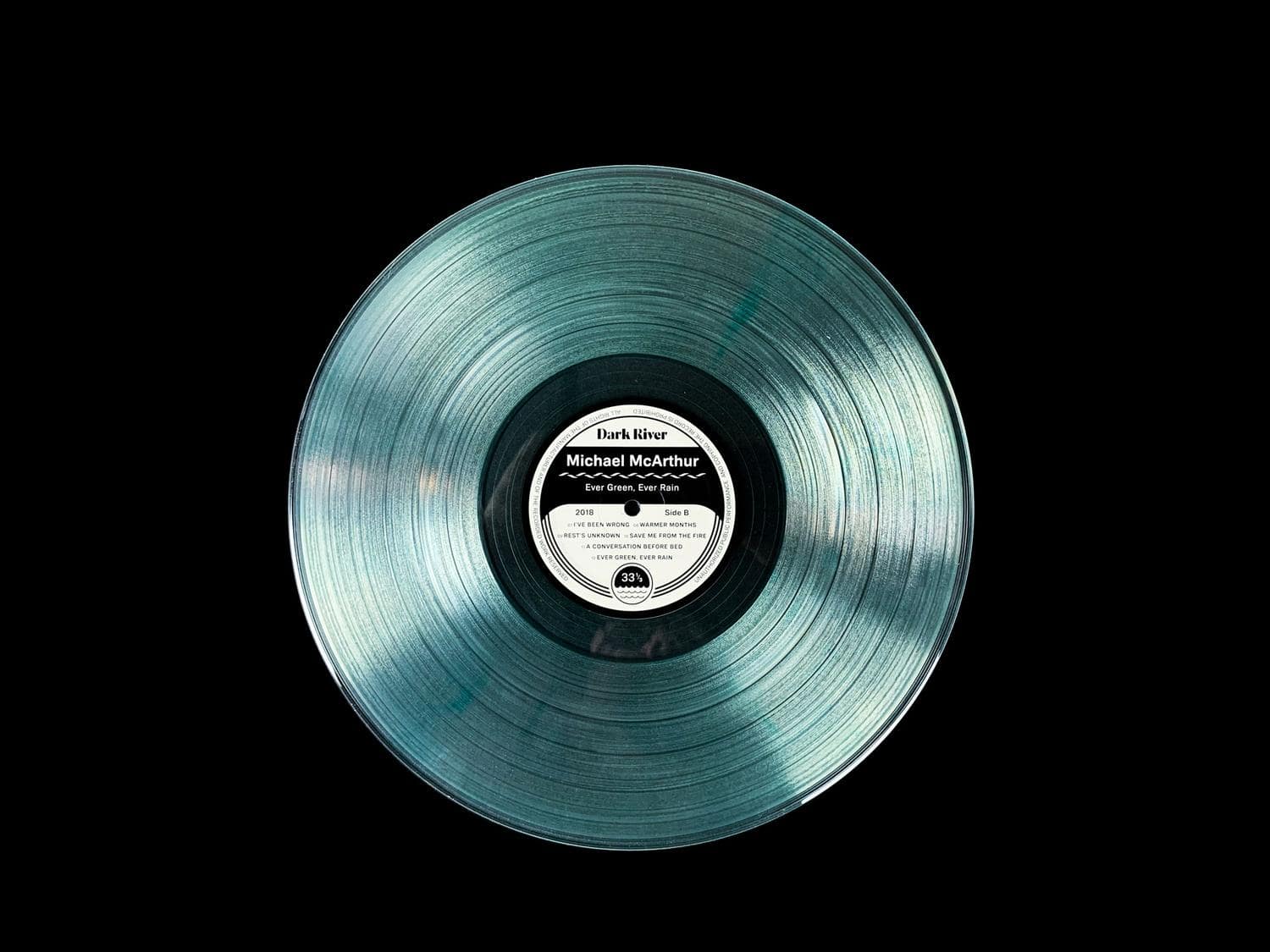
Michael McArthur's debut studio album, titled "Ever Green, Ever Rain", not only showcases his stunning vocal range and songwriting skills, but also tells the story of an artist in pursuit of his dreams.
Recorded in Los Angeles in the summer of 2018, the album is a testament to Michael's dedication and passion for music. Despite the long drive from his home in Florida, he pushed through to create a work of art.
When Michael approached me, he had a clear vision for the album's direction. He wanted the album art and packaging to capture the mood of his songs. I worked closely with him to bring his vision to life. The album art features a constant rhythm pattern across the spine, which is a nod to the musicality of the songs. The color themes expressed through the photography and vinyl add depth to the overall visual experience of the album.
When Michael approached me, he had a clear vision for the album's direction. He wanted the album art and packaging to capture the mood of his songs. I worked closely with him to bring his vision to life. The album art features a constant rhythm pattern across the spine, which is a nod to the musicality of the songs. The color themes expressed through the photography and vinyl add depth to the overall visual experience of the album.


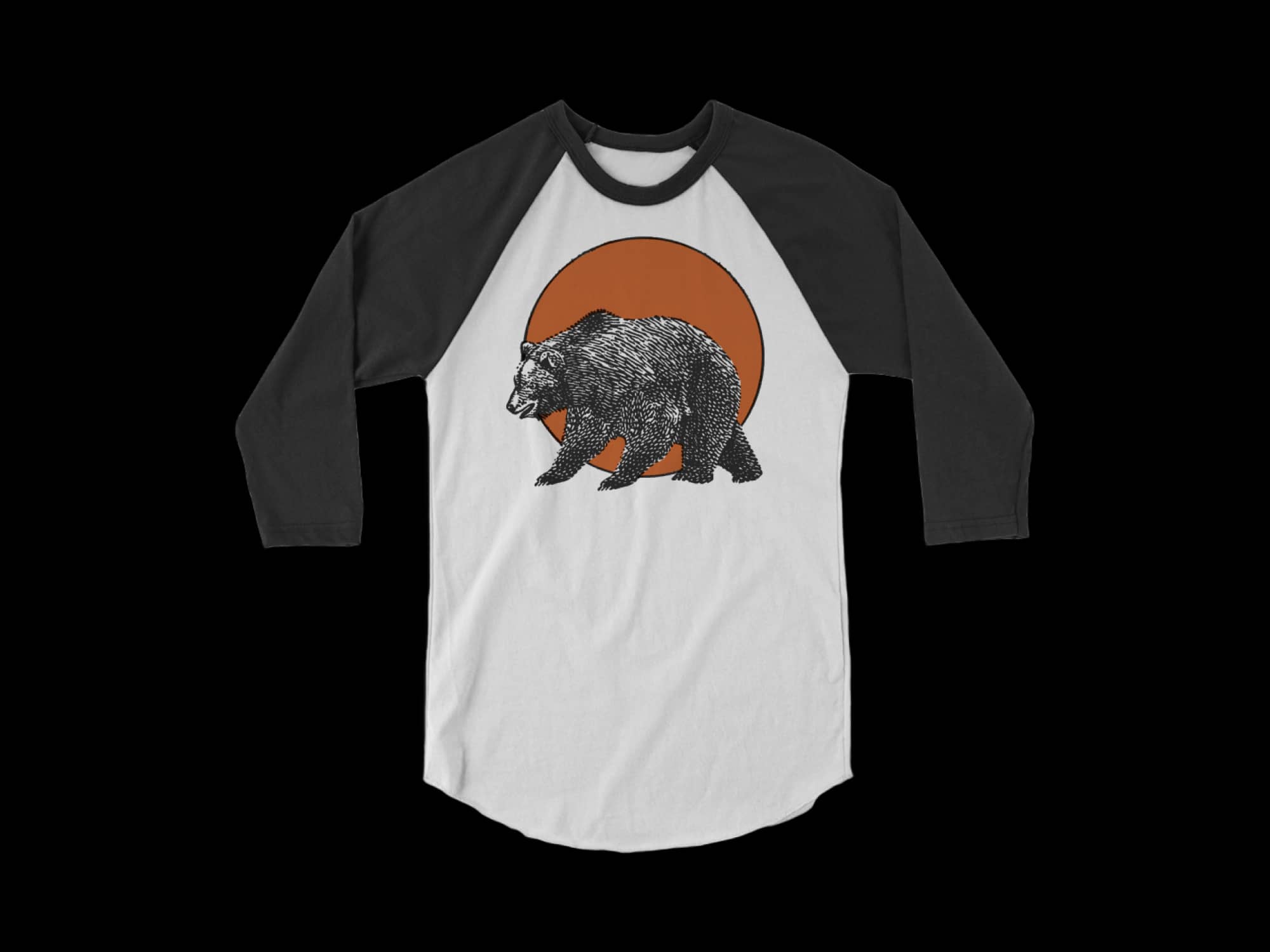


My longstanding partnership with the Indianapolis Kuma's has resulted in the creation of several apparel items. These items are inspired by, and often parodies, the heavy metal music played within the restaurant. It's worth noting that the creative process for these products is quite intricate and involves the careful selection of materials, unique design applications, and top-notch manufacturing techniques. Above are a few examples of the products we've crafted.
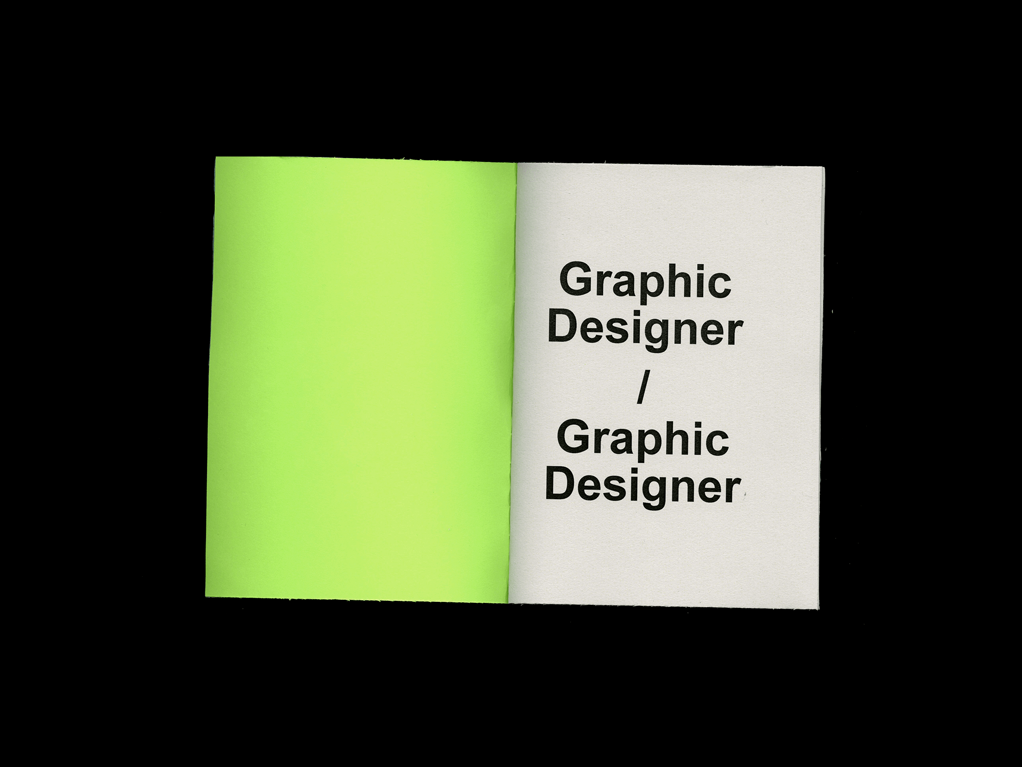
The Teaching Assistant
2017
E
Self Initiated
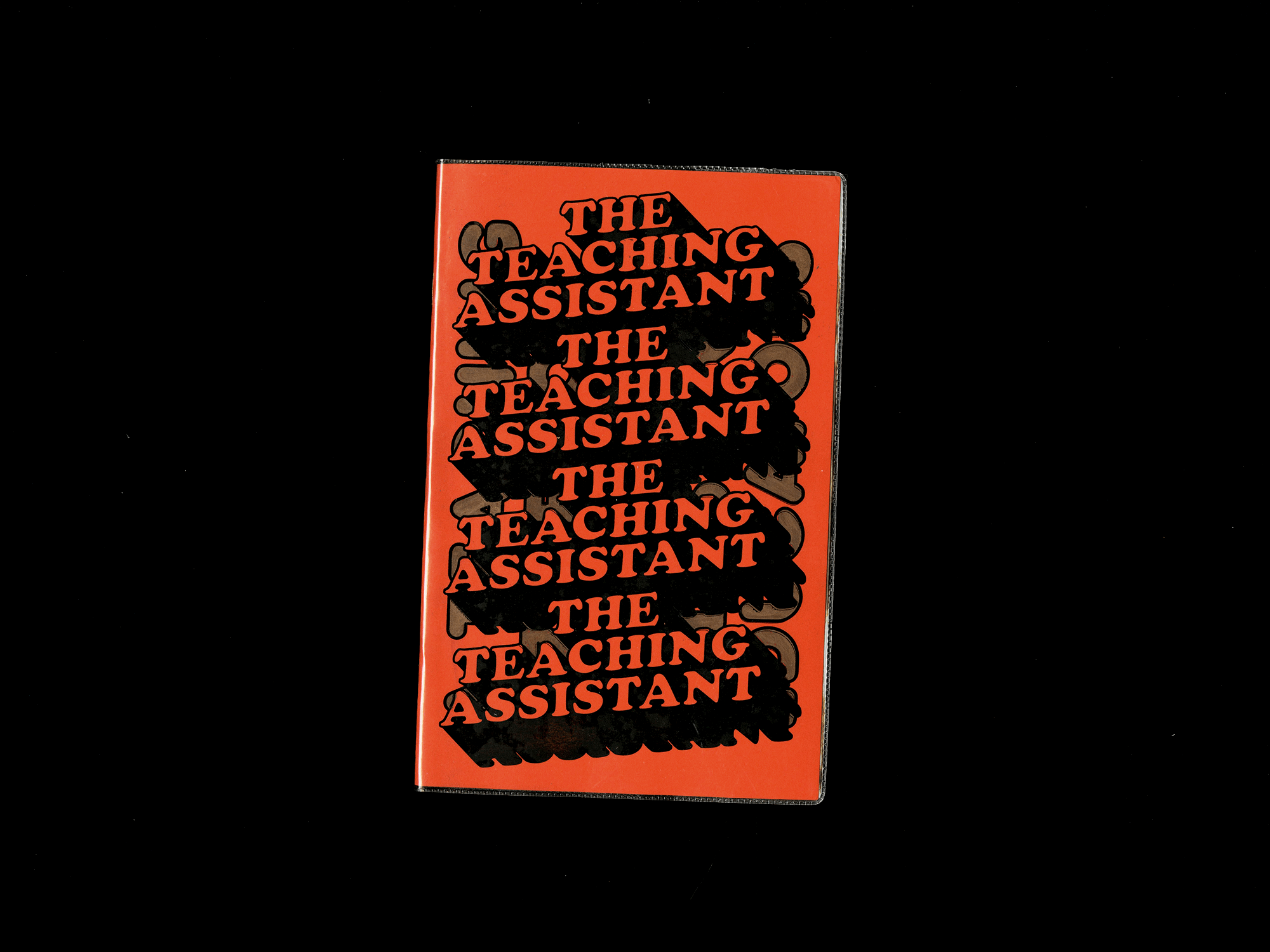
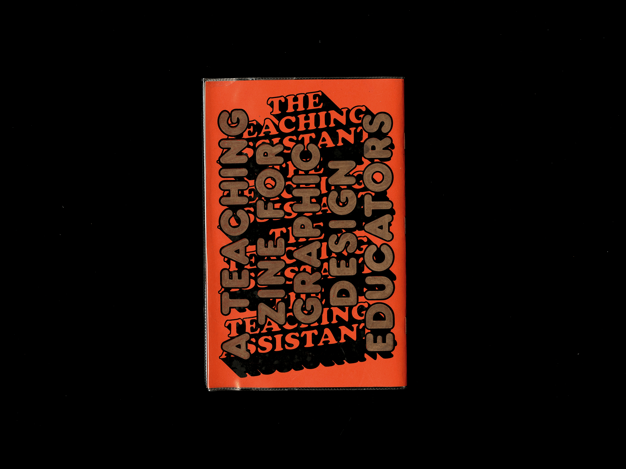
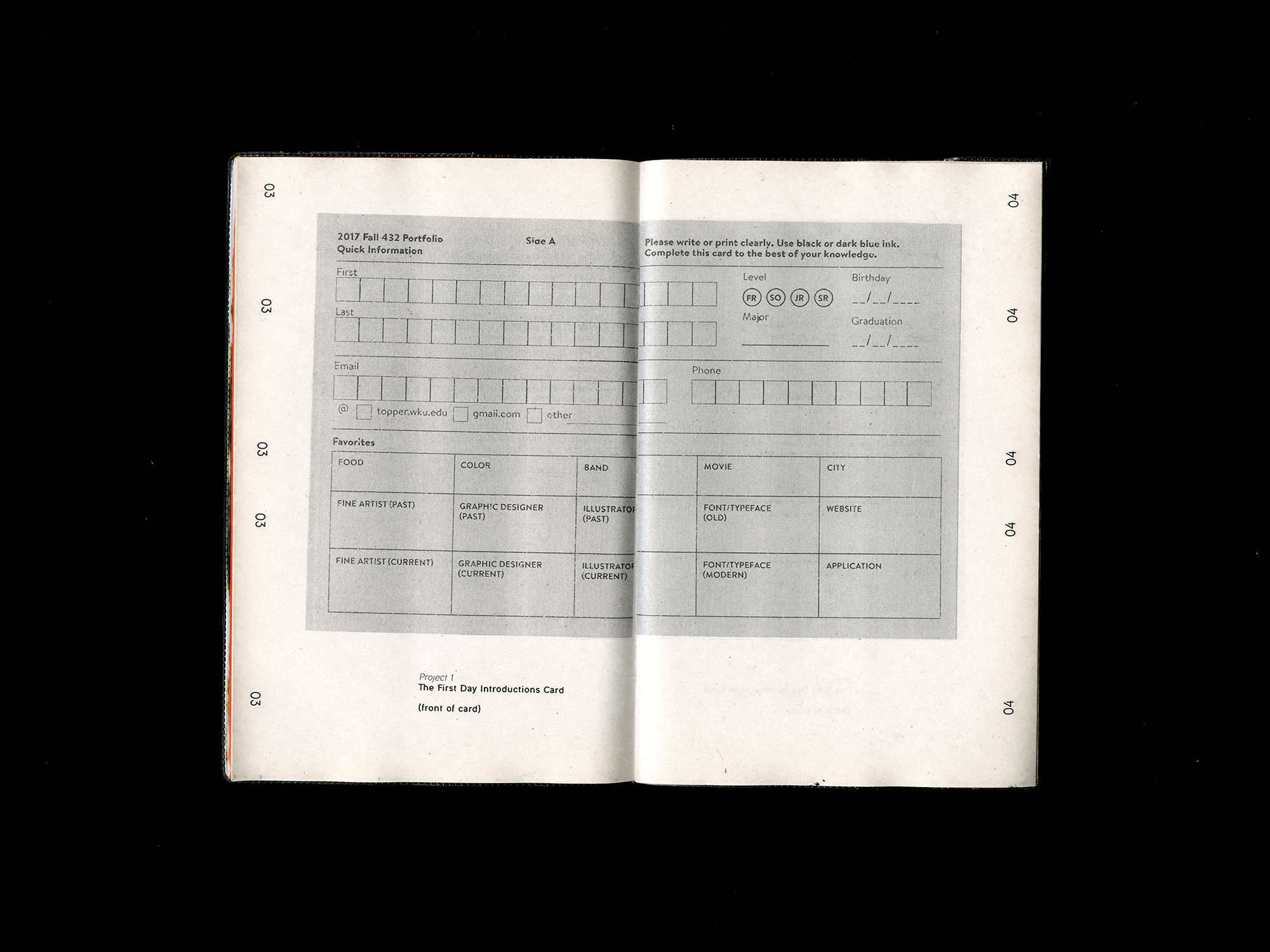
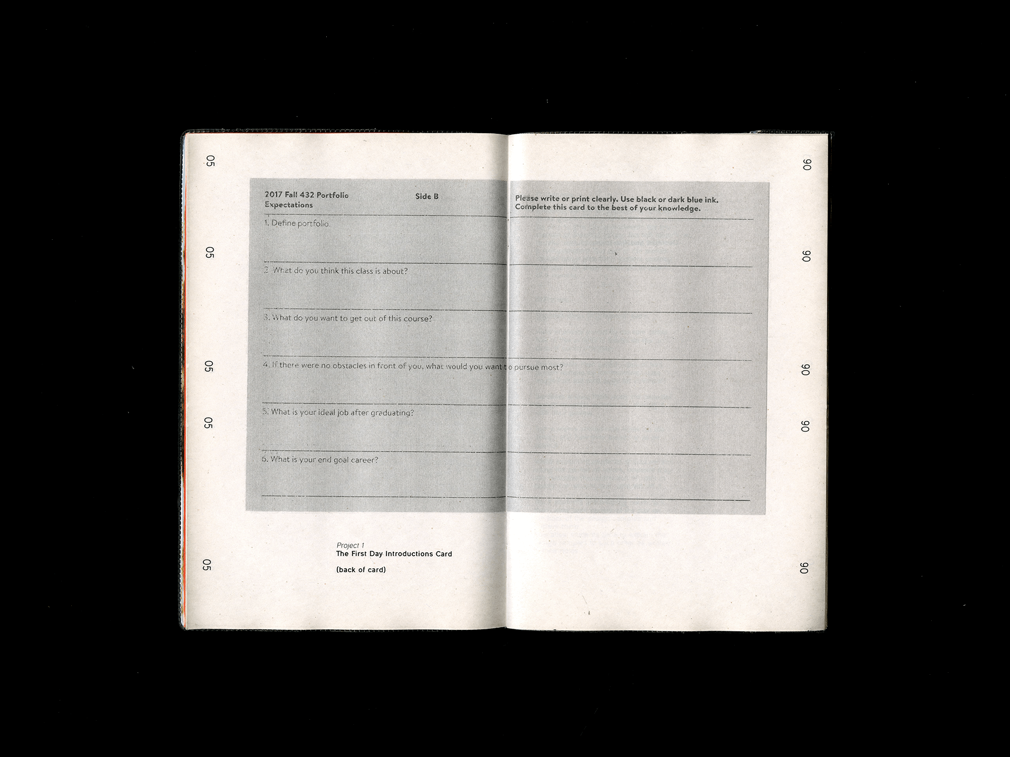
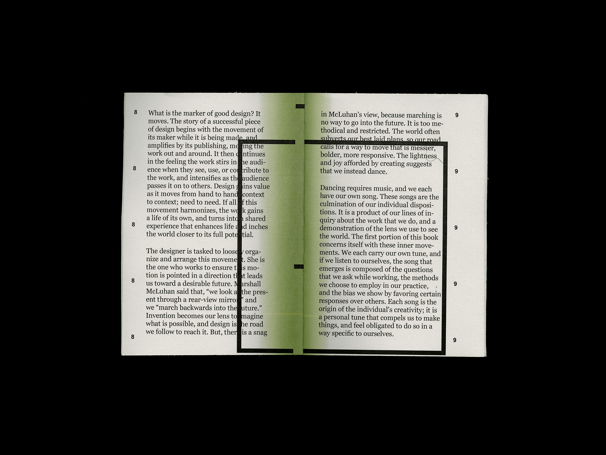
During my MFA education, I went through a phase of angst fueled by the idea of comparison between different design education programs. I constantly questioned the choices I made in picking schools and my lack of knowledge about them. I even considered whether we should get rid of 90-99% of the existing programs. But instead of erasing and starting over, why not try something else?
As part of my MFA thesis work, I created a small publication to share projects, understanding, and goals with other educators. Not everyone can attend an elite school, but we can all work on the same projects.
Projects are created with specific learning goals in mind, similar to how I work with clients at my day job. We use projects to help students learn concepting and how to articulate their work effectively.
Found Typography and Cryptography
2017
E
Self Initiated

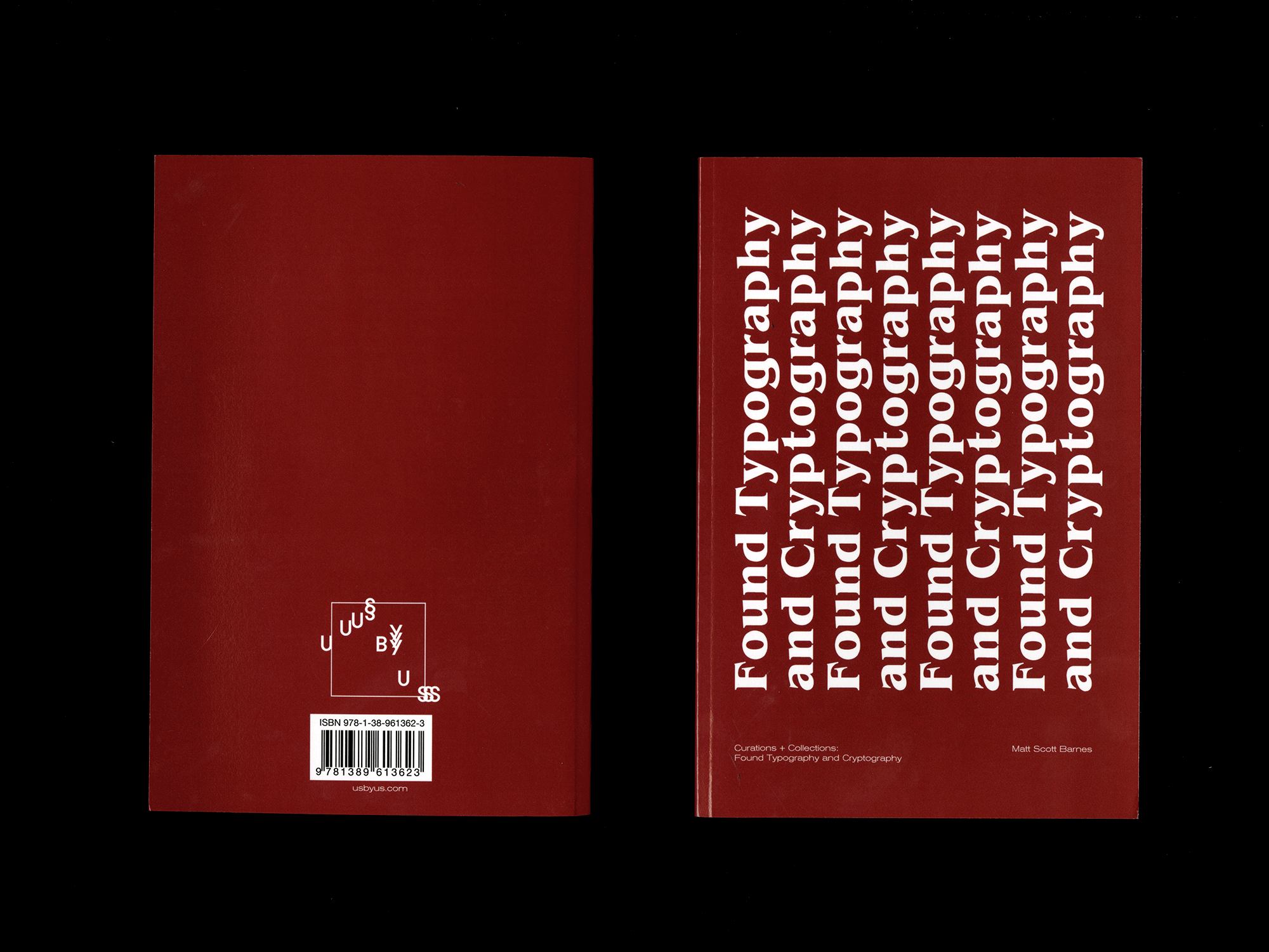
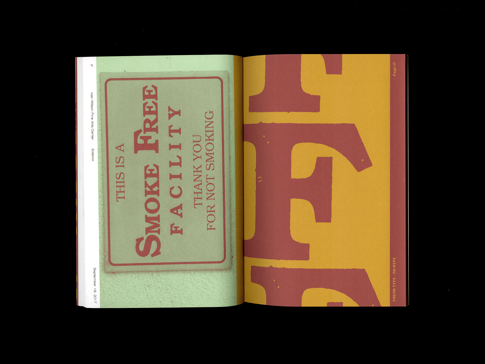
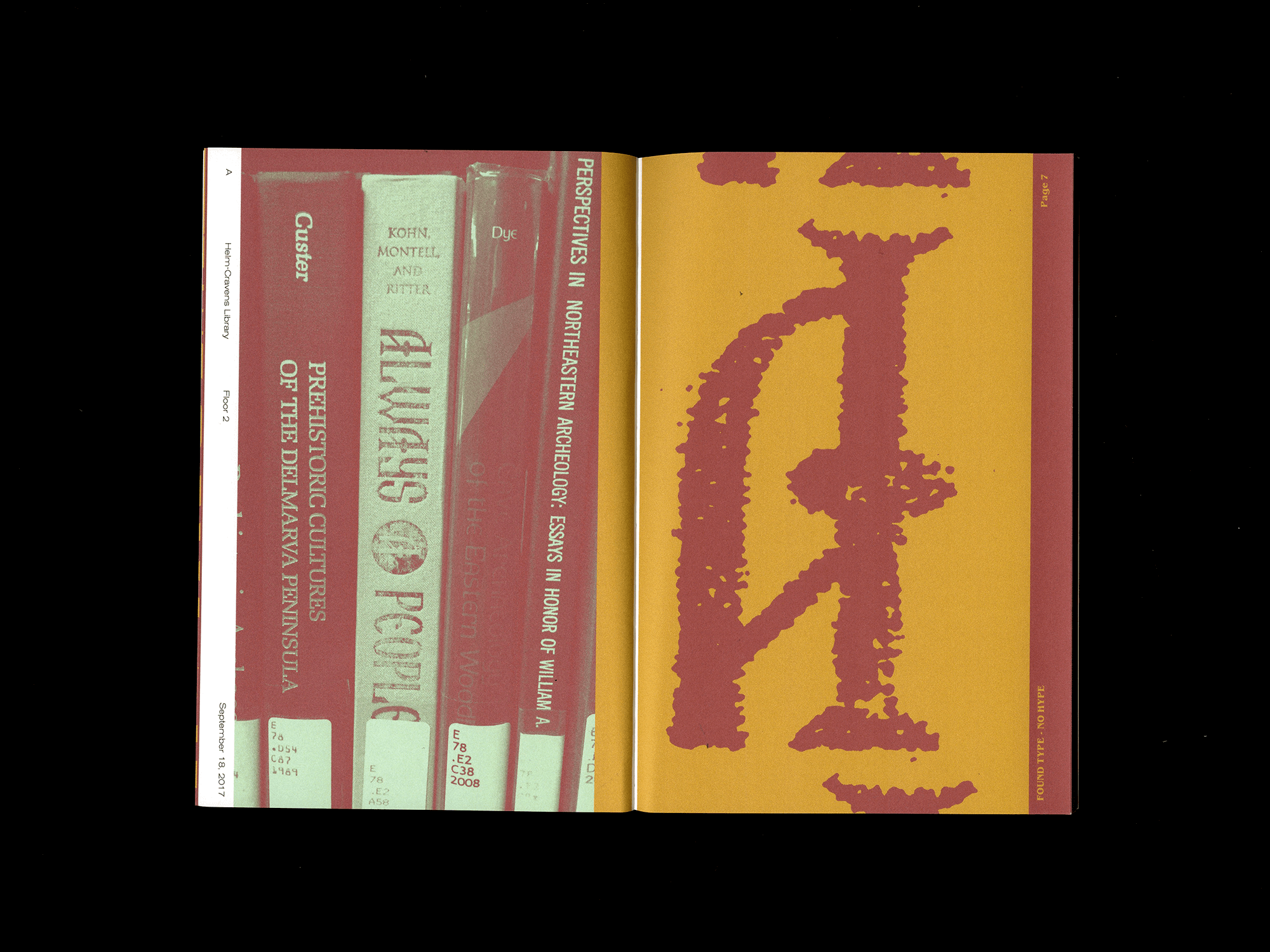
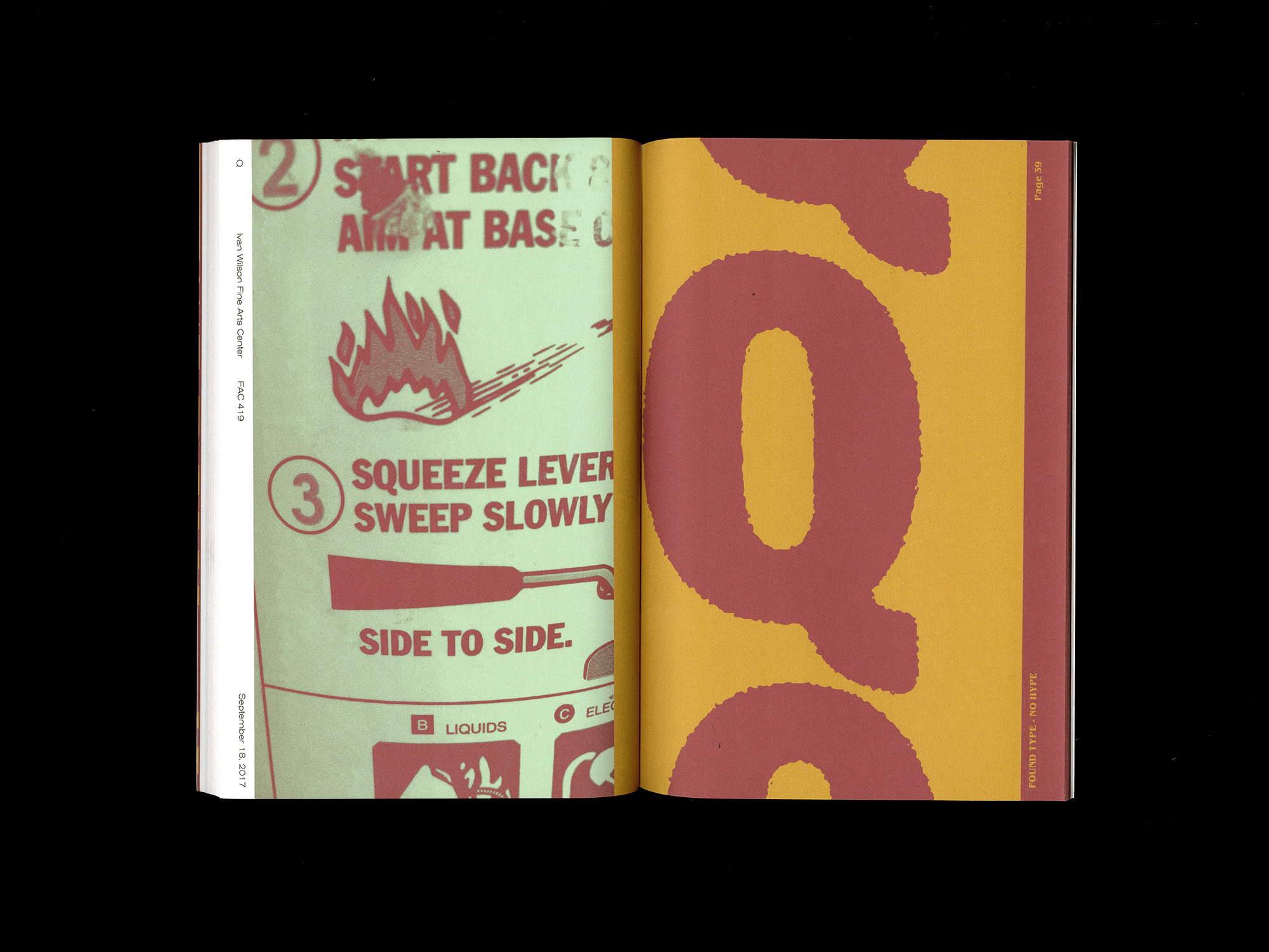
Edition of 5
While teaching an introductory level class in typography I produced this as an example for a project. The assignment was to observe and document the under-observed typography we pass everyday. Curate a coolection of images and produce a small booklet categoring their selection.
Alone: To The Pure, All Things are Pure
2016
P
Commission


Credits:
Music by Alone
Created Alonside Cole Dunn
Additional help by King Joe Wehrman
Music by Alone
Created Alonside Cole Dunn
Additional help by King Joe Wehrman
First full length and final release by Bowling Green, Kentucky’s finest shoegaze band, Alone. Featuring nine tracks on clear dark green vinyl. Hand pulled screen printed covers and xerox liner notes.
Edition of 250
Self-released on Febuary 9, 2016
Edition of 250
Self-released on Febuary 9, 2016
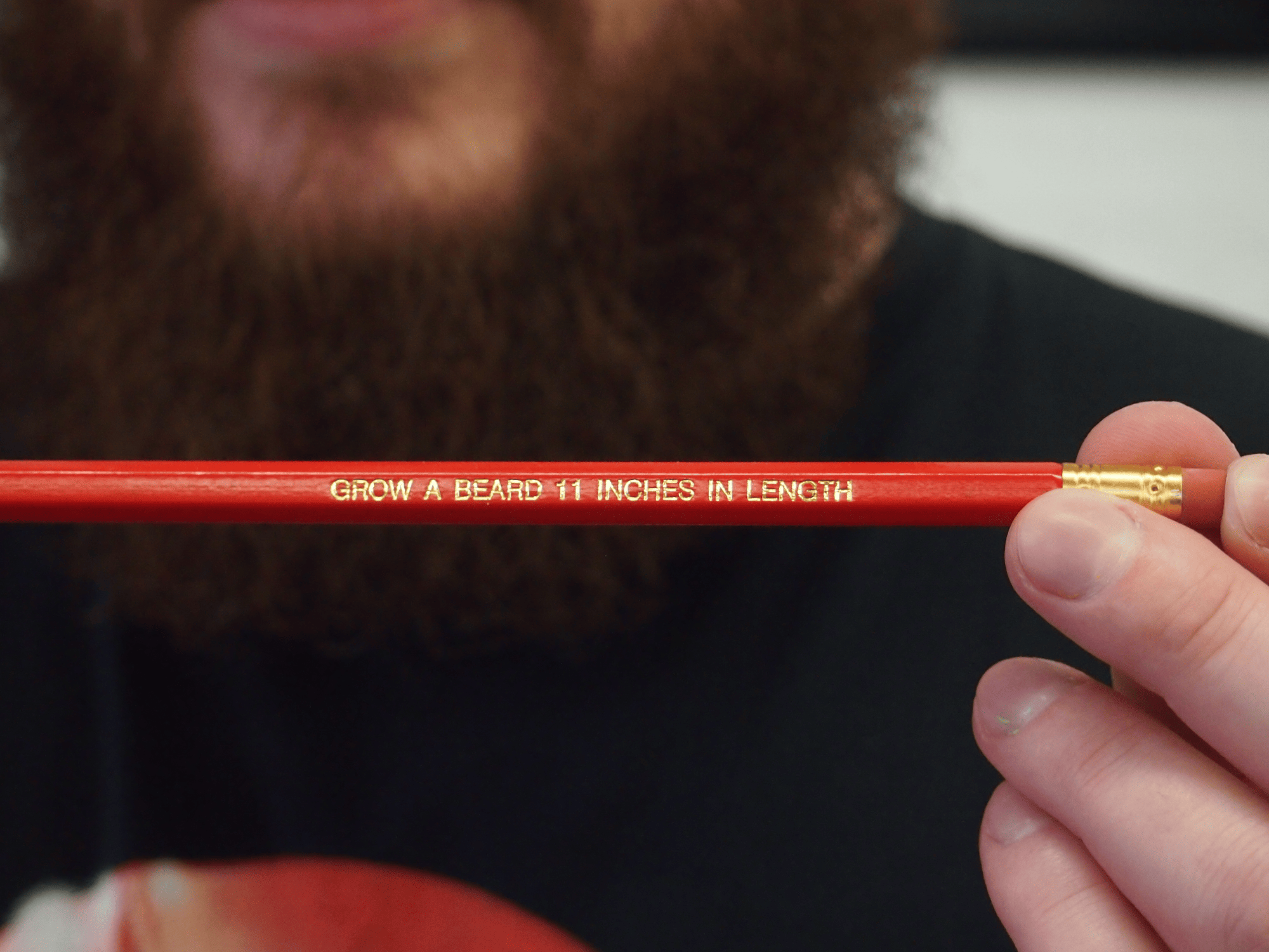
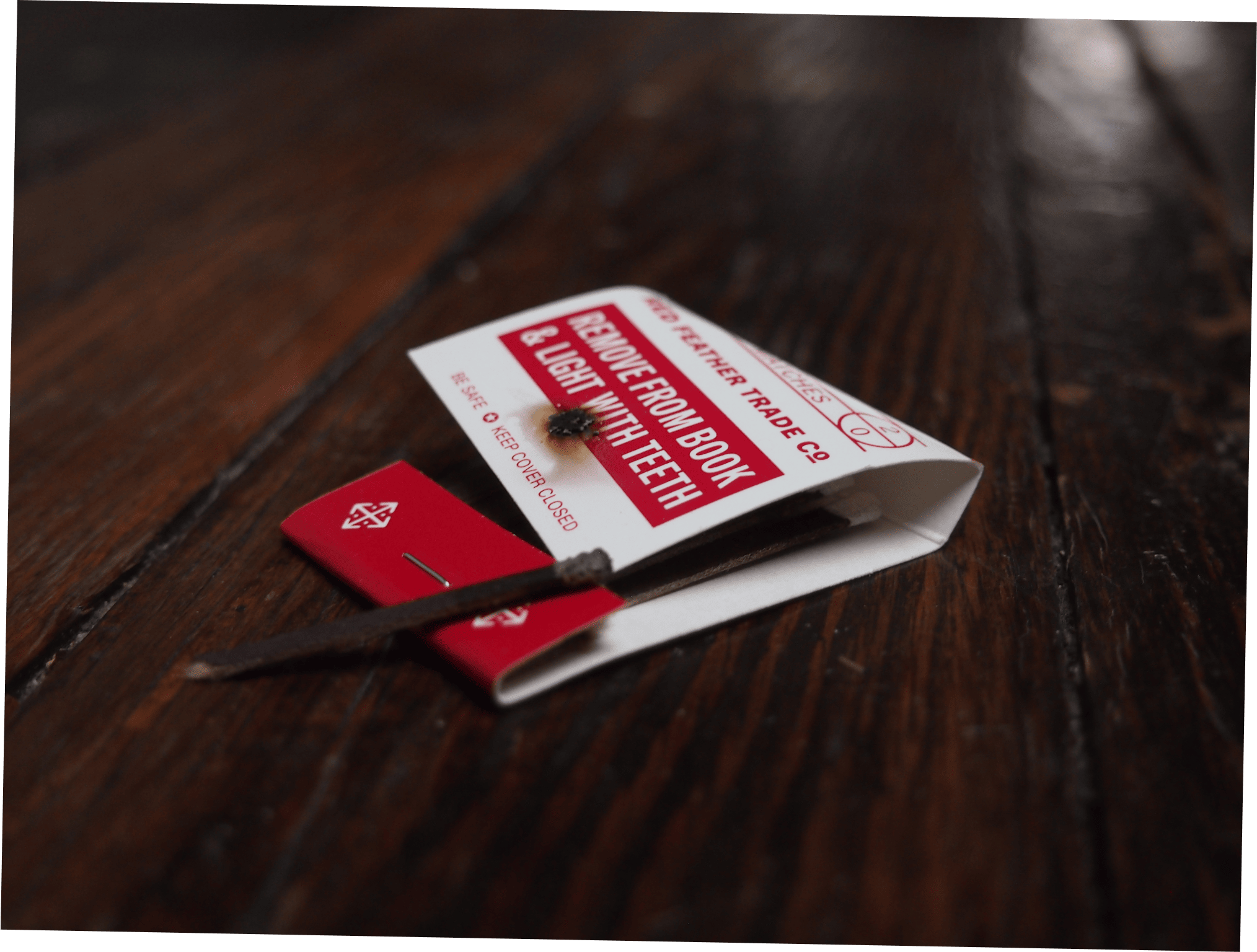
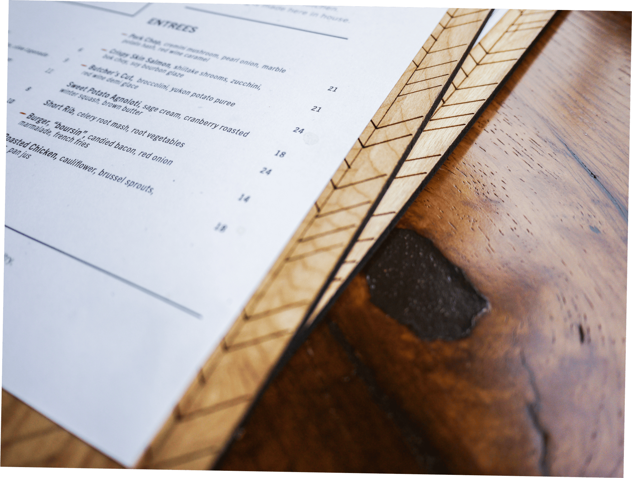
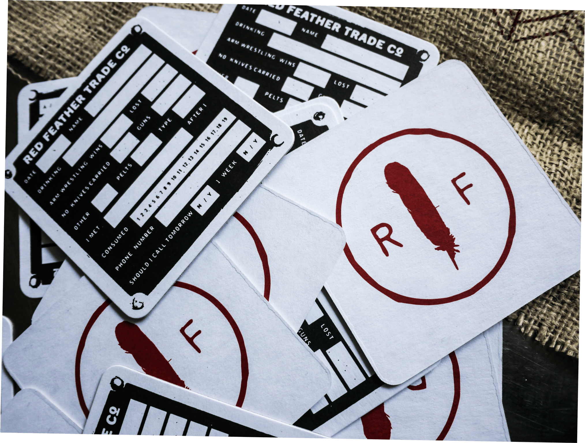
Red Feather Kitchen
2013
B. P
BLDG
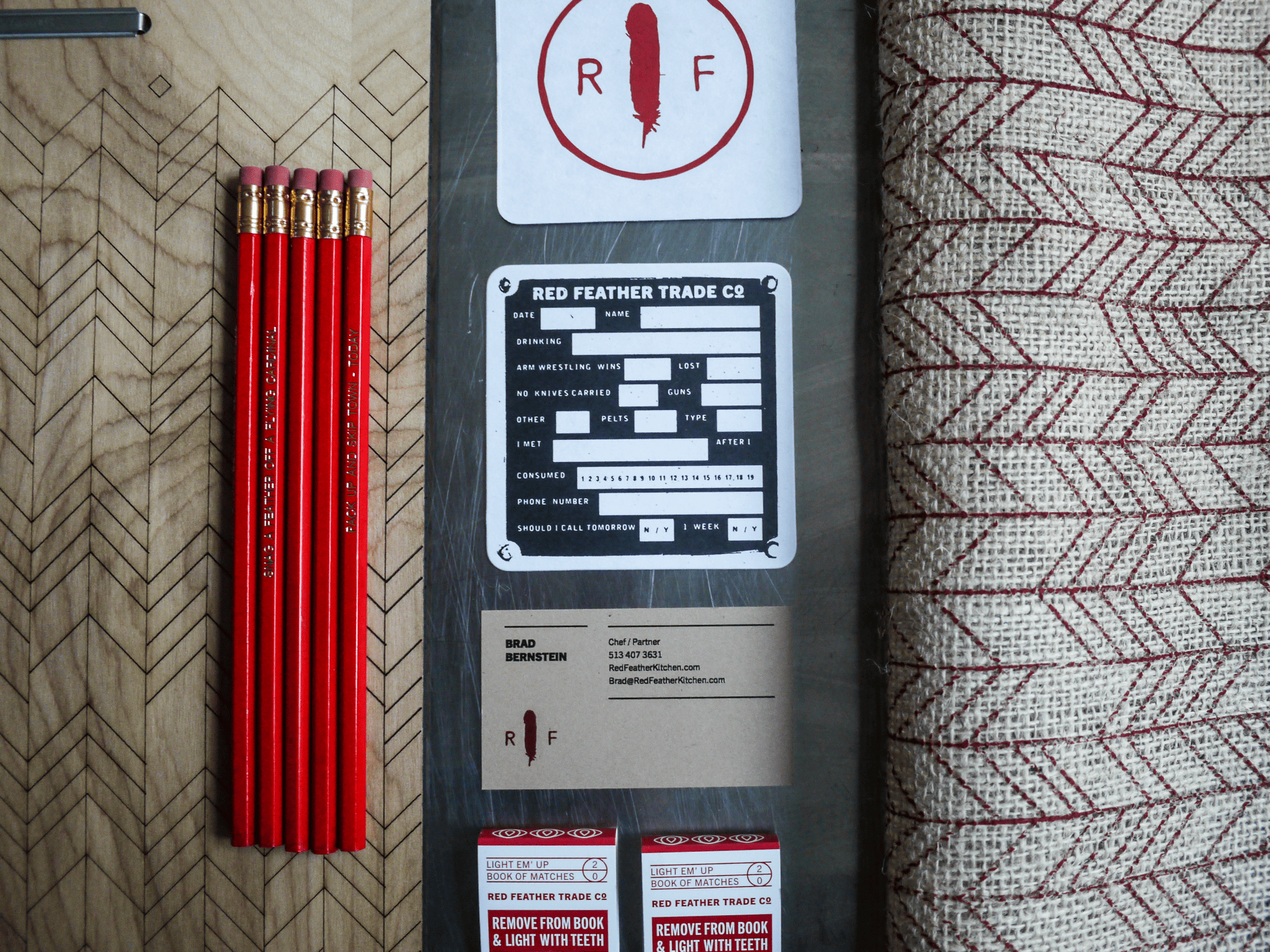
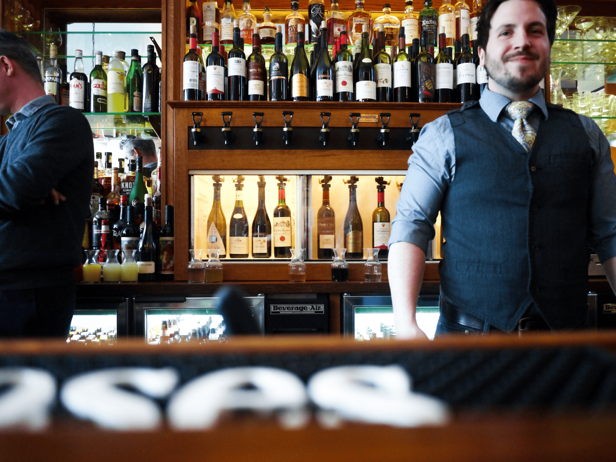
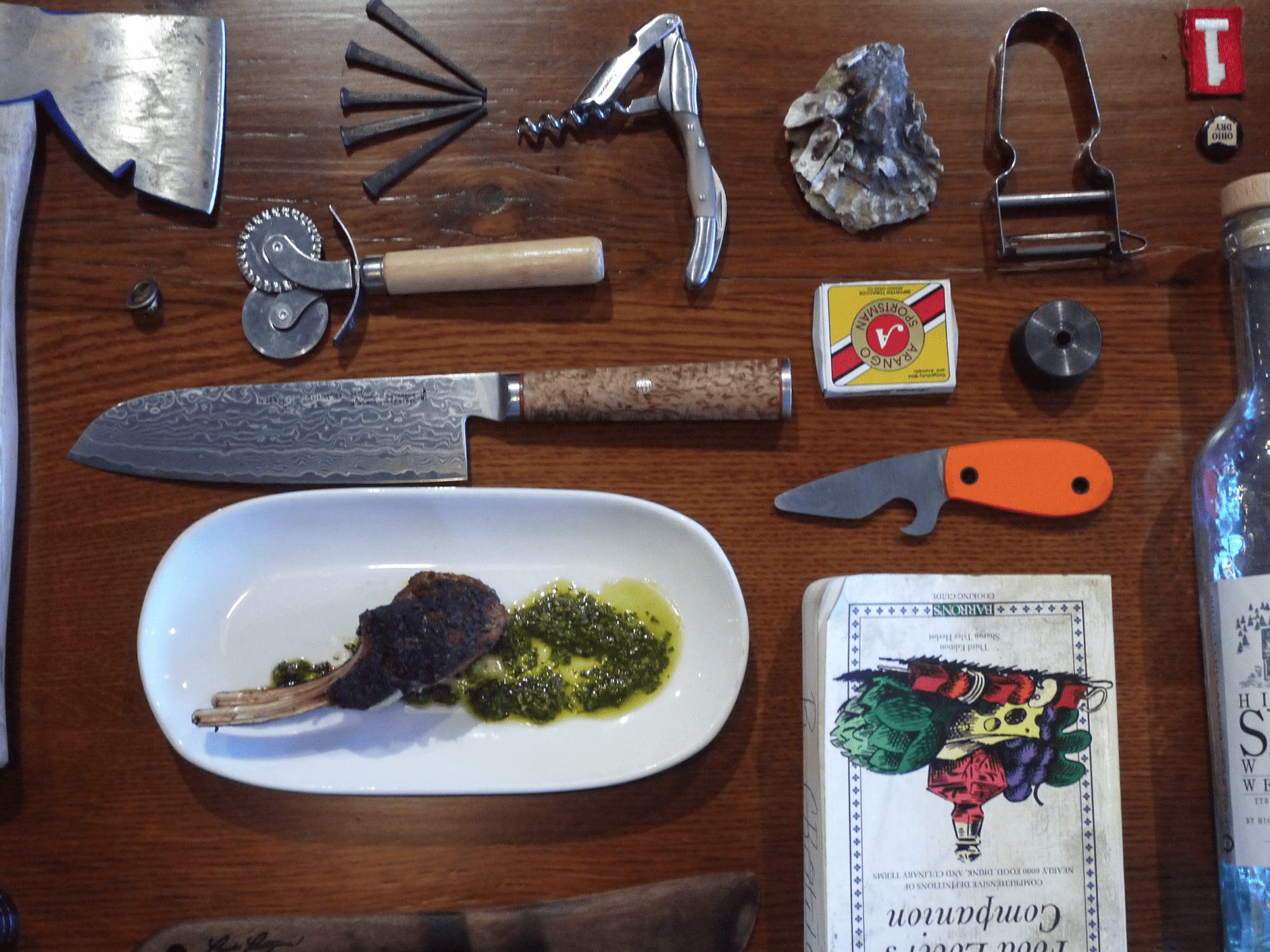

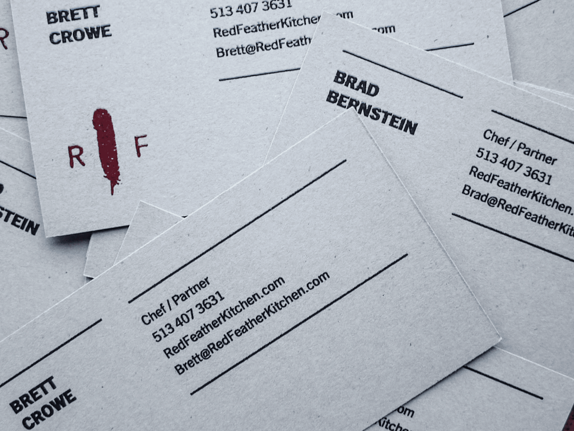

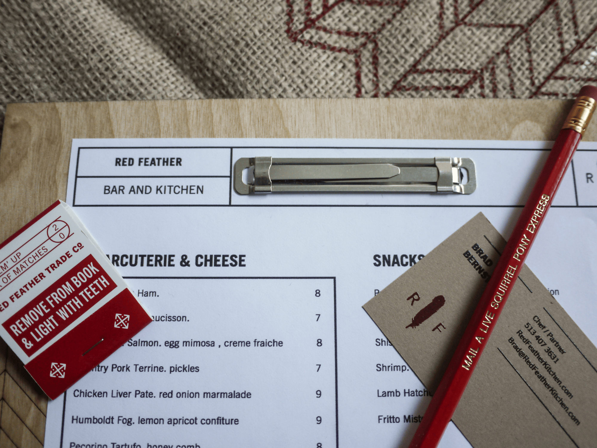


Red Feather is a restaurant with a unique identity that sets it apart from other fine dining establishments. The restaurant prides itself in its rustic-yet-upscale "scratch kitchen," where the chefs utilize fresh, high-quality ingredients from all over to handcraft dishes that are full of character and distinction.
To further enhance the restaurant's image, we developed an identity that tells the story of quality and craftsmanship with charm and irreverence. The graphic elements and patterns were meticulously hand-drawn to add texture and detail that elevates the restaurant's rough and rugged appeal. We also used various techniques to create a tangible connection to handcrafted quality, such as screen-printed pencil sleeves and laser-engraved menu boards.
As a result of our efforts, Red Feather is now renowned not only for the quality of its food, but also for the unique and unforgettable experience it provides. The attention to detail and emphasis on handcrafted quality truly sets it apart, making it a must-visit destination for anyone who appreciates fine dining done right.